Sunday 16 February 2014

Drawing 1, Part 1 Mark Making and Tone, Assignment 1 – Check and Log


Did you do enough preliminary work before starting on your final pieces?


Yes definitely, the preliminary work not only helped me decide on the best composition for the final piece but helped me to decide which mediums I should use. In both parts of this assignment it changed my mind about what mediums I would use and also the layout of the composition for the final piece. I probably could have done more with regards to colour blending and make more notes on which colours to use for the Natural Objects.
Do your large drawings give an accurate interpretation of the still life groups? If not, what went wrong?
The large drawing for Made Objects I believe was a very accurate interpretation of the still life group even after playing down certain details such as the amount of bars on the electric fan cage. However I I’m not too happy with the interpretation of the still life group in the large drawing for the Natural forms. There are certain shapes on the edge of the drawing that I know are not the same as the actual objects this was due to moving the objects about trying to find the composition that I chose to develop, then having to work from the drawings I had already done and photos that I had taken.
Did you make a good selection of objects or did you try to include too much?
I believe I made a good selection of objects for both parts of this assignment with a minimum amount of objects in mind as I set out on each project.
Do your drawings fit well on the paper, or could they be improved by working on a larger sheet of paper?
The drawings do fit well on the paper but I do feel that both compositions may have been improved on a larger A1 sheet of paper because of the objects that I chose for the Made Objects and for the medium that I chose for the Natural Forms.
Did you have problems with drawing, or find hatching too difficult?
I don’t feel that I have any problems with drawing, any problems that do have are probably from the lack of experience with certain mediums. In the Natural forms part of the assignment I thought I did quite well in developing my hatching skills with hard pastel.
View My Drawing 1 learning log here www.mydrawingcourse.com

Drawing 1, Part 1 Mark making and Tone, Assignment 1 – Natural Forms


Getting started with this part of the assignment was quite difficult as it is hard to find good natural forms in Bangkok and did not have time to leave the city for the countryside. So I  collected pebbles from the car park of my apartment and in front of the office block where my language centre is and also went out with a pair of scissors and took a couple of cuttings from plants in the garden downstairs. Overall I was quite happy with the objects I chose.


Assignment 1 - Natural Forms - Finished Drawing
Assignment 1 – Natural Forms – Finished Drawing
After the very technical composition of the made objects I wanted to show a complete variation with something more simple and the objects I chose allowed me to do so. I originally intended to do the finished drawing in colour pencil but as I began the project things took a different path.
Assignment 1 - Natural Forms - Composition Studies
Assignment 1 – Natural Forms – Composition Studies
Working on the composition studies it was like a breath of fresh air compared to the composition studies of the made objects so much so that I may have moved a bit too quickly with fast strokes and very sketchy outlines. The leaves the plants that I had brought in to draw were not going to wait for me as they had started to wither as soon as they felt the air-conditioning of my living room, so working quickly was very necessary. I tried a few compositions with three and four pebbles eventually settling for one of the easiest compositions possible and so worked on it a little more and got it ready for enlargement.
Assignment 1 - Natural Forms - Composition Development
Assignment 1 – Natural Forms – Composition Development
The next step was to experiment with different mediums to help me decide exactly which one I would be using for the finished piece. By this stage the plants were well on their way to the grave, so I took several shorts with my camera so that they would help me later, unfortunately I did not take a photo of the composition I had chosen this would prove to be a problem later.
Assignment 1 - Natural Forms - Variations and Materisla Used
Assignment 1 – Natural Forms – Colour Pencil and Hard Pastel
I actually wanted to try soft pastel but then when I opened the box up I realised I had purchased a portrait set which would be no good for this project.So I tried both colour pencil and hard pastel. I don’t like the feel of colour pencil on paper, they are ok for lighter work but for work that needs more darker tones you have to press on and it makes me feel uptight as the pencil drags across the paper. Hard pastel is different on different types of paper on the Canson sketching paper it can not be smudged but is great for sketching. I decided that I would develop the composition in colour pencil and use hard pastel for the finished drawing.
assignment 1 - Natural Forms - Composition Development - Colour Pencil
assignment 1 – Natural Forms – Composition Development – Colour Pencil
Drawing a grid onto another A3 sheet from my sketchbook I enlarged the drawing and completed it in colour pencil to see how it would look. I was satisfied with how it looked but I wasn’t satisfied with the waste of paper around the edges. There was a very minimum amount of shadow in this composition and so I had to take advantage of the negative space between the objects and cropping the composition would help me to do just that. I had already erased the grid I drew when enlarging the previous drawing so it was a great chance to use the acetate grid I made in the Enlarging an Image module.
Assignment 1 - Enlargement Grid
Assignment 1 – Enlargement Grid
By this time the plants had withered up and I had forgotten to take the photo of this composition so I was working between this drawing in colour pencil and various photos. I was worried that I would just be smudging on this piece especially with my chosen medium and not be able to demonstrate anything I have learnt in the first part of the course but apart from smudging on the rocks and pebbles I managed to resist the temptation of smudging and complete it with some nice hatching and fluid strokes.
Assignment 1 - Natural Forms - Finished Drawing
Assignment 1 – Natural Forms – Finished Drawing
There are certain parts of the finished drawing that I am not happy with mainly the rock and the pebble in the top left they don’t look two bad but the shape is out on the sandy coloured rock and I couldn’t play with it that much for fear of messing up  the leaf and the white pebble which I did and used fixative before going over it again.
However, I am satisfied that I managed to make reference to certain projects in the first part of the course such as negative space, enlarging an image, tone and form, hatching and lines and other marks and managed to demonstrate quite a lot of these in the leaf and the purple plant alone. I do wish the rocks would have been more sketchy though but with the pastel paper that I used it was hard to do so without the paper underneath showing through.
composition of natural objects

Drawing 1, Part 1 Mark Making and Tone, Assignment 1 – Made Objects


I originally had the idea to to use traditional Buddhist items for this part of the assignment such as yellow cloth, a candlestick, temple type money box and did go out and purchase them. The medium I chose for the original composition was coloured pencil, but as I laid down watching the girlfriend iron in front of the electric fan with the white wall of my apartment I had a better idea.


Assignment 1 - Made Objects - finished A2
Assignment 1 – Made Objects – finished A2
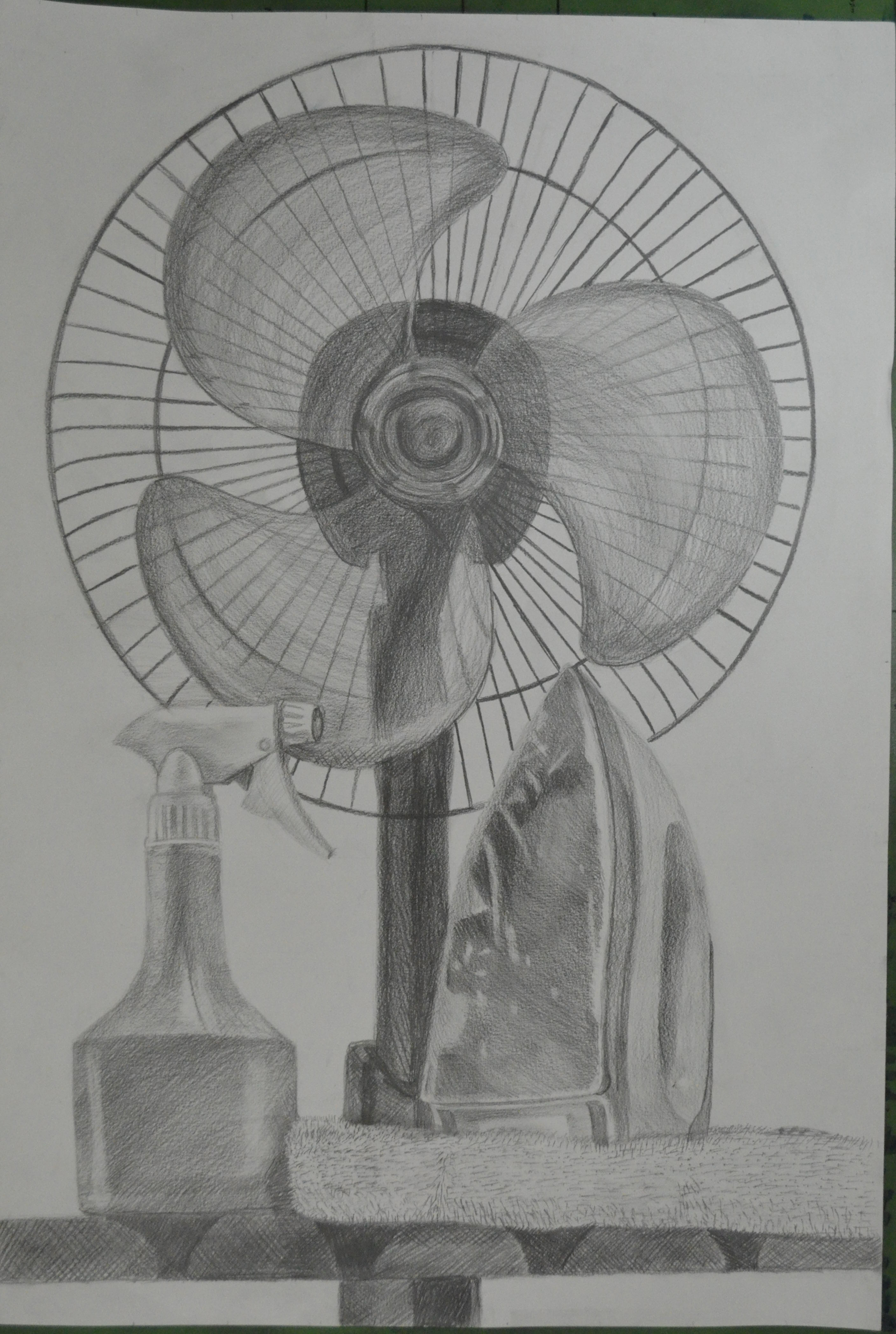
I wanted to show something about my life in Thailand and I felt that the new objects set out in the right composition would describe my life perfectly, a normal working-class life in a tropical country. With 13 years in the country and the last few years living alone I knew these objects intimately but the fan would prove to be something of a challenge..
Assignment 1 - Made Objects - composition studies
Assignment 1 – Made Objects – composition studies
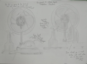
I began with composition studies in my A3 sketchbook, I found it difficult to come up with more than two variations as I was locked into how i felt the objects should be presented from the start. How every I did vary the composition slightly with the iron laying down in the first composition which I think was actually my first idea and then the iron stood up proudly in the second. The ironing board was lifted up on the table and I was almost laid down drawing the second composition sketch which I liked so much that I decided this would be the one to develop and decided that I would be there for a while so raised the ironing board higher with the ironing board on top of a table on top of another table. We had to do without a place to eat for the next few days.
Assignment 1 - Made Objects - Photo of Original Composition
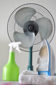
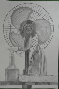
Assignment 1 – Made Objects – Photo of Original Composition
At this stage I did things a little bit in reverse with the composition studies just finished I decided to develop the composition in pencil to get a feel of how it would look in that medium before looking at others. One of the main reasons for doing so was being insecure about whether or not I would be able to demonstrate the techniques especially pencil holding techniques that I had practiced in the first part of this course. I then concentrated on enlarging the image by drawing a grid over the top of the composition ready for enlarging for the finished drawing.
Assignment 1 - Composition Development and Enlargement grid
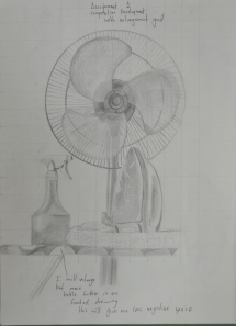
Assignment 1 – Composition Development and Enlargement grid
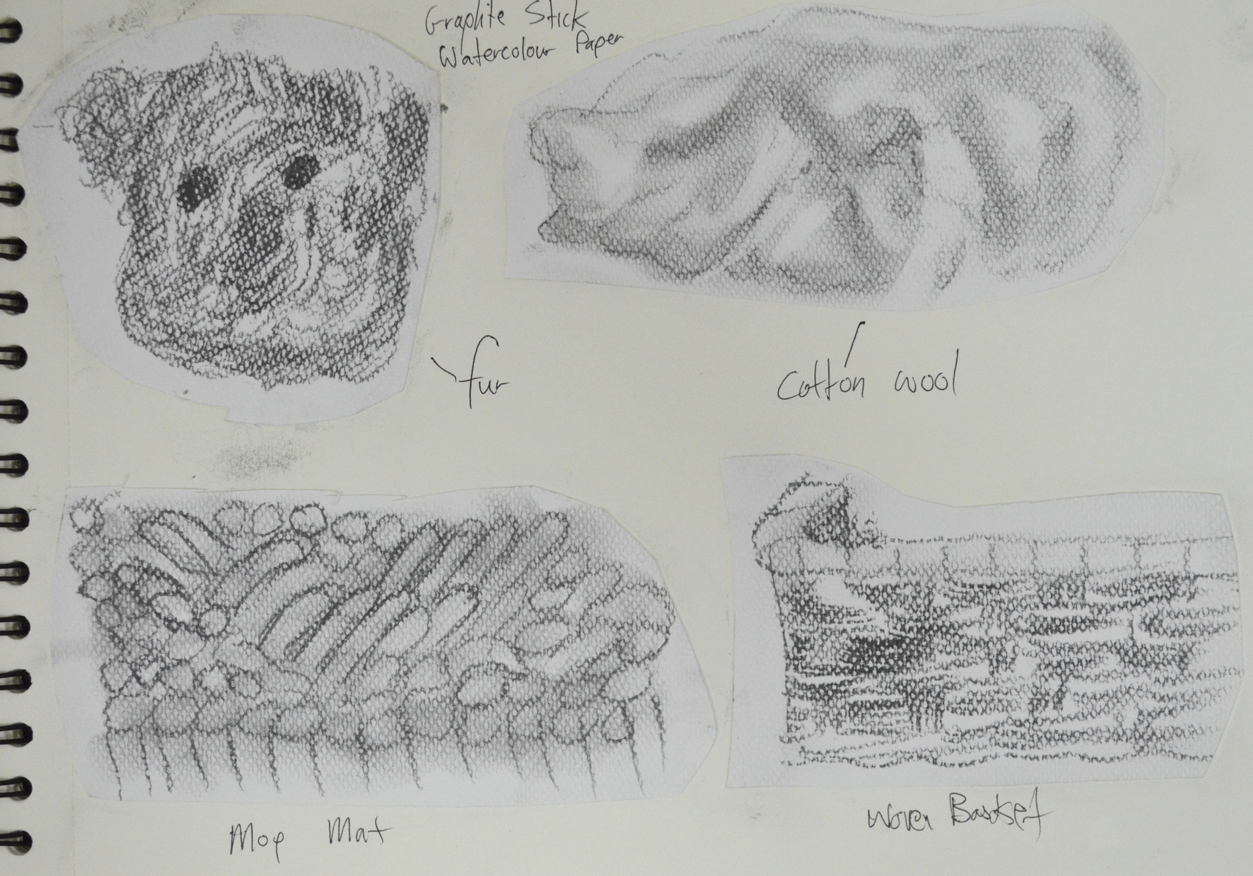
At this stage I was still not so sure about what medium I would use for the finished drawing, so as instructed on an A2 sheet I practiced with colour pencils and charcoal.
Assignment 1 - Charcoal and Colour Pencil Studies
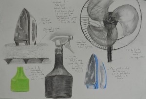
Assignment 1 – Charcoal and Colour Pencil Studies
Charcoal would have been great for the towel and even the water bottle and possibly the iron but on an A2 sheet which I was planning to use this medium proved itself too messy for the electric fan. I did love the way the water bottle looked in charcoal though, rather like stencil street art. Colour pencil wasn’t too bad but didn’t look solid enough for me, I was still trying to get practice with this medium and didn’t feel like I could carry it off in any other medium than graphite pencil and so that was my final decision.
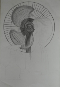
assignment 1 made objects
Fan Almost Complete
At this stage i decided the composition still needed more work and moved the squirty bottle further in to create less negative space to fill the rectangle shape of the paper. The layout of the fan was very technical it helped that there was no front on it but still took well over an hour and a compass and ruler for the cage. After everything was sketched out my insecurity about not being able to show the various techniques that I practiced in the first part of the course disappeared as I got into it, swapping between 3B and 4B pencils using different pencil holding techniques and several different forms of hatching.
The squirty bottle was pretty straight forward and quite easy to show tone and form on…eventually after I managed to get the shoulders of the bottle right after several goes, as I had moved the bottle in since the composition development work. This was completed mainly by hatching and cross hatching.
The iron allowed me to use several different drawing techniques including hatching, smudging and drawing the patterns on the blade with a putty rubber. However the shape of the iron varies slightly from the photo above I was having double vision when it came to the iron as my left eye is quite bad but refused to work from the photo.
The towel and the ironing board itself allowed me to draw with texture using short, lines dots and a putty rubber on the towel to dry and fluff it up and cross hatching for cloth ironing board cover.
I’m satisfied that I have managed to make reference to most of the aspects of drawing that have been covered in the first part of the course in this part of my assignment from holding pens and pencils to enlarging an image. Drawing the fan allowed me to demonstrate different pencil holding techniques, the bottle allowed me to demonstrate tone and form while the iron allowed me to show both tonal variation as well as reflected light on the blade. The towel was also a great idea which I originally added to raise the iron and didn’t realise it would help me to demonstrate techniques for drawing with texture.


Drawing 1, Part 1 Mark making and Tone, Scaling Tools for Enlarging an Image – Acetate Grids


For this project of ‘Enlarging an Image‘ I was instructed in the course materials that I needed two acetate grids, one with small squares across it and the other with large squares printed on it.


As instructed I went out and bought a roll of acetate and card and made myself two acetate grids, one small and one big and glued them to card so I could use them as view finders. I managed to slice my finger open with a Stanley knife while making the big one so you can see the dodgy line where the CD marker hit the big chunky bandage.
Acetate Grids for Enlarging an Image - My new scaling tools
Acetate Grids for Enlarging an Image – My new scaling tools
Unfortunately I didn’t get to use them as I didn’t really need to because I was also instructed to draw a grid with an HB pencil over the small image, where as I could have placed the small grid over the image in my A5 sketchbook instead; but I can see they will be getting plenty of use in the future. The size of the squares on the small grid are 2cm, the size of the squares on the large grid are 4cm, I think I also need to make those 2cm as well.

View My Drawing 1 learning log here www.mydrawingcourse.com

Drawing 1, Part 1 Mark Making and Tone, Using Texture – Check and Log


Have you discovered any new ways of using your drawing tools to depict surface and texture?


Not as much as I wished I had, there were a few things that I couldn’t find here in this part of Bangkok such as a chunky sponge, I would have loved to have tried dripping or splashing ink for the texture of this. However I did discover new ways of hatching for as in the the fur of the teddy bear, hatching with small strokes in flowing patterns. I also discovered new ways of using my putty rubber to show texture such as twisting for the mop rug underneath my composition.
a Drawing with Textures - Second Drawing
a Drawing with Textures – Second Drawing
How successful were you at implying form with little or no tonal hatching?
I seemed to use some kind of hatching for nearly everything except the mop rug. The technique that I used to depict the mop strings (as I would call them) showed real depth. This was a mixture of squiggles, circles smudging and twisting with a putty rubber and it worked well.
What are your impressions of frottage as a drawing technique?
I really love the idea of using this as a drawing technique and I love the way that a surface of one thing can give you a totally different result to what you thought it would and how something as simple as the joint of 4 breeze blocks can give you an idea for a drawing of a crucifixion or graveyard scene. The best thing about frottage is that you can use it for texture in drawing you are already working on or it can give you an idea for a new drawing.
Yellow crayon on breeze block wall

Drawing 1, Part 1 Mark making and Tone, Enlarging an Image - Enlarging a Simple Flat Image


This exercise was aimed to give me further practice in enlarging original drawing with a slightly more complicated structure. For this exercise I chose a fancy jar of face cream (borrowed from my girlfriend), a roll on deodorant and a plastic Nasol bottle.


Enlarging a simple flat image -
Enlarging a simple flat image – initial sketches
To get familiar with the objects I did a quick 3 minute drawing of each one before putting them together for the composition in my A5 sketchbook. This helped me to recognise problem areas on the objects such as the top of the Nasol bottle that would have looked a mess too wide or too narrow.
Enlarging a simple flat image - A5 sketchbook
Enlarging a simple flat image – A5 sketchbook
As in the previous exercise ‘ Enlarging an Existing Image’ I drew the composition of three objects in my A5 sketchbook and drew a grid of 2 cm squares over the top of the composition with an HB pencil. Just as in the previous exercise I labeled the squares by writing numbers across the top and letters down the right hand side to stop any confusion to which squares I would be drawing in.
From there I drew a grid of 3 cm squares in my A4 sketchbook, again moving the composition up the page by taking away the A row in the grid then reproduced the drawing on a larger scale.
Enlarging a simple flat image - englarged sketch
Enlarging a simple flat image – englarged sketch
Again, I really loved this exercise it was so simple and easy, I erased the odd line due to points of contact on the grid being slightly wrong, but the results of drawing these 3 objects were actually better than in the first object. I think this  was down to viewing all three at once rather than trying to look for faults on the angles and curves of one single object.
Enlarging a simple flat image - Side by Side
Enlarging a simple flat image – Side by Side

View My Drawing 1 learning log here www.mydrawingcourse.com

Drawing 1, Part 1, Mark making and Tone, Enlarging an Image - Enlarging an Existing Image


For this exercise I drew a thumbnail drawing of my favourite coffee cup roughly 10 cm square in my small A5 sketchbook, which I’ve barely put to use so was good to fill a page or 2. Once I had finished the thumbnail drawing I drew a grid of 2 cm squares with an HB pencil over my thumbnail sketch.


Enlarging an existing image 1
Enlarging an existing image – A5 sketchbook
In my A4 sketchbook I drew 3 cm squares, deciding they were a perfect size for this object on this size paper, with a larger more detailed composition I would have probably needed smaller squares in both sketchbooks.
Enlarging an existing image - A4 Sketchbook
Enlarging an existing image – A4 Sketchbook
To make it easier for myself to identify which squares I would be drawing in I labelled the squares with letters down the left hand side and numbers across the top. However the drawing was quite low in my A5 sketchbook so in my A4 sketchbook I started at B instead of A lifting the drawing up 1 square.
Enlarging an existing image using grids
Enlarging an existing image – side by side
I loved this ‘Enlarging an Existing Image’ exercise, it was like piecing together a jigsaw puzzle but a hell of a lot easier and as the squares weren’t that big quite easy to judge where  a line curves or which point of the grid they would meet. Admittedly I did do a little bit of rubbing out with an eraser but not that much.

View My Drawing 1 learning log here www.mydrawingcourse.com

Drawing 1, Part 1, Mark making and Tone, Using Texture - A Drawing with Textures


For this exercise I was determined to get outside and draw so I took a few objects with different surfaces  onto the balcony and tried them in different compositions. Originally I planned to use objects that I used in the ‘Experimenting with Texture‘ exercise and what I had in mind was a reel of red and white string, a Siamese football, a mesh dishcloth, mop mitten and a teddy bear so moved them around in different composition to see how they looked. After much thought I headed down to the shop to buy some money type bags and cotton wool and came up with the following composition.


A Drawing with Textures - Composition
A Drawing with Textures – Composition
Because of the texture of the mop mat I chose graphite stick on watercolour paper to complete this exercise and started out with some more experimenting to see how each object would look.
More experimenting with textures
I must have not been myself that day because I did a quick sketch of each objects texture with a soft graphite stick and thought everything looked great so grabbed my drawing board and went ahead with the drawing.
Drawing with Textures - first drawing
Drawing with Textures – first drawing
I wasn’t too worried about perspective as it was about depicting the texture rather than anything else. The drawing took me no time at all and when I had finished I packed up, confident that I had done great. I must have been in some kind of trance because when I woke up the next day I looked at again and realised not only did the drawing look awful but was too smudged and I had done a bad job in depicting any texture that was in the composition apart from the woven basket. So I made the decision to change the medium and the paper and  start again.
a Drawing with Textures - Second Drawing
a Drawing with Textures – Second Drawing
This time I did something I had never done before, instead of drawing everything first and then going over it again with texture and detail the only thing I drew in advance was the shape of the bears head and completed the rest of the picture stroke by stroke, The drawing took me quite a few hours and due to not drawing the outlines of the objects first the perspective was off but again I wasn’t too worried about the perspective.
Medium used: graphite pencil - b, hb, 2b, 4b, 7b and white hard pastel
Paper: A3 Canson drawing paper
Technique used:
  • Teddy Bear – Small flowing hatching
  • Bears clothes – cross hatching
  • Woven Basket – hatching, smudging
  • Mop Mat – loops, circles, smudging, putty rubber (twisting)
  • Cotton wool balls – hatching, smudging
  • Cotton wool in plastic bag – putty rubber (twisting and erasing lines) and hatching
I changed the length of the mat as it did get a bit tedious but I am happy I got to show the depth of the mat, my only regrets are 1, that I didn’t get to do the drawing in a different medium such as pen and 2, I didn’t leave the cotton wool in the plastic bag the colour of the paper instead of trying to use a white medium which got a bit messy as I tried a few on the actual drawing before using fixative and going over in white pastel which still looks cream.
to see mnore of my work visit markasmithoca.wordpress.com

Drawing 1, Part 1, Mark Making and Tone, Using Texture, Experimenting with Texture part B – Frottage


The technique of Frottage was invented by Max Ernst in 1925 and involves placing paper over a rough surface such as grained wood and rubbing with a crayon or pencil. In this exercise I experimented with the technique of Frottage (which I always thought was just called rubbing) to see what kind of patterns and textures rubbing over certain surfaces gave me.


Up until this exercise I had done all of the coursework in my apartment and most of it at night, due to early evenings and work finishing times, this was a great opportunity to get outside and do something in the daylight.
Armed with charcoal and pencils I headed out to the swimming pool to experiment on tree bark, stone-chip floors and wooden sun chairs only to find that the paper in my new sketchbook was too thick or too rough and it wasn’t giving me any patterns/texture whatsoever.
It was another day before I finally got going on this exercise or should I say the next evening (fated to working at night) I took some pages out of my small sketch book, a white paper with less tooth and started with charcoal.
Experimenting with Frottage - Charcoal
Experimenting with Frottage – Charcoal
I tried the technique on stone chip floor, my apartment door, floor and even the draining board and then again with different colour crayons before heading downstairs to the lobby,
Experimenting with Frottage - Crayon
Experimenting with Frottage – Crayon
Unfortunately the bark of the trees outside did not give me good results which was both surprising and disappointing and down to the bark being very smooth (difficult to find great trees in Thailand). I did get some nice rubbings off other surfaces though including the joint of a breeze block wall, which looking at it now resembles a crucifix in the sunshine but the best results using both charcoal and coloured crayon were got from the grain of the wooden door of my apartment with different panels giving me different patterns.
View My Drawing 1 learning log here www.mydrawingcourse.com

Drawing 1, Part 1, Mark making and Tone, Using Texture, Experimenting with Texture – Part A


In this exercise I gathered together a a range of objects with different surfaces, some I bought and some I already had. The objects that I used were a takraw (Siamese football), shaggy teddy bear, a towel, mop mitten and  Scotch-Brite brillow sponge as well as a woven basket, PVC chair, wire wool, toilet roll and leather Lay-Z-Boy (not the whole thing) plus a couple of other different surfaces.


Experimenting with Texture 1
In my sketchbook I made a series of approximately 5 cm squares and used both pens and pencils to depict the textures in the squares. To depict the surfaces I used several different techniques such as hatching (takraw ball), irregular hatching squiggles and stippling (Scotch-Brite sponge) and very short hatching (towel) as well as some very irregular marks for my leather look PVC chair and the creases in the arms of my Lay-Z-Boy armchair. I also tried stippling with felt tips for a toilet roll tube but I could not get it to look anything like.
Experimenting with Texture 2
One surface that created something of a challenge was the shaggy teddy bear fur and so I chose this as well as the woven basket for the exercise ‘A Drawing with Textures’.

View My Drawing 1 learning log here www.mydrawingcourse.com

Drawing 1, Gallery Visits, First Visit to the National Art Gallery – Marco Evaristti


I don’t get many days off in fact the only day I do get off is the only day I get to see my kids, Saturday but luckily for me my kids love drawing and looking at art so we went for a day out to the Thai National Art Gallery near the Khaosan Road area of Bangkok.


A Visit to the Gallery
It was my first visit to the National Art gallery, I didn’t even know where it was which was a bit embarrassing as I used to cycle past it everyday to the last school I used to work at. With it being my first visit to the National Art gallery I didn’t know what to expect, I actually thought it would be a bit disorganized.
A Painting by King Bhumipol, a self portait maybe?
The price for the ticket for the gallery was 250 baht for foreigners but only 30 baht if you speak Thai, the kids were free so it only cost us 30 baht to enter. On entering my first impression was that it was all a bit too royalist and I with photos of the Royal family from different generations, traditional Thai drawings, which I am quite fond of and even an abstract painting by the king (which I think is a self portrait).
DSC_0294
Muslim Girl unknown
As I made my way round into the temporary gallery section I decided that my money was well spent and was amazed at some of the work on display, so much so that I forgot to get the name of the artist who created this piece which I believe is of a Muslim girl, knowing what is going on in the south of Thailand.
Close up of Muslim Girl by Thai Artist
At a first glance of the painting it looked to be made up of Thai alphabetical characters but I think most probably just squiggles influenced by both Thai and Islamic characters.
It wasn’t long before I came across the next exhibition, Crossing over by Chile born artist Marco Evaristti. Crossing over displays several drawings and paintings of dismembered suicide bombers and victims, although they were very beautifully drawn my kids were terrified so I only managed to stick around long enough to get some photos and managed to get the details on line from the Bangkok post.
It was a shame that I had to rush through crossing over I did go down for a second visit a few weeks later but the artists in the temporary gallery had changed.
Marco Evaristti Crossing Over suicide bombers
Crossing Over by Marco Evaristti remainders of suicide bombers
drawing of suicide bomber and victims
Crossing Over by Marco Evaristti
Crossing Over by Marco Evaristti – skulls
Crossing Over by Marco Evaristti
Terrorialista Dismembered Terrorist
cityscape 2013
Cityscape 2013 part of the Crossing Over exhibition
View My Drawing 1 learning log here www.mydrawingcourse.com

Drawing 1, Part 1, Mark Making and Tone, Still Life - Observing Negative Space and Perspective

This exercise of observing negative space and perspective involved following the silhouette of a group of objects that shared similar elements with a soft drawing tool such as soft pencil without taking it off the paper.
I drew in from the left using the furthest edge of the table as a starting point and followed the upper silhouette of the objects carefully assessing the silhouette and proportions of each object and changing the direction of the line as the silhouette of one object impacted off another.
Then I went back to my original starting point and followed the line until it reached the first object again then followed the bottom silhouette of the objects following the same steps as the top half. When the bottom half of the silhouette was complete I went back and drew in the details of the objects themselves.
Observing Negative Space and Perspective  1
Observing Negative Space and Perspective 1st Attempt
I used a 6B pencil for this exercise as I am still waiting for Derwent to send me replacements for my 7, 8 and 9B. I found the exercise quite difficult and frankly one that I should keep having ago at from time to time.
Observing Negative Space and Perspective 2
Observing Negative Space and Perspective 2nd Attempt
I made a few attempts without taking my pencil off the paper and I was actually very surprised when I drew the bottom silhouette and the objects looked something similar to what they did in my composition. There were a few errors in each of my attempts, vase to wide (starting to draw it too early and the bowl to narrow and the jar on the right hand side was quite wonky in each of my attempts, but the negative space between each object was the correct shape just not always the right size.
observing-negative-space 3
Observing Negative Space and Perspective Attempt 3 and 4
Like I said earlier it is an exercise that I think I will gain a lot from and should practice from time to time, I also like the way that I arranged the objects and would like to do a similar still life using a similar composition, this exercise maybe a great starting point for that still life.

View My Drawing 1 learning log here www.mydrawingcourse.com