Tuesday, 7 October 2014

Drawing 1, Part 2 Observations in nature, Detailed Observation, Research Point B - 2 Contrasting Artists, Gustave Courbet

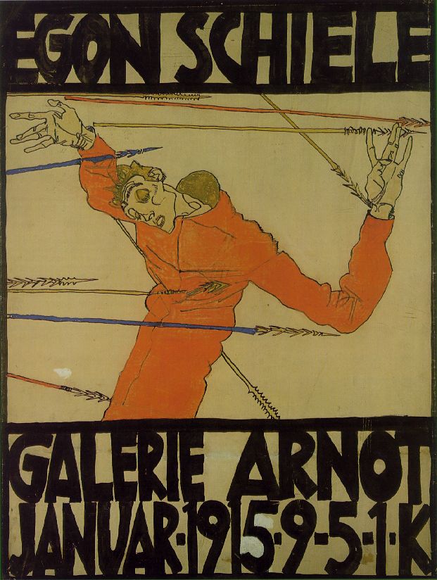
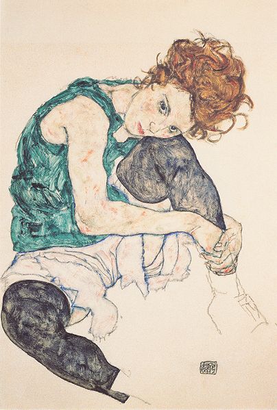
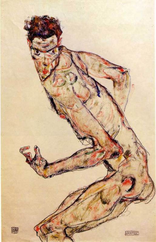
For this research point I was to find two artists who work in contrasting ways: from tight, rigorous work to a more sketchy style. For the artist who worked in a sketchy style I had already researched Egon Scheile in Part A so now it was time to find an artist who did more tight, rigorous work.
I was all ready to research a modern artist for this part of this research point and discovered Grant Wood while looking at Egon Schiele’s work, but then on a last minute search I found another artist that was just as new to me.
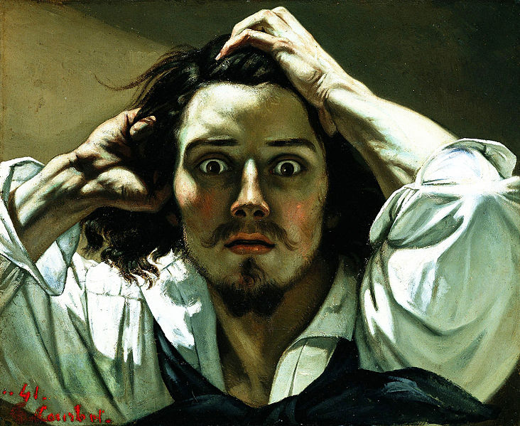
While searching for images  I came across a picture that I had seen many times and for some obvious reason I thought was a picture of Johnny Depp in one of his movie rolls. I was surprised to find out that it was a self-portrait called ‘A Desperate Man’ by an artist called Gustave Courbet, the father of realism and even more interesting the artist that first coined the phrase.
Born in Ornans, France to a wealthy family, Gustave Courbet went to Paris in 1841 with the intention of studying law but soon decided that he would study painting and did so by copying the paintings of the French, Flemish and Spanish masters in the Louvre.
His style was shaped near the start of his career when he chose direct his paintings to observed reality, among his early paintings were self portraits portraying himself in various roles he also painted seascapes, still-lifes and figurative compositions.
Courbet's figurative work was somewhat controversial because he addressed social issues in his paintings portraying subjects that were considered vulgar at the time such as rural hierarchy, peasants and the poor working conditions of the underprivileged.
Courbet's style became known as realism however instead of using perfect line and form in his paintings he dealt with realism with spontaneous brush strokes and a rough handling of paint achieving a sense of direct observation by the artist while depicting the inconsistency in nature.
Although Gustave Courbet and Egon Schiele are artists of two different movements living at two different times their lives are very similar in that they seem to demonstrate freedom of expression in their art by painting subjects that were pornographic or controversial at that time. The poses by Courbet's nudes such as La Femme Aux Bas Blancs, (Woman with White Stockings), 1861 and The Origin of the World (L'Origine du monde) (1866) remind me very much of Schiele's paintings; as though Schiele could have been influenced by the artist. Both artist's also served time in prison.
I'm not particularly turned on by the works of the old masters and so there are a lot of Gustave's paintings that I don't find appealing, but there are two or three that I think are brilliant simply because I can imagine how sensational they were at that time being so 'real' when photography was still in it's infancy.
http://en.wikipedia.org/wiki/File:Origin-of-the-World.jpg - The Origin of the World (L'Origine du monde) (1866)
Gustave Courbet auto retrato
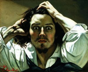
Self-portrait (The Desperate Man), c. 1843–1845 (Private collection)
Gustave Courbet Autoportrait
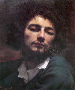
The man with a pipe Self-portrait, 1848-49
Bibliography:

Drawing 1, Part 2 Observations in Nature, Detailed Obsevations, Research Point 2 Contrasting Artists A - Egon Schiele

For this research point I was to find drawings by two artists who work in contrasting ways: from tight, rigorous work to a more sketchy style.
I decided to research the artist who works in a sketchy style first.  While I have tried to find new artist so far in this module for this part of this research point I decided to research an artist I was already familiar with as when I saw the words 'sketchy style' he was the first artist that popped into my head and rightly so.
Austrian Expressionist painter Egon Schiele  was born in Tulin in 1890. His father Adolph Schiele was the station master at Tulin Railway station and as a child Egon was fascinated by trains and would spend many hours drawing them. It is said that his passion for drawing started at the early age of 1 and a half years old and this led his father to believe is son would become an engineer and so at eleven years old was sent off to attend a Realgymnasium 25 miles away from his home town. Due to lack of friends and lack of interest in his studies he was a poor student and was kept back two years. When his father died of syphilis in 1905 family problems made his situation worse and eventually was politely asked to leave school by his teachers
In 1906 he asked his mother and uncle to allow him to apply at the Vienna Academy of Fine Arts and in the summer of that year, passed the tough entrance exam to became the youngest student ever to attend his class. Although he was passionate about art he showed a resistance to the strict regimen at the academy. As a brilliant draughtsman he would get through projects in minutes that would take other students in his class hours to complete but his early works were heavy handed and his soulless depictions of professional models did not amuse his tutors who simply gave him grades of ‘satisfactory.’
Schiele’s early work showed traits of Gustav Klimt and then in 1908 after a visit to a the large art show known as the ‘Kunstschau’ where a room full of the artists’ paintings were on show the influence of Klimt emerged full blown in Schiele’s paintings. He saw himself as the new Klimt and paraded round Vienna calling himself the ‘Silver’ Klimt and against the Academy’s authority accepted invitations to exhibit at the ‘Kunstschau’. In 1909 Schiele and a few of his like-minded class mates handed over a formal letter of protest to the academy expressing their disapproval at the academy’s rigid rules and withdrew themselves from the school.
By 1910 Egon Schiele’s unique expressionist style had gotten him many admirers including Gustav Klimt himself who bought several of his paintings and also offered to exchange some for his own. Klimt also introduced him to patrons and collectors and he thought that leaving the academy had turned out to be a wise career move but that wasn’t to be the case. Klimt was very vain and expected his works to be snapped up by the patrons who he had hoped would show him devotion but the truth was they didn't find him the least bit cooperative and found his commissioned works, far too sexually explicit. Feeling let down he left Vienna for the countryside.
Egon Schiele led a short life dying at the early age of 28 of the Spanish flue in the epidemic that swept Europe in 1918 but his short life was somewhat controversial. At 21 years old he was imprisoned for seducing an underage girl and during his arrest the officials destroyed many of his drawings that were regarded at the time as pornographic due to the nature of his subjects. He spent a total of only 24 days in custody but during that time he a created a 'series of 12 paintings depicting the difficulties and discomfort of being locked in a jail cell' - Wikipedia.
His work was shaped by World War I during which he was drafted up and stationed in a Russian prisoner of war camp; however he still continued to paint and was even given a disused store room to be used as a studio where he painted captured Russian officers.
His style changed over the years  he was influenced by Klimt and Oskar Kokoschka and his early works from 1907 to 1909 resembled those of Klimt but in 1010 began experimenting with nudes and began developing his own unique style that we know today, pasty soulless doll like figures with strong overtones. Many view his works as pornographic, twisted or erotic depicting death, sex and discovery and yet I see his works as simply brilliant and way ahead of their time; paintings that have influenced so many artists since.
I first came across Schiele's work in the music room at my secondary school, a poster of his 'Self Portrait of Saint Sebastian' but it wouldn't be til many years later that i would find out the name of the artist or what the painting was called.
Egon Schiele - Self Portrait as Saint Sebastian
My favourite paintings by Schiele have got to be the Fighter 1913 and Seated Woman with Bent Knee 1917, although I have to admit I do love a nude or two of his which are simple, crude but very erotic.
Egon Schiele - Seated Woman with Bent Kneee 1917
Egon Schiele - Fighter, 1913
I love the way he has clearly thought hard about the subjects (maybe a bit too hard from what we know of Schiele) and yet his paintings are no more than coloured sketches on a plain background, allowing him to show movement and even though some regard his subjects as being 'soulless' I don't think they can be accused of being lifeless. I can see how it is easy to be influenced by an artist such as Schiele and I know that his paintings will come to mind in the 'Drawing Figures' part of this course.
Bibliography:

Friday, 4 July 2014

Drawing 1, Part 2 Observations in in Nature, Detailed Observation - Getting Tone and Depth in Detail

In this exercise I was to practise building up dark medium and light tones principally using pencils and hatching and cross-hatching techniques. I was to select a single object such as a shell or piece of driftwood and get a varied effect by combining soft and medium grade pencils as well as altering the direction of the strokes I make. The brief also informed me that this exercise would be time consuming and indeed it was. I used a smooth sheet of A3 Canson paper and 2B, 3B, 4B, 5B pencils to complete this exercise as well as a putty rubber for the highlights which I used quite often to lighten strokes that were too dark as I made my way through my chosen subject. Living in Bangkok has it's downfalls especially when taking a drawing course but I'm very lucky to have a small park with some very exotic trees in front of the primary school that I teach at. I found a small branch that had fallen or been broken off one of the trees a few weeks ago that reminded me of the hammers in Pink Floyd the Wall with patches of bark still on it and some really nice contours,  so I decided to use it for this exercise.
My subject for this drawing exercise, a tree branch
I started on the end that I knew would be the most difficult to try and reproduce with pencils, the tree bark, going over it first hatching with a 2B pencil then, 3B, 4B and 5B to get the darker tones. I know the brief said use hatching and cross-hatching on this exercise but I threw everything I had at it, including stippling, squirkling and dashes and I think I depicted the surface of the bark quite well. Unfortunately my photographic skills aren't that great and the photo of the finished drawing is not as great as the drawing itself.
Getting Tine and Depth in Detail 1
The area that I thought would be the most difficult was actually the easiest, to depict tone on the areas of stripped branch with soft bare wood was the most difficult, but one thing it did teach me was to be more fluid with my drawing and for the first time ever I loosened up.
Getting Tine and Depth in Detail 2
I know there are flaws in the finished drawing, the shape is wrong in certain places and the shadow isn't brilliant but there are parts of this drawing that I am really proud of namely the  bark area which reminds me of a 'bio' tattoo for some reason. In fact I think the finished piece reminds me of an anatomy drawing and while I was working on it I kept thinking of the Marco Evaristti drawings of parts of suicide victims that I saw during my first visit to the national gallery. Overall I think I did quite well in this exercise, my tutor told me I should be more fluid and I think I managed it while working on this exercise. However, one thing I do have a problem with is drawing the very dark tones on a textured surface such as this which is something I will have to work on.

Wednesday, 14 May 2014

Drawing 1, Part 2 Observations in Nature, Detailed Observation, Line Drawing Detail

For this exercise I was to select an object with interesting detail such as a sliced through red cabbage or a fir cone. Then on a sheet of A4 paper create a line drawing of the object that I set up, taking time and effort to really look at the patterning, thickness of line, texture and shape of the overall composition. The brief also said that I was to position the drawing well on the paper and fill the paper effectively with a continuous line drawing and no shading which is what I TRIED to do...
I made a few attempts at this with two different subjects, both of which were green peppers but in the Bangkok heat they go off pretty quick. With the first pepper every attempt was a continuous drawing with minimum detail, I used the thick nib of a double tipped felt pen and although the subject fit well on the paper, I didn't give it a strong enough light source to pick up all the detail and too be honest the finished drawings at that line thickness all looked somewhat pathetic.
Exercise - Line Drawing Detail First Subject
I gave it a week with another exercise in between before I had another go at this exercise. Visually the drawings with the second subject look a lot better, I used the finer nib of the felt pen and this time after I completed what I could do continuously without taking my pen off the paper I decided to add the detail which were the ribs on the inside of the pepper that I could see from wisely using a light source this time.
Exercise - Line Drawing Detail Second Subject 1
Exercise - Line Drawing Detail Second Subject - Image A
I probably did go a bit overboard and it does look like I have had a go at shading the object but this is all down to the closeness off the lines on the inside of the pepper. However I am quite happy with the results.
Exercise - Line Drawing Detail Second Subject 2
Exercise - Line Drawing Detail Second Subject - Image B
The thing that I am not happy with however is the positioning on the paper and how much space I left to the sides and underneath it. When drawing an object such as a pepper with a very irregular shape I think it's best if you know where to start, in Image A above I started at the core just above the seeds. With Image B I started at the tip of the stem Starting near the center of the image was better with this object but that would differ with something like a cabbage.

View my full Drawing 1 Learning log

Drawing 1, Part 2 Observations in Nature, Research Point, Masters of Detailed Drawing, 19th Century Thomas Hartley Cromek

For this research point I was asked to find two artists who exemplify mastery of detailed drawing.
I used to have a reproduction painting site and am familiar with the works and lives of quite a few but since starting this course I've been introduced to new artists and new techniques so I thought I'd carry that on by typing in a few keywords on Google to see where they took me.
The first artist I found was a 19th century artist called Thomas Hartley Cromek and after seeing that his place of death was Wakefield, my home town, I made the decision to research this artist a little more.
Born in London in 1809 Thomas Hartley Cromek was the son of Robert Hartley Cromek the  engraver and art dealer who allegedly cheated William Blake out of potential profits. In his childhood he moved from school to school starting off his education at Enoch Harrison's school in Wakefield and then onto the Moravian School in Fulneck. He then moved back to Wakefield to study at the grammar school there before returning to Harrison's.
Thomas Hartley Cromek received his first art lessons from a Wakefield based portrait painter, James Hunter but then in 1826 he moved to Leeds study landscape painting under Joseph Rhodes, while studying in Leeds Thomas also taught himself anatomical drawing.
He travelled to Italy in 1830 to study the old masters and spent most of the next 20 years within the country mainly in Florence eventually reaching Rome where he attracted much attention for his 'excellence in drawing and his careful colouring' - Wikipedia. While in Rome he gave drawing lessons to several distinguished visitors including the British artist and poet, Edward Lear.
Between 1831 and 1849 Thomas Cromek spent most of his time drawing the major buildings in Rome as well as Greece but then was forced to leave Rome with the outbreak of the first Italian War of Independence.
There's not much information about Thomas Hartley Cromek online about techniques, ideas, influences etc but I did find quite a few images.
Study of Plants, Ariccia Watercolour, over traces of a pencil underdrawing.
Study of Plants, Ariccia
Watercolour, over traces of a pencil underdrawing.
I found many of his works online but it was the drawing above that caught my eye and I thought it was quite relevant to this module. The drawing itself is only 7 1/4 x 8 1/8 in in size and yet his brilliant use of shadow amplifies the detail of the drawing. I enlarged this image on my computer to the size he would have worked at and was amazed how much detail he has got into such a small drawing with what I still regard to be a messy medium, for me that is anyway. He has managed to depict some very thin leaves and blades of grass and makes this picture seem a lot bigger than what it is.
THE TEMPLE OF ANTONINUS AND FAUSTINA, FORUM, ROME - WATERCOLOUR 18 1/4 X 13 INCHES
 Just like his drawing of plants and flowers his watercolour paintings of buildings such as the Temple of Antoninus above shows brilliant detail and colour as well as amazing shadows which really amplify the bulkiness of the stone structure.
Bibliography

Drawing 1, Part 2 Observations in Nature - Research Point: Masters of Detailed Drawing - Modern Artist, Eliot Hodgkin

For this research point I was asked to find two artists who exemplify mastery of detailed drawing 1 from the 19th century or earlier and a modern artist. I already researched the 19th century artist Thomas Hartley Cromek in 'Masters of Detailed Drawing 1, 19th Century, Thomas Hartley Cromek' and it was now time to find a Modern artist. Again I wanted to find an artist that I wasn't familiar with so I started my search on Google looking for British artists of the 20th century. A list of names of British artists came up on Wkipedia so I went down the names looking at their work 1 artist at a time.
I came across the name Eliot Hodgkin, a name that I was very familiar with but I'm not sure from where so I took a look at his work to see if I recognised any of his paintings. I had never seen any of his paintings before but what I did see was truly inspiring and perfect for this part of the course. With the image below Large Leaf 2 particularly catching my eye as near my school there are some very similar large leafs that I would love to draw for this part of the course.
Eliot Hodgkin Large Leaf 2 Tempera on Card
Curwen Eliot Hodgkin was an English painter born into a Quaker family in Purley-on-Thames on 19 June 1905 and was the cousin of abstract painter Howard Hodgkin. Eliot Hodgkin was educated at Harrow School but his artistic life began at the Byam Shaw School of Art and then at the Royal Academy Schools where he studied under Francis Ernest Jackson.
Eliot Hodgkin Seven Brussel Sprouts
Hodgkin had already established himself as a still life and landscape painter by the mid-1930s and regularly exhibited at the Royal Academy. In 1937 Hodgkin started working in egg tempera a recipe that was given to him by his close friend and former teacher Maxwell Armfield.
Hodgkin stated that he wasn't attracted to tempera as a medium as it was used by Italian primitives and their work did not do anything for him, he simply used tempera as it was the only medium that allowed him to express the unique character of the objects that fascinated him.
Hodgkin said that his conscious purpose was to 'show the beauty in natural objects'- that people would usually think unattractive such as 'Brussels sprouts, turnips, onions, pebbles and flints, bulbs, dead leaves, bleached vertebrae, an old boot cast up by the tide.'
When i did a search for his paintings and saw his work the first thing that went through my mind was how beautiful his paintings were and yet his compositions are so very simple. I have heard of tempera before but as far as I know I have never seen anything painted in it until now and I knew at firs glance that they were painted in a medium other than oil or acrylic.
He depicts the texture of his objects wonderfully and his paintings are so crisp and life-like but still he manages to express them in a way that makes u aware of the beauty of these objects for the first time with wonderful contours and a brilliant balance of light and dark tone, whether it be a dead leaf or a toilet roll.
Toilet Rolls Eliot Hodgin
Like Eliot Hodkin Says ' People sometimes tell me that they had never really ‘seen’ something before I painted it, and I should like to believe this… For myself, if I must put it into words, I try to look at quite simple things as though I were seeing them for the first time and as though no one had ever painted them before.'
For me I agree with others that to see these objects in his paintings is to 'see' them for the first time with detail and beauty that you would never notice before. Hodgkin really makes you notice every part of the object, every leaf, every crease and every pattern on the objects surface.
Bibliography - Wikipedia

Drawing 1, Part 2 Observations in Nature, Exploring Coloured Media - Check and Log

Which of the media you have experimented with did you find the most expressive?
From experimenting with the different colour media in this exercise I would probably say at this stage that the oil pastel is the most expressive. Oil pastels seem to allow more sketchy fluid strokes and seems to work well with all the techniques that I have practised so far.
Which medium do you think lends itself to more detailed work?
From what I have seen so far I would say coloured pencils as well as ball point pen but then again I do not think I have worked with nib pens and ink enough at this stage to dismiss these as a medium for more detailed drawings