The brief for this was to make a drawing in a similar style to Patrick Caulfield White Ware screen prints, it wasn't that easy. I decided that I wasn't going to keep looking at his images so after I finished my part 1 of this research point, researching him, I thought I could remember enough about his prints and paintings to work in a similar style.
I decided to work on an A2 sheet from my larger sketchbook which is too big to work with felt tips and I wanted to show as little pen or brush strokes as possible so I went out and bought some Kurecolor graphic design markers, which were very expensive but well worth the money.
I used the vase that I used in an an earlier exercise 'Study of Light Reflected from one Object to Another' and placed it in the chair that I would usually sit in to do my work. I wanted to shine a more acute light on my subject so instead of using the bendy light that I used before I used a torch that I got free from the local western supermarket. I knew that the batteries in the torch wouldn't last that long so I turned all the lights off found the right angle for the torch to shine at and took a photo, then I worked completely from the photo.
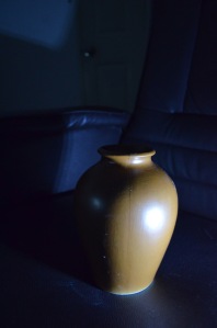
- Photo with Torch, vase and Chair

I started by drawing the shadow on the vase, then instead of using white I used colour for the other half, I purchased the markers day before but I swapped vases so the colour did not match but I wasn't worried about that, I just wanted to know if I could draw something in the similar style as Patrick Caulfield, I highlighted the light reflected from the vase vase by leaving those areas blank.
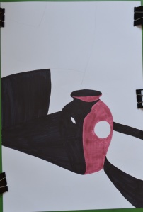
- Drawing after first Two Colours

I used grey for the light that spread from the torch beam as I had I didn't want the drawing to be completely dark and I had seen Patrick Caulfield also use grey in his paintings, this paid off.
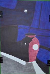
- Finished drawing
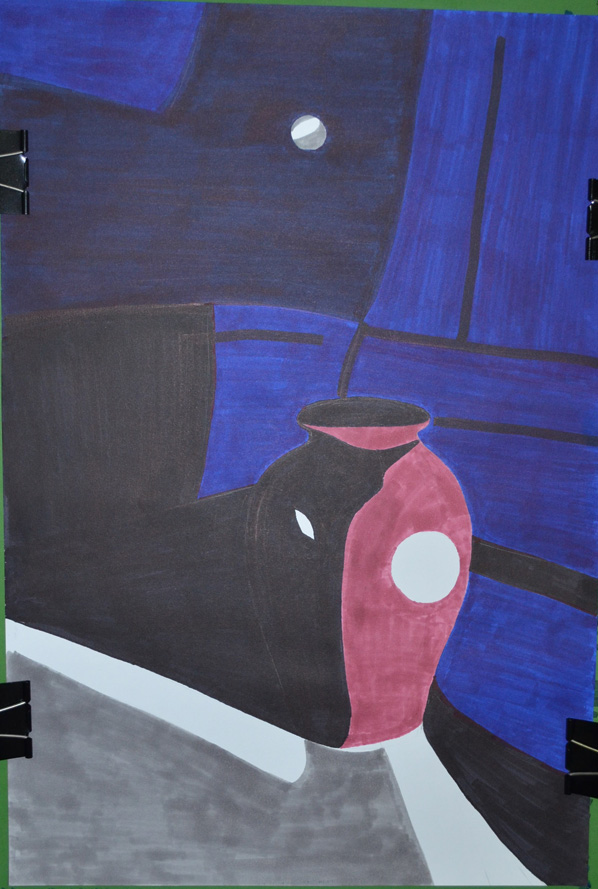
I cut down on the detail in my drawing and over exaggerated the detail that was left, after adding colour to the vase shadows and foreground I stopped looking at the photo and worked completely from memory hence the various differences like the position of the door handle and seams in the chair positioning where I thought they would look best rather than where they should be.
I was really happy with the finished drawing and even though it doesn't resemble any 1 particular Caulfield style of painting you can tell he is the inspiration behind it.
View my learning full drawing 1 learning log at: http://www.mydrawingcourse.com/
View my learning full drawing 1 learning log at: http://www.mydrawingcourse.com/
No comments:
Post a Comment