Showing posts with label Art Degree. Show all posts

Sunday, 16 February 2014

Drawing 1, Part 1 Mark Making and Tone, Assignment 1 – Check and Log


Did you do enough preliminary work before starting on your final pieces?


Yes definitely, the preliminary work not only helped me decide on the best composition for the final piece but helped me to decide which mediums I should use. In both parts of this assignment it changed my mind about what mediums I would use and also the layout of the composition for the final piece. I probably could have done more with regards to colour blending and make more notes on which colours to use for the Natural Objects.
Do your large drawings give an accurate interpretation of the still life groups? If not, what went wrong?
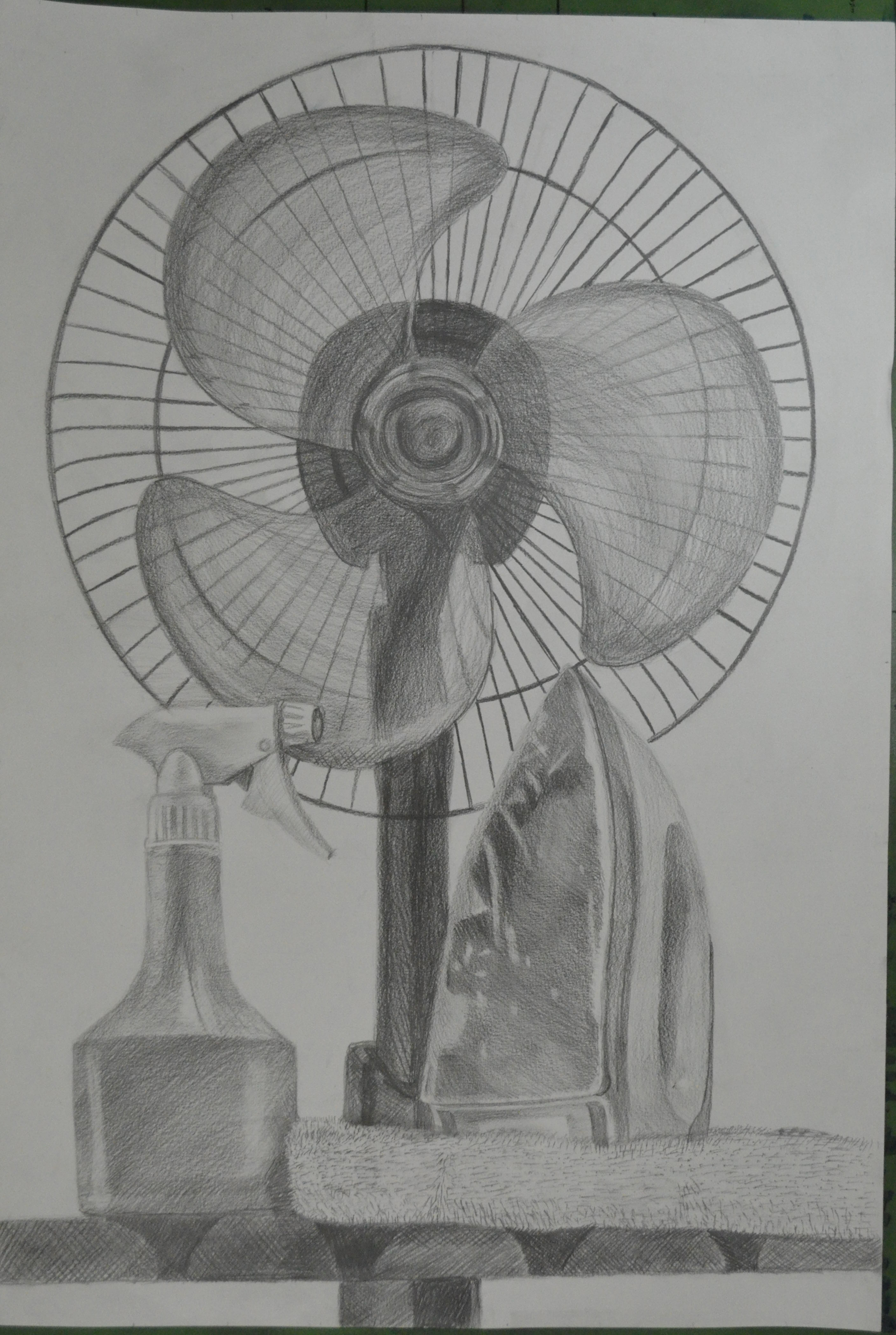
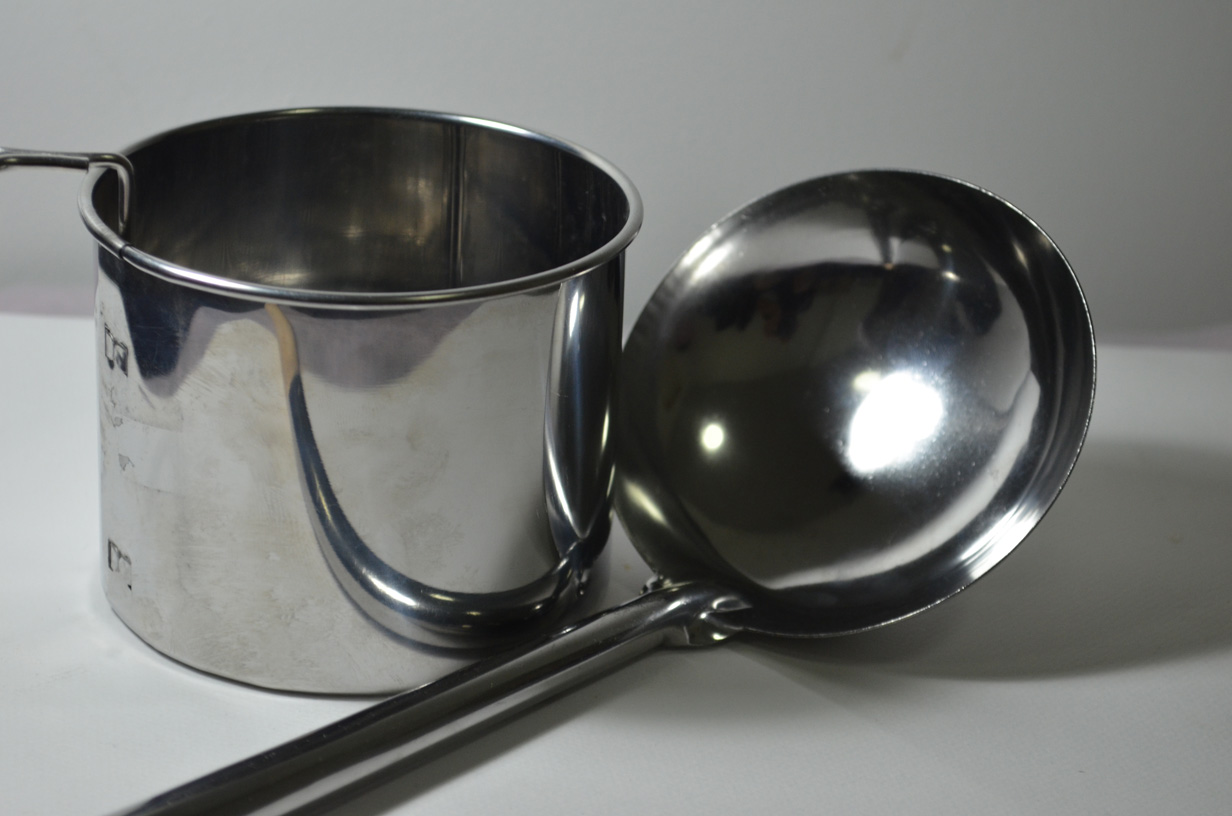
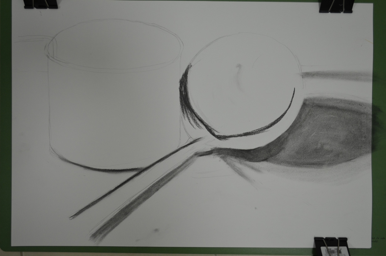
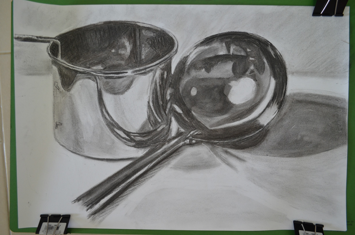
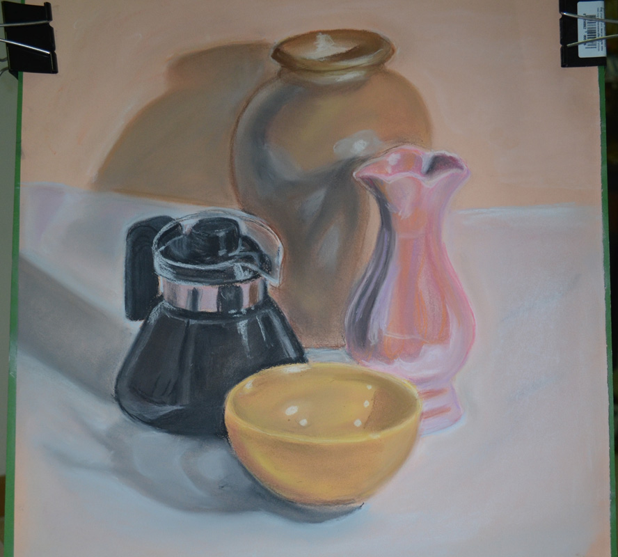
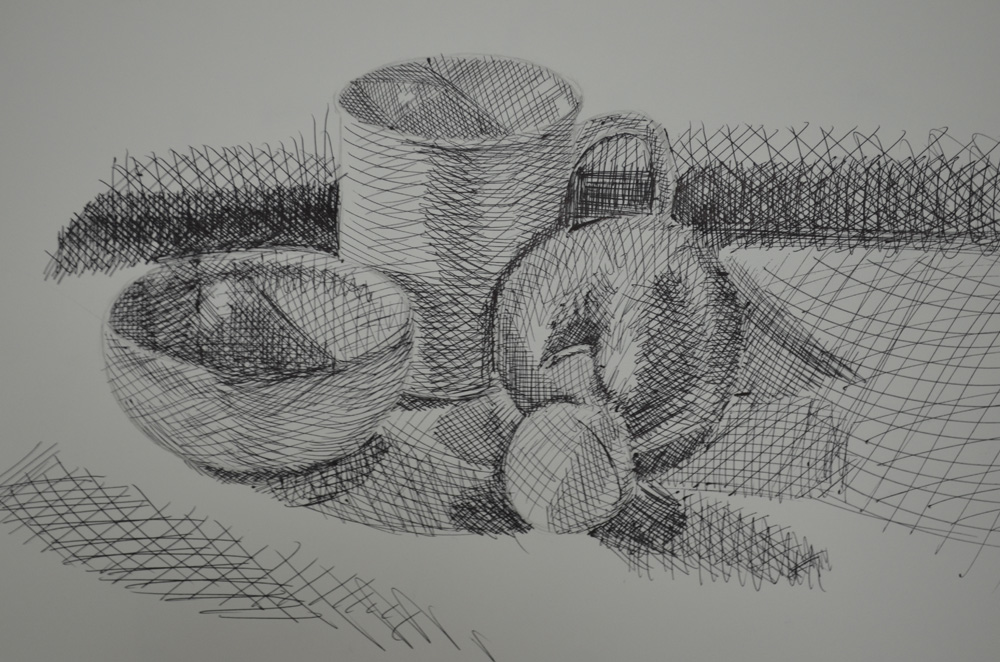
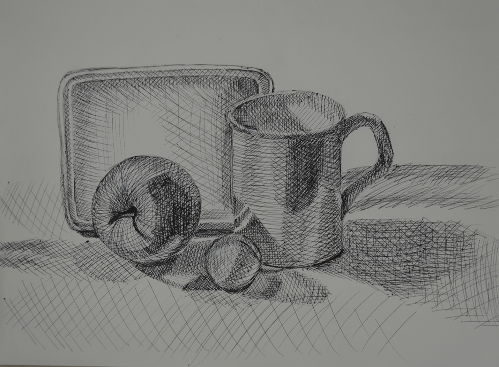
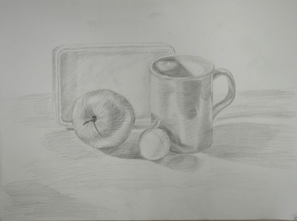
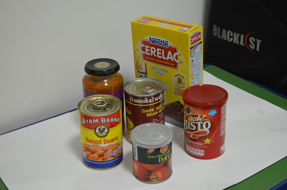
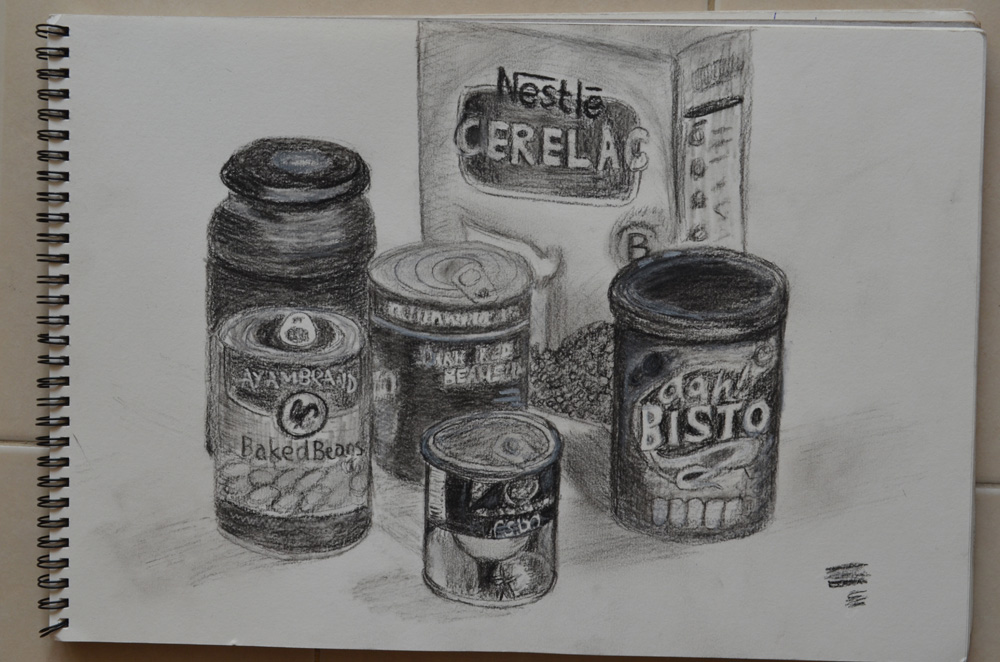
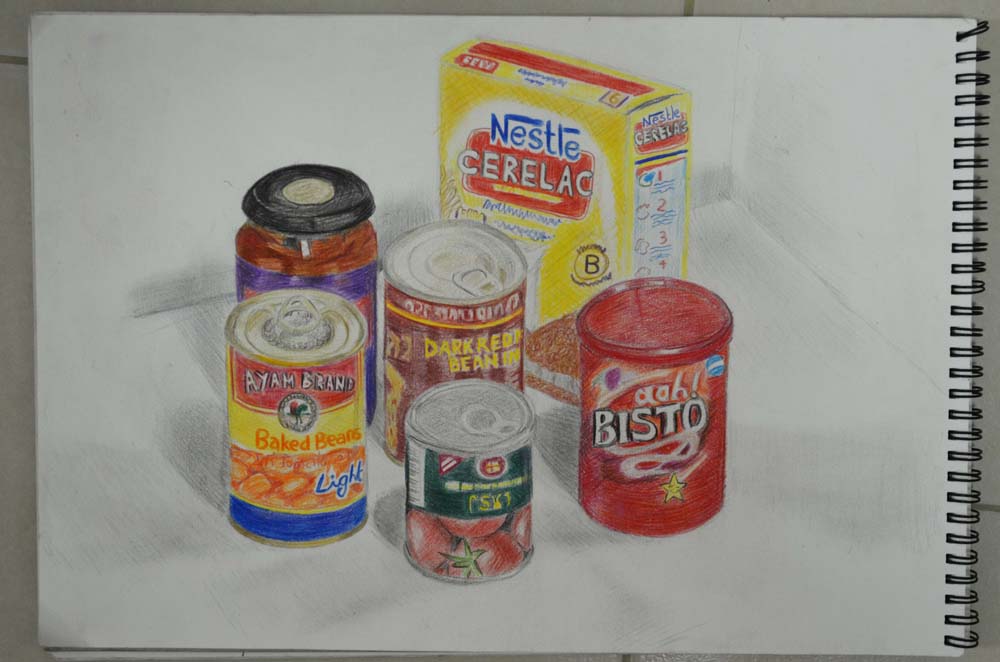
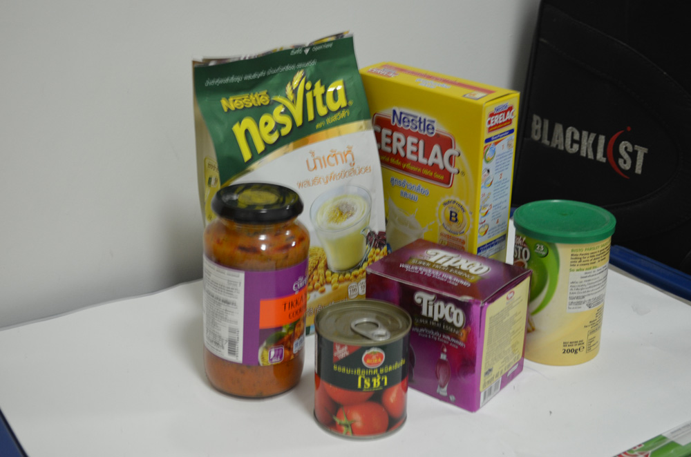
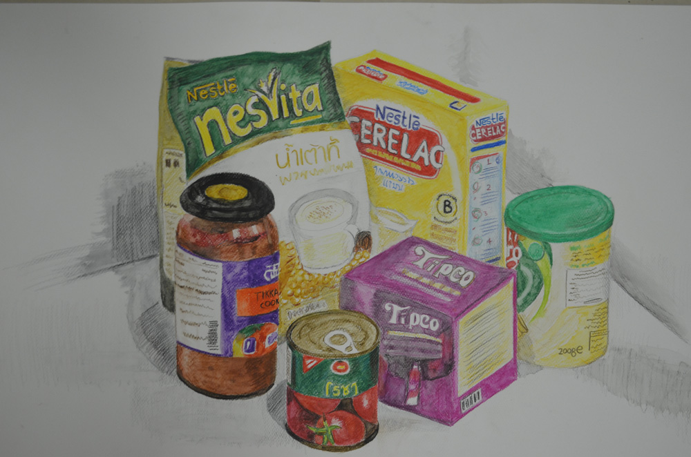
The large drawing for Made Objects I believe was a very accurate interpretation of the still life group even after playing down certain details such as the amount of bars on the electric fan cage. However I I’m not too happy with the interpretation of the still life group in the large drawing for the Natural forms. There are certain shapes on the edge of the drawing that I know are not the same as the actual objects this was due to moving the objects about trying to find the composition that I chose to develop, then having to work from the drawings I had already done and photos that I had taken.
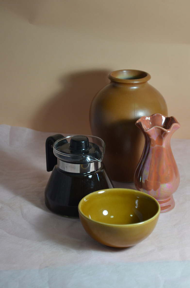
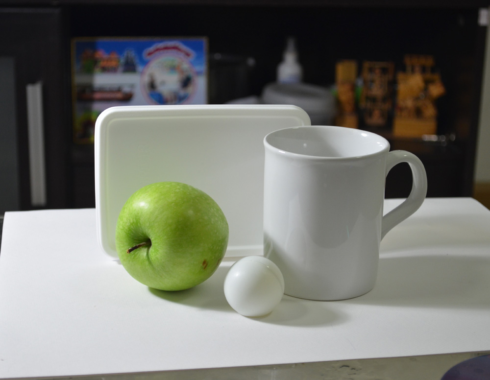
Did you make a good selection of objects or did you try to include too much?
I believe I made a good selection of objects for both parts of this assignment with a minimum amount of objects in mind as I set out on each project.
Do your drawings fit well on the paper, or could they be improved by working on a larger sheet of paper?
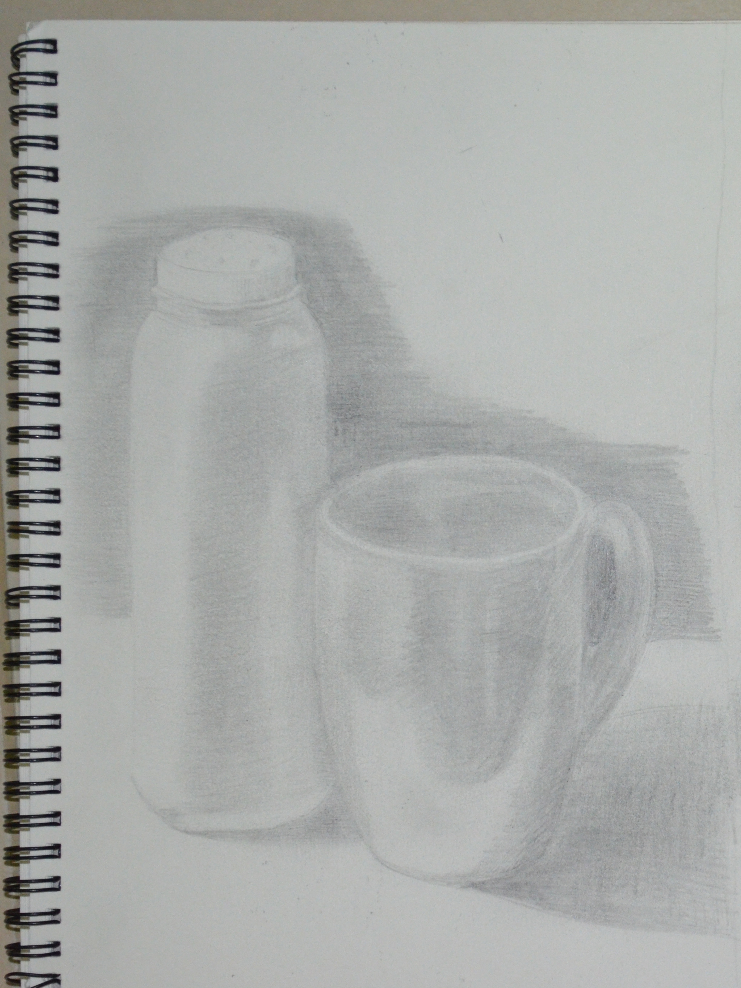
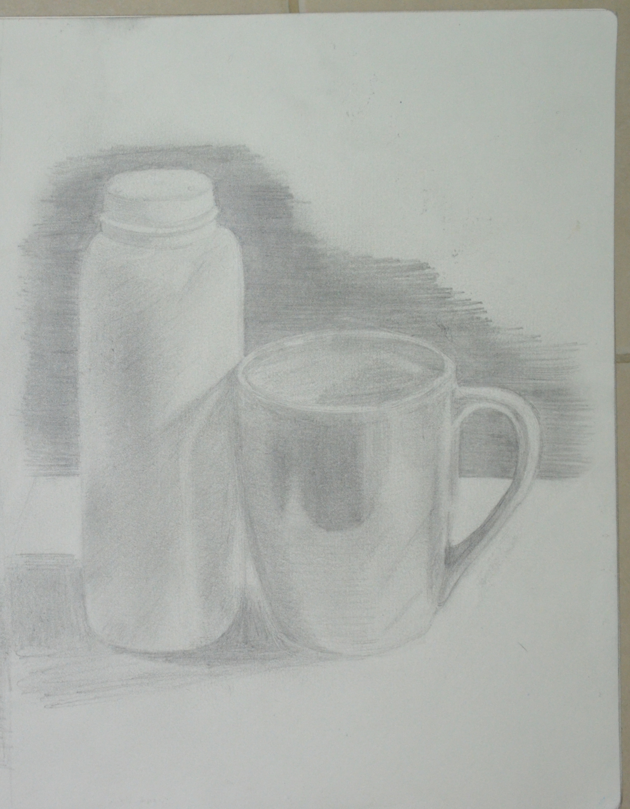
The drawings do fit well on the paper but I do feel that both compositions may have been improved on a larger A1 sheet of paper because of the objects that I chose for the Made Objects and for the medium that I chose for the Natural Forms.
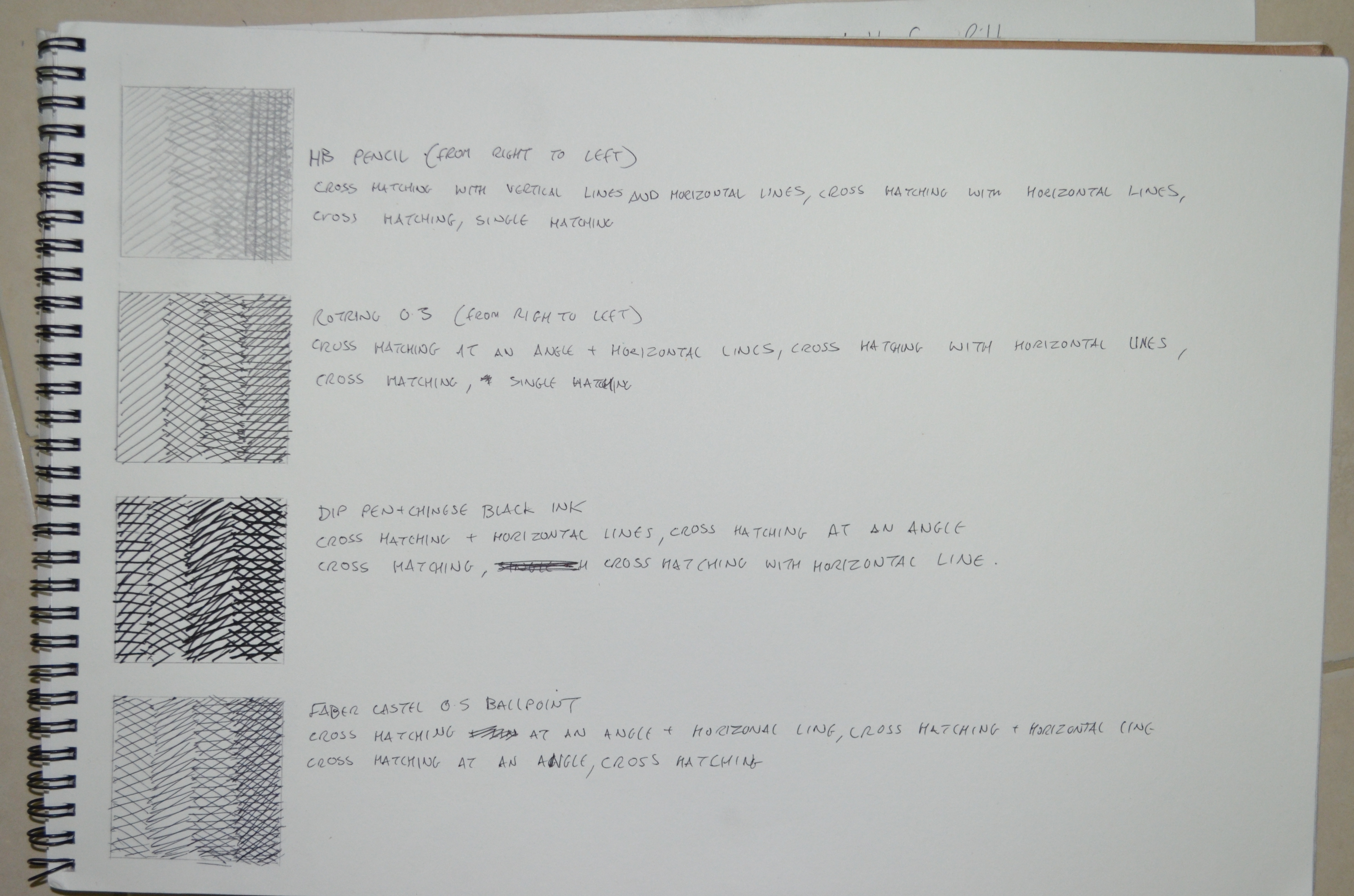
Did you have problems with drawing, or find hatching too difficult?
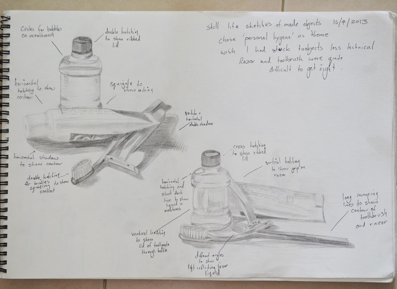
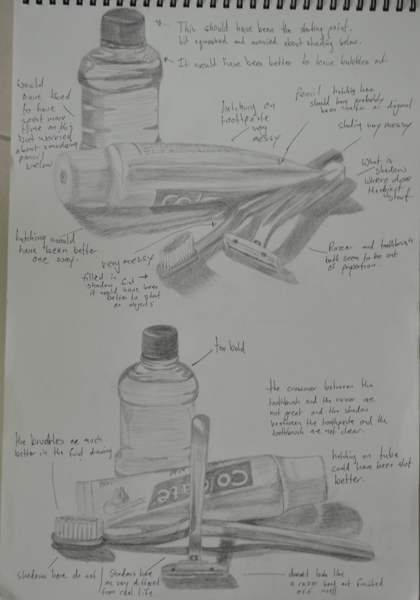
I don’t feel that I have any problems with drawing, any problems that do have are probably from the lack of experience with certain mediums. In the Natural forms part of the assignment I thought I did quite well in developing my hatching skills with hard pastel.
View My Drawing 1 learning log here www.mydrawingcourse.com

Drawing 1, Part 1 Mark Making and Tone, Assignment 1 – Made Objects


I originally had the idea to to use traditional Buddhist items for this part of the assignment such as yellow cloth, a candlestick, temple type money box and did go out and purchase them. The medium I chose for the original composition was coloured pencil, but as I laid down watching the girlfriend iron in front of the electric fan with the white wall of my apartment I had a better idea.


Assignment 1 - Made Objects - finished A2
Assignment 1 – Made Objects – finished A2
I wanted to show something about my life in Thailand and I felt that the new objects set out in the right composition would describe my life perfectly, a normal working-class life in a tropical country. With 13 years in the country and the last few years living alone I knew these objects intimately but the fan would prove to be something of a challenge..
Assignment 1 - Made Objects - composition studies
Assignment 1 – Made Objects – composition studies
I began with composition studies in my A3 sketchbook, I found it difficult to come up with more than two variations as I was locked into how i felt the objects should be presented from the start. How every I did vary the composition slightly with the iron laying down in the first composition which I think was actually my first idea and then the iron stood up proudly in the second. The ironing board was lifted up on the table and I was almost laid down drawing the second composition sketch which I liked so much that I decided this would be the one to develop and decided that I would be there for a while so raised the ironing board higher with the ironing board on top of a table on top of another table. We had to do without a place to eat for the next few days.
Assignment 1 - Made Objects - Photo of Original Composition
Assignment 1 – Made Objects – Photo of Original Composition
At this stage I did things a little bit in reverse with the composition studies just finished I decided to develop the composition in pencil to get a feel of how it would look in that medium before looking at others. One of the main reasons for doing so was being insecure about whether or not I would be able to demonstrate the techniques especially pencil holding techniques that I had practiced in the first part of this course. I then concentrated on enlarging the image by drawing a grid over the top of the composition ready for enlarging for the finished drawing.
Assignment 1 - Composition Development and Enlargement grid
Assignment 1 – Composition Development and Enlargement grid
At this stage I was still not so sure about what medium I would use for the finished drawing, so as instructed on an A2 sheet I practiced with colour pencils and charcoal.
Assignment 1 - Charcoal and Colour Pencil Studies
Assignment 1 – Charcoal and Colour Pencil Studies
Charcoal would have been great for the towel and even the water bottle and possibly the iron but on an A2 sheet which I was planning to use this medium proved itself too messy for the electric fan. I did love the way the water bottle looked in charcoal though, rather like stencil street art. Colour pencil wasn’t too bad but didn’t look solid enough for me, I was still trying to get practice with this medium and didn’t feel like I could carry it off in any other medium than graphite pencil and so that was my final decision.
assignment 1 made objects
Fan Almost Complete
At this stage i decided the composition still needed more work and moved the squirty bottle further in to create less negative space to fill the rectangle shape of the paper. The layout of the fan was very technical it helped that there was no front on it but still took well over an hour and a compass and ruler for the cage. After everything was sketched out my insecurity about not being able to show the various techniques that I practiced in the first part of the course disappeared as I got into it, swapping between 3B and 4B pencils using different pencil holding techniques and several different forms of hatching.
The squirty bottle was pretty straight forward and quite easy to show tone and form on…eventually after I managed to get the shoulders of the bottle right after several goes, as I had moved the bottle in since the composition development work. This was completed mainly by hatching and cross hatching.
The iron allowed me to use several different drawing techniques including hatching, smudging and drawing the patterns on the blade with a putty rubber. However the shape of the iron varies slightly from the photo above I was having double vision when it came to the iron as my left eye is quite bad but refused to work from the photo.
The towel and the ironing board itself allowed me to draw with texture using short, lines dots and a putty rubber on the towel to dry and fluff it up and cross hatching for cloth ironing board cover.
I’m satisfied that I have managed to make reference to most of the aspects of drawing that have been covered in the first part of the course in this part of my assignment from holding pens and pencils to enlarging an image. Drawing the fan allowed me to demonstrate different pencil holding techniques, the bottle allowed me to demonstrate tone and form while the iron allowed me to show both tonal variation as well as reflected light on the blade. The towel was also a great idea which I originally added to raise the iron and didn’t realise it would help me to demonstrate techniques for drawing with texture.


Drawing 1, Part 1, Mark making and Tone, Enlarging an Image - Enlarging an Existing Image


For this exercise I drew a thumbnail drawing of my favourite coffee cup roughly 10 cm square in my small A5 sketchbook, which I’ve barely put to use so was good to fill a page or 2. Once I had finished the thumbnail drawing I drew a grid of 2 cm squares with an HB pencil over my thumbnail sketch.


Enlarging an existing image 1
Enlarging an existing image – A5 sketchbook
In my A4 sketchbook I drew 3 cm squares, deciding they were a perfect size for this object on this size paper, with a larger more detailed composition I would have probably needed smaller squares in both sketchbooks.
Enlarging an existing image - A4 Sketchbook
Enlarging an existing image – A4 Sketchbook
To make it easier for myself to identify which squares I would be drawing in I labelled the squares with letters down the left hand side and numbers across the top. However the drawing was quite low in my A5 sketchbook so in my A4 sketchbook I started at B instead of A lifting the drawing up 1 square.
Enlarging an existing image using grids
Enlarging an existing image – side by side
I loved this ‘Enlarging an Existing Image’ exercise, it was like piecing together a jigsaw puzzle but a hell of a lot easier and as the squares weren’t that big quite easy to judge where  a line curves or which point of the grid they would meet. Admittedly I did do a little bit of rubbing out with an eraser but not that much.

View My Drawing 1 learning log here www.mydrawingcourse.com

Wednesday, 24 April 2013

Drawing 1, Part 1, Mark Making and Tone, Still Life - Check and Log


Do you think it is easier to suggest three dimensions on man-made or natural objects?
This project has taught me that it is easier to suggest three dimensions on man-made objects rather than natural objects. Man-made objects are usually made up of geometrical shapes such as cylinders, cones or cubes and so the lines of man-made objects are easier to draw and suggest their 3D form using most mediums. The irregular shapes of natural objects means that their three dimensional features are much more subtle with lines that are more difficult to depict and draw.
How did you create a sense of solidity in your composition?
In the exercise ‘Still Life Sketches of Made Objects’ I created a sense of solidity by using various hatching techniques and swapping between pencils of different hardness mainly B, HB and 2B, shadows and tone also played a big part in making the objects look solid.
exercise still life of made objects
Image 1: Exercise - Still Life of Made Objects
In the exercise 'Composition of Natural Objects' working with watercolor pencil I used hatching and layers of darker colour to show solidity.
Composition of Natural Objects
Image 2: Exercise - Composition of Natural Objects
Do you think changing the arrangement of your composition makes a difference to the way you create a sense of form?
Changing the arrangement of the objects changed the way each objects interacted with each other, shadows and light reflected off one object to another and other objects in the composition (such as the plate in image 2) can play a major role in creating a sense of form.
How did you decide how to position yourself in relation to the objects?
For the second exercise I decided to position myself slightly above looking down at the objects so I could see the full form of the the objects and shadows interacting with each other in the middle of the composition, I thought this would help me to create a sense of form in my drawing. A bruised rib from a an accident the day before helped me to reinforce this decision.

View My Drawing 1 learning log here www.mydrawingcourse.com

Drawng 1, Part 1, Mark Making and Tone, Still life, Still Life Sketches of Made Objects


The aim of this exercise was to create a small still life composition from a small themed selection of made objects, of which I chose personal hygiene as my theme and the objects that I chose were, a tube of toothpaste, a toothbrush, a Bic Razor and a bottle of mouthwash.
Then with a pen, pencil, or ballpoint use a technique such as hatching. I used a 3H and a HB pencil (to show the darker shadows).
Then I had to draw two or three thumbnail sketches in my sketchbook of different arrangements from different view points, using my light source to help create strong lights and dark shadows on the surfaces of the objects. I had to include tonal values to indicate form in my sketches as well as shadows seeing as they can also play an important part of a still life composition.
Then I was to make notes on or around my sketches about the technique I used and why I had used it. And make notes on anything else I felt was important.
I did two initial drawings that I have to admit were not exactly thumbnail size, I think this was down to miscalculating proportions of the first objects I started on in each composition and then having to keep up proportions,
exercise: still life of man made objects
First attempt at this exercise
In the first drawing I started on the toothpaste tube as I always end up working clockwise, I think this is force of habit. However, because of this I misjudged how much paper I would need for the mouthwash so squashed the lid to fit the rest in; so when I came to the second drawing I worked from  the mouthwash down.
On the first attempt I forgot what I was instructed to do in the exercise. Instead of writing down about the techniques I used I totally ripped the sketches apart fault by fault, only actually remembering what I was supposed to do after I took the photo to upload to my working log. I decided to do the exercise again and this time do it right.
In my second attempt I scaled the drawings down and was less worried about every detail. My hatching technique also seemed to improve a lot in my second attempt, using a variation of cross, vertical and horizontal hatching as well as swooping lines to follow the contours of certain objects.
exercise 2 still life of made objects
Second Attempt at this exercise was much better
This exercise was probably the first time that I made no attempt of smudging in the pencil lines instead I practiced the pencil holding techniques I used earlier in this course, from the tip, from the end etc...
The hardest thing to draw in the composition were the toothbrush and razor and I felt like abandoning the objects and using something easier to draw but stuck at it and did a reasonably good attempt at getting proportions and details right all 4 times

You can visit the learning log that my tutors see right here http://www.mydrawingcourse.com 

Thursday, 4 April 2013

Drawing 1, Part 1, Mark Making and Tone, Reflected Light - 2 Shadows and Reflected Light and Shade


In this exercise I was instructed to 'Use charcoal, a putty rubber and pick two objects with shiny reflective surfaces. Decide on the size of the composition, use A1 or A2 paper so that you can do bold strokes. Try to fill the paper with your objects showing the reflected light and shade of one object falling on another and try to leave very little background space.'
Shadows and Reflective LIght and Shade
Photo of Chosen Objects, Sieve and Ladle
I went out and purchased a few objects specifically for this exercise, after putting them together in pairs to see how they reflected off each other I settled for what I think is some kind of sieve and a ladle. I chose A2 for the composition because my drawing board wasn't big so an A1 size drawing board will be my next purchase. The brief said to leave very little background but I wanted to show some of the handle of the ladle and the shadow that it cast but to be honest I could have shown a lot less and made the objects bigger.
Drawing Pattern of Shadow with Charcoal
Drawing Pattern of Shadow
I sketched an outline with an H3 pencil then as instructed I drew the basic pattern of shadow first with sweeps of charcoal. I did try hatching but the charcoal seemed to leave too darker marks on the paper even trying the charcoal at different angles, this may have been down to the smoothness of the Carson paper that I used.
I tried to stay away from smudging the charcoal as it said nothing about it in the brief but when I did resort to smudging my finger took too much off so I used a stump that I forgot I had. It was great for smudging the charcoal without taking too much off as well as drawing solid outlines. I think if I had used A1 sized paper I could have probably had a better chance of completing the drawing using hatching.
Finished Drawing, Shadows and Reflective Light and Shade
I did start off with the darker tones on the ladle but just on the inner shadows to make sure I was drawing the correct shape (hopefully in time I'll get more confident with charcoal) and then once everything was fine I switched to the mid tones and then built up to the darker tones.
For the lightest tones and the light reflected from the bendy lamp I used a putty rubber to erase the charcoal. I bought a couple of Conte  knead-able erasers which were much better quality than the ones I bought when starting off the course which stuck to everything in the Bangkok heat and left debris on the paper.
I enjoyed the exercise and proud of the result but I am still lacking the confidence with charcoal. I seem to still have a lot more to know about the different types of charcoal, if time allowed I would have liked to have done this again on an A1 sheet of paper to see if I can do the whole exercise without smudging.
View my learning full drawing 1 learning log at: http://www.mydrawingcourse.com/

Drawing 1,Part 1, Mark Making and Tone, Reflected Light, Study of Light Reflected from one Object to Another


The brief was to 'Arrange two three objects ,  at least one of which has a shiny reflective surface, side by side with a small space in between them. Place a light source so that it is to one side of your (two) objects to cast clear shadows. Sit so that you can easily see the shadow on one side of the objects and the light on the other'.
Objects with Coloured Paper Background
The first sentence said two or three and the second paragraph said two but the example students drawing had quite a few objects so I want for four, which were a ceramic bowl, a pearlescent vase, a Chinese style vase and a glass teapot. The glass teapot had a chrome band around it but it didn't cover a large area so I filled it up with a very strong black coffee in order to make the glass more reflective
The sample student drawing was on coloured paper which gave me an idea, so I bought some large sheets of orange coloured paper and set one as the background and did the drawing on the other. The medium I chose for this exercise was hard pastel by Cretacolor, I had never drawn with hard pastel before and this was the perfect chance to lose my virginity.
I was instructed to draw the main shadow pattern created by the light source first then add the reflective light and shadow patterns to the drawing. I followed the instructions drawing it in graphite pencil first as I knew that when it came to add the shadow patterns and reflective light with the hard pastel I would have to work on an object at a time due to how much work blending in this medium needed especially on the coloured paper that I chose.
A Close up of my Finished Drawing in Hard Pastel
I found that I bit off more than I could chew and it took me about 6 hours to finish the exercise, and the colours on the objects in the drawing were quite different from real life, I find blending most mediums quite difficult and really need to spend more time experimenting before working on a piece.
Although happy with the finished drawing I feel I have let myself down and could have gone out of my way to find better objects that were more reflective, although the teapot reflected the colour of the other objects quite well over the small reflective area, the pearlescent vase also did quite a good job.
I could have also done a better job of positioning the objects on the paper which was approximately A3 with about a third of the paper gone to waste.
The valuable lessons that I have learnt from this are that I should choose my mediums and objects wisely and  to use more of the paper next time.
Bad Example of Paper Wastage
View my learning full drawing 1 learning log at: http://www.mydrawingcourse.com/

Drawing 1, Part 1, Mark making and Tone, basic Shapes and Fundamental Form, Research Point - Odilon Redon


Odilon Redon (April 20, 1840 - July 6, 1916), started drawing as a young boy, and was awarded a prize for drawing at school at the age of 10. At 15 years of age, at his father’s insistence, he took up formal architectural studies, but failed to pass his entrance exams at Paris ‘Ecole des Beaux-Arts (School of Fine Arts). On return to Bordeaux he took up sculpture, and also etching and lithography under the instruction of Rodolphe Bresdin.
Threw his early career he continued to work almost exclusively in black and white, in lithographs and charcoal drawings right into his 50s. These drawings became known as his Blacks ‘Les Noirs’. He developed an extremely unique repertoire of weird subjects such as strange creatures, insects and plants with human heads on; these subjects were often influenced by the writings of Edgar Allen Poe.
In 1975 he studied trees and the Underwood at Barbizon in North-Central France, the same year saw his Blacks reached the ‘Most distressed period’ with him often depicting the topic of prisoners in his works, appearing behind the bars of windows or isolated in a nightmare or hallucination. Has he said about his Noirs “They were executed in hours of sadness and pain”.
From the 1890s due to illness and a religious crisis which transformed into a happier person he began to use  pastels and oils, expressing himself with use of vibrant colour, creating works that depicted mythical scenes and flower paintings. Odilon abandoned his Noirs completely after 1900.
He always remained a fairly private person but the end of his life he became a rather distinguished figure with various awards and recognitions and was also regarded by the surrealists to be one of the forefathers of the surrealist movement (I was almost certain that it was going to say this in at least one of the online biographies as I began to look at his works.)
I had never heard of this artist until I was asked to research him but I’m glad I got the chance to do so. It was good to get a chance to see all his paintings side by side and to see how his works changed over the years, rollercoastering in and out of an often dominating dark mood until his change in mediums in the 1890s. I found a lot of his images disturbing and quite a lot of the hybrid characters made me feel uncomfortable like ‘The Egg’. However I was inspired by some of his darker works like ‘The Convict’; since my childhood I have often tried to put something similar down on paper but never got around to it.
The Egg, Odilon Redon 1885
I find a lot of his works interesting and could probably gain inspiration and ideas from them. Although I would find it hard to bare my emotions like he did, for all to see I quite often like to depict some of my innermost feelings and beliefs into my work and will continue to do so.
The Convict, Odilon Redon 1881
View my learning log at: http://mydrawingcourse.com/

,Drawing 1, Part 1, mark Making and Tone, Tone and Form – Check and Log


How difficult was it to distinguish light from the primary light source and secondary reflected light?
I was very aware of where the light was coming from on the first two drawings of the Johnsons baby Powder Bottle and Mug in the first exercise, and even clearer while working on the second sketch. There were other light sources in the room as I worked on them in the evening but still it was quite easy to tell, I think using the ceramic mug helped.
In the second exercise it was not so easy to tell but I did know what to look for so it helped; the easiest reflections to make out was the light reflecting from the ping  pong  ball on to the apple. But even though I knew  which light came from the primary source I wasn't quite sure where certain reflections of light on the mug were coming from. I could only guess.
How as awareness of light and shade affected your depiction of tone and form?
I could have gone my whole life missing certain reflections and shadows out, saying to myself ‘Yeah, that’ll do’, trying to copy as precisely as possible, thinking that’s enough. However, these two exercises have made me more aware of reflected light and I’m starting to piece together where the light in certain places is coming from, this has helped to make these drawings more realistic than anything I’ve done before so it’s something I will continue to observe.
View my learning full drawing 1 learning log at: http://www.mydrawingcourse.com/

Drawing 1, Part 1, Mark Making and Tone, Tone and Form - 2 Tonal Studies


The brief of the first part of this exercise was to draw four 5 cm squares in my sketchbook using 4 different drawing tools such as a pencil, drawing pen, nib pen and black ink and a ballpoint pen. Try to make 4 distinctive grades of hatching with each square without paying too much attention to detail, suggesting that we have close our eyes as this will help eliminate most of the detail.
I totally read this wrong, drawing the squares in pencil and then hatching within the square using the 4 drawing tools that it gave as examples as above. I tried different types of hatching to do this including, cross hatching at an angle as well as using horizontal and vertical lines to give a much denser tone. The nip pen was probably the most difficult for me and couldn't quite graduate the tones.
Tone Using Hatching
Tone Using Hatching
The second part of the exercise was to arrange 4 objects such as an apple, orange, ball, cup or other kitchen utensils, draw the objects then use a hatching technique to technique to add tonal shadow patterns to these objects. The 4 objects I initially chose were a mug, a small bowl an apple and a pong pong ball and chose to have a go at cross hatching with a Faber Castelle Ballpoint pen.
1st Drawing Using Ballpoint
I failed miserably in my first attempt, I even forgot I was hatching with a pen at one stage and went to smooth the pen and smudged the ink across the paper having to fill in the background to cover it up. However it did give me some well needed practise.and confidence towards the end to have another go with the ballpoint pen.
2nd Choice of Objects
2nd Drawing Using Ballpoint
My second attempt was much better, this time I swapped the bowl for a tupperware container turned on its side and I could clearly make out what each of the objects were in my finished drawing, well...apart from the ping pong ball that is.
3rd Drawing Using 2B Pencil
For my third attempt I went back to a 2B graphite pencil, the tool I feel most comfortable with and successfully cross hatched the whole drawing without smoothing any lines with my finger and this time even the ping pong ball was clear enough to make out in my finished drawing,. I think deciding to start off the exercise with a ballpoint pen was a very wise idea and may have even helped to improve my cross hatching technique.

View my learning full drawing 1 learning log at: http://www.mydrawingcourse.com/

Drawing 1, Part1, Mark Making and Tone, Tone and Form - 1Observing Light and Shadow Formations on a Surface


The brief for this exercise was to place two objects together and position a lamp so they are lit from one side, or natural light if its a bright day. Originally I wanted to get out on the balcony during the daytime but housework took me right through to early evening, so I settled for a bendy lamp in the living room and I'm glad I did because it threw more definite light on the objects that I chose, which were a Johnson's Baby Powder bottle and a ceramic cup.
2 Drawings Light from Alternative Sides
I started with a simple sketch that I knew I could alter as I shaded back through the drawing. I begun with the mid tones but was very tempted to start on the darker tones first. The objects were placed on a glass table, however I put some paper down on the table top to cut down on where the reflected light was came from.

Light from Left Hand Side
I was very happy with the first drawing, the sketch itself took me about 10-15 minutes and the areas of dark and light were very clear so I didn't think it would take me long to complete the shading, which in the end took me well over an hour. To complete the drawing off I shaded in the background as the edges on both of the objects were quite light and I wouldn't have been able to show that on a lighter background.
Light from Right Hand Side
For the second drawing I pointed the lamp on the opposite side, which gave me different shadows and light and dark tones in different areas so between the two drawings I think I managed to get quite a lot of practise.
I really enjoyed this exercise but would have probably preferred to do it in colour as the cup looks more chrome than ceramic done in pencil.
View my learning log at: http://mydrawingcourse.com/

Drawing 1, Part 1, Mark Making and Tone, Basic Shapes and Fundamental Form - Check and Log


Are the objects in your drawings the correct size and shape in relation to each other? 
In most of the drawings in these three exercises, especially Boxes and Books, the objects were the correct size and shape in relation to each other apart from when I started to use pen for the Jugs and Jars, but with a bit of practise I managed to get them in proportion, a better quality pen helped.
Do the shapes between the objects look correct? 
Yes, one thing I don’t seem to have a problem with at this stage is the space between the objects, it helps to get them right the first time and then make sure you are looking from the same angle as you continue to draw.
Do the objects in your drawing look solid? 
Yes the drawings in the Supermarket shop exercise all look solid, however the objects in the watercolour pencil drawings do not look as sturdy as the others, but with more practise I will get better at drawing with these.
Have you managed to create the feeling of depth? 
I would say that in all three exercises I managed to create a good feeling of depth but more so in the charcoal sketch and the colour pencil drawing of the Supermarket Shop exercise

View my learning log at: http://markasmithoca.wordpress.com/

Drawing 1, Part 1, Mark Making and Tone, Basic Shapes and Fundamental Forms - 3 Supermarket Shop


I originally wanted to do this exercise as quickly and as simply as possible, but then turned into something that I needed, a practise for using different medium.
DSC_0359
I did a practise drawing in charcoal pencil rather than graphite, I probably should have sketched it out in pencil first to see if it fit on the paper as I lost the top of the box of baby food but it felt good to do something completely in charcoal.
1st rawing with charcoal and Pencil
I wanted to produce the finish drawing in watercolour pencil, but I needed to get work up some confidence as I had never used watercolour pencils before so did an initial drawing in ordinary colour pencils, and I'm glad I did as it taught me a few crucial lessons.
1. I would never buy any drawing tools made in Thailand again, the leads kept breaking.
2. Next time I produce a colour pencil drawing to use paper with less tooth, rough paper is hard for blending.
3. Place objects at the best angles so I don't have to spend hours producing every bit of detail.
4. Read the exercises in the course materials properly. Most of these objects were cylinders with only 1 box and no packets.
2nd Drawing Colour Pencil
After completing the colour pencil drawing which wasn't great as I left a lot of text out off the objects plus the tin in the the middle was too light (the rough paper making it hard to blend) I went to do a bit of shopping. This time I purchased Faber Castell watercolour pencils not trusting the Masterart ones I had in the drawer and some A3 watercolour paper.
DSC_0384
I changed a few objects, I had to use the gravy for Sunday dinner so swapped that for parsley sauce, swapped the tin for a big bag of Nesvita cereal drinks, took the plastic lid off the Rosa tin and swapped the baked beans for a bag of Tipco something or other that the school director gave me for Christmas.
3rd drawing watercolour pencil on watercolour paper
I've never used watercolour pencils or watercolour paper before so instead of spending hours trying to learn how to use them through trial and error I jumped onto YouTube to have a look at a couple of videos.
However once I started the exercise I learnt some more valuable lessons:
1. This probably want the best medium for this exercise with all the writing on the boxes.
2. I probably should have used a heavier paper, the 190 I was using begun to warp like mad.
3. The video was not enough I should have practised before doing this exercise.
Even though I did not rush through this exercise (it took a good few hours split up over a couple of days) the final drawing in my eyes looks a complete mess due to the very reflective purple box in the middle that made me lose my rag. However I am happy that I allowed myself the chance to start using watercolour pencils and to be honest for the first drawing ever with this medium, I don't think I did too bad even though it does looks better without my glasses and my eyes squinted.
Overall the shapes were fine, the shapes between the objects were pretty much perfect and there is depth there so in that respect I was successful.

View my full learning log for Drawing 1 at: http://www.mydrawingcourse.com