Showing posts with label Research Point. Show all posts

Monday, 27 October 2014

Drawing 1, Part 2 Observations in Nature, Drawing Fruits and Vegetables in Colour, Research Point: Ben Nicholson

Born in to an artistic family in Denham, Buckinghamshire in 1894 Ben Nicholson was the son of artists William Nicholson and Mabel Pryde.  In 1896 the Nicholson family moved to London where Ben was educated at the Tyttenhangar Lodge Prepatory School in Seaford before becoming a boarder at the Gresham’s School for boys in Holt, Norfolk. Ben Nicholson began his training as an artist in London at the Slade School of art, where he studied from 1910 – 1911, then from 1912 to 1914 he travelled between France, Spain and Italy.
In 1920 Nicholson married is first wife, painter Winifred Roberts to whom he had three children, two sons, Jake and Andrew and a daughter Kate, who also became a painter. From 1923 Ben and Winifred split their time between England and Switzerland spending their winters in the southern Swiss town of Lugano and the rest of the year was divided between Cumberland, where they made their home for that decade and London While In London following an exhibition with his wife Winifred he was invited to join the 7 & 5 Society, he was made chairman of the society in 1926.
Nicholson’s early paintings were still-lifes influenced by the works of his father but then after his first solo show at the Twenty-one gallery he began experimenting with abstract painting influenced by Synthetic Cubism which he implied in all his works thereafter. His works throughout the 1920s were of deceptively simple table top still-life’s and landscapes painted in Switzerland, Cumberland and Cornwall, making his first visit there in 1928.
While visiting France in 1932 and 1933, Nicholson became familiar with the works of artists such as Hans Arp, Joan Miro, Piet Mondrian and Alexander Calder who had settled in Paris in the 1920s. Nicholson was successful in fusing the European trends into a new style that would become identified as his own.
He made these visits to Paris with Barbara Hepworth; Winifred and Ben were divorced in 1938 a break up that was brought on by his growing relationship with Wakefield born sculptor. Hepworth had kids to Nicholson in 1934, three triplets and after his divorce in 1938 she would become his second wife.
Together they moved to Cornwall in 1939 and in 1943 he joined the St. Ives society of artists. Following the Second World War Nicholson lost faith in the ‘utopian promise of geometric abstraction’ and resumed painting landscapes adding colour to his abstract reliefs to emphasize the fundamental unity between nature and abstraction. Hepworth and Nicholson were divorced in 1951.
Throughout the 1950s he achieved international recognition as an artist through a series of awards which included the first Guggenheim International Painting Prize in 1956 and the International Prize for Painting at the São Paulo Biennale in 1957. From 1954 – 1961 retrospective exhibitions of his work were held throughout Europe including shows at the Venice Biennale and Tate Gallery and in several cities in the USA in the 60’s and 70’s.
Nicholson married his third wife, German photographer Felicitas Vogler in 1957 and the two moved to Ticino in Switzerland in 1958 where he again began to concentrate on painted reliefs. In 1968 Queen Elizabeth awarded him the O.M. (Order of Merit) and in 1971 after the end of his third marriage he moved back to England where he died in London in 1982 at the age of 87.
Researching this Artist
I used many different websites researching this artist as the information I found was confusing and contradictory, with information differing from site to site and so I chose to gather information from the websites of establishments that I found out at shown his work, The British Council, Tate Gallery and the Guggenheim comparing the details with the biographywww.oxfordartonline.com.
I have never heard of Ben Nicholson before although his second wife Barbara Hepworth is very familiar to coming from Wakefield I have seen her works in West Bretton (Yorkshire Sculpture Park). Since I have been living in Thailand they have opened the Hepworth Center in her name in my home town so it was interesting to read about their relationships, both personal and professional.
Although I have never heard of the artist by name before, I did recognise a few his works, including 1934 (Still Life – Birdie),  1933 (Study of a Head) and 1932 (Head and Mug in a Greek Landscape).
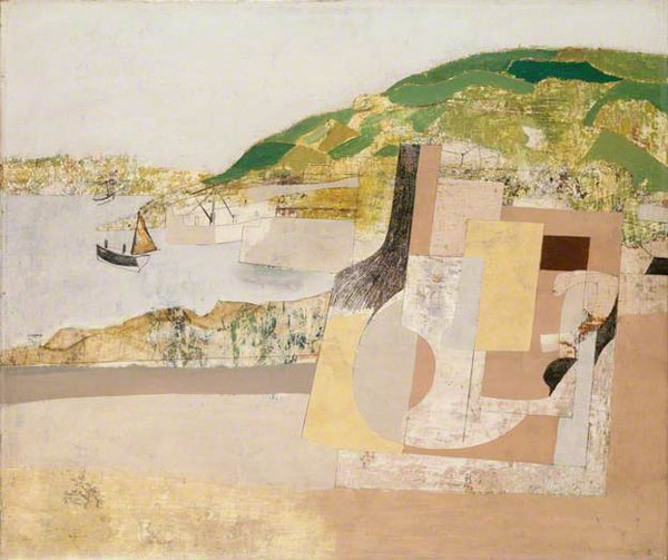
Ben Nicholson Mousehole 1947
Why does he simplify still life forms and negative space and superimpose them on a Cornish Landscape?
I think the answer to this lies in the above text where it says Nicholson ‘resumed painting landscapes and added colour to his abstract reliefs to show the fundamental unity between nature and abstraction’.  Which maybe reflected in what he said in a letter from Nicholson to Patrick Heron (9 February 1954) ‘All the “still lifes” are in fact land-sea-sky scapes to me.’
Bibliography:

Tuesday, 7 October 2014

Drawing 1, Part 2 Observations in nature, Detailed Observation, Research Point B - 2 Contrasting Artists, Gustave Courbet

For this research point I was to find two artists who work in contrasting ways: from tight, rigorous work to a more sketchy style. For the artist who worked in a sketchy style I had already researched Egon Scheile in Part A so now it was time to find an artist who did more tight, rigorous work.
I was all ready to research a modern artist for this part of this research point and discovered Grant Wood while looking at Egon Schiele’s work, but then on a last minute search I found another artist that was just as new to me.
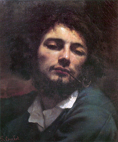
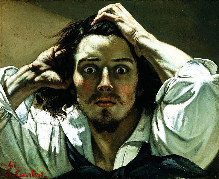
While searching for images  I came across a picture that I had seen many times and for some obvious reason I thought was a picture of Johnny Depp in one of his movie rolls. I was surprised to find out that it was a self-portrait called ‘A Desperate Man’ by an artist called Gustave Courbet, the father of realism and even more interesting the artist that first coined the phrase.
Born in Ornans, France to a wealthy family, Gustave Courbet went to Paris in 1841 with the intention of studying law but soon decided that he would study painting and did so by copying the paintings of the French, Flemish and Spanish masters in the Louvre.
His style was shaped near the start of his career when he chose direct his paintings to observed reality, among his early paintings were self portraits portraying himself in various roles he also painted seascapes, still-lifes and figurative compositions.
Courbet's figurative work was somewhat controversial because he addressed social issues in his paintings portraying subjects that were considered vulgar at the time such as rural hierarchy, peasants and the poor working conditions of the underprivileged.
Courbet's style became known as realism however instead of using perfect line and form in his paintings he dealt with realism with spontaneous brush strokes and a rough handling of paint achieving a sense of direct observation by the artist while depicting the inconsistency in nature.
Although Gustave Courbet and Egon Schiele are artists of two different movements living at two different times their lives are very similar in that they seem to demonstrate freedom of expression in their art by painting subjects that were pornographic or controversial at that time. The poses by Courbet's nudes such as La Femme Aux Bas Blancs, (Woman with White Stockings), 1861 and The Origin of the World (L'Origine du monde) (1866) remind me very much of Schiele's paintings; as though Schiele could have been influenced by the artist. Both artist's also served time in prison.
I'm not particularly turned on by the works of the old masters and so there are a lot of Gustave's paintings that I don't find appealing, but there are two or three that I think are brilliant simply because I can imagine how sensational they were at that time being so 'real' when photography was still in it's infancy.
http://en.wikipedia.org/wiki/File:Origin-of-the-World.jpg - The Origin of the World (L'Origine du monde) (1866)
Gustave Courbet auto retrato
Self-portrait (The Desperate Man), c. 1843–1845 (Private collection)
Gustave Courbet Autoportrait
The man with a pipe Self-portrait, 1848-49
Bibliography:

Drawing 1, Part 2 Observations in Nature, Detailed Obsevations, Research Point 2 Contrasting Artists A - Egon Schiele

For this research point I was to find drawings by two artists who work in contrasting ways: from tight, rigorous work to a more sketchy style.
I decided to research the artist who works in a sketchy style first.  While I have tried to find new artist so far in this module for this part of this research point I decided to research an artist I was already familiar with as when I saw the words 'sketchy style' he was the first artist that popped into my head and rightly so.
Austrian Expressionist painter Egon Schiele  was born in Tulin in 1890. His father Adolph Schiele was the station master at Tulin Railway station and as a child Egon was fascinated by trains and would spend many hours drawing them. It is said that his passion for drawing started at the early age of 1 and a half years old and this led his father to believe is son would become an engineer and so at eleven years old was sent off to attend a Realgymnasium 25 miles away from his home town. Due to lack of friends and lack of interest in his studies he was a poor student and was kept back two years. When his father died of syphilis in 1905 family problems made his situation worse and eventually was politely asked to leave school by his teachers
In 1906 he asked his mother and uncle to allow him to apply at the Vienna Academy of Fine Arts and in the summer of that year, passed the tough entrance exam to became the youngest student ever to attend his class. Although he was passionate about art he showed a resistance to the strict regimen at the academy. As a brilliant draughtsman he would get through projects in minutes that would take other students in his class hours to complete but his early works were heavy handed and his soulless depictions of professional models did not amuse his tutors who simply gave him grades of ‘satisfactory.’
Schiele’s early work showed traits of Gustav Klimt and then in 1908 after a visit to a the large art show known as the ‘Kunstschau’ where a room full of the artists’ paintings were on show the influence of Klimt emerged full blown in Schiele’s paintings. He saw himself as the new Klimt and paraded round Vienna calling himself the ‘Silver’ Klimt and against the Academy’s authority accepted invitations to exhibit at the ‘Kunstschau’. In 1909 Schiele and a few of his like-minded class mates handed over a formal letter of protest to the academy expressing their disapproval at the academy’s rigid rules and withdrew themselves from the school.
By 1910 Egon Schiele’s unique expressionist style had gotten him many admirers including Gustav Klimt himself who bought several of his paintings and also offered to exchange some for his own. Klimt also introduced him to patrons and collectors and he thought that leaving the academy had turned out to be a wise career move but that wasn’t to be the case. Klimt was very vain and expected his works to be snapped up by the patrons who he had hoped would show him devotion but the truth was they didn't find him the least bit cooperative and found his commissioned works, far too sexually explicit. Feeling let down he left Vienna for the countryside.
Egon Schiele led a short life dying at the early age of 28 of the Spanish flue in the epidemic that swept Europe in 1918 but his short life was somewhat controversial. At 21 years old he was imprisoned for seducing an underage girl and during his arrest the officials destroyed many of his drawings that were regarded at the time as pornographic due to the nature of his subjects. He spent a total of only 24 days in custody but during that time he a created a 'series of 12 paintings depicting the difficulties and discomfort of being locked in a jail cell' - Wikipedia.
His work was shaped by World War I during which he was drafted up and stationed in a Russian prisoner of war camp; however he still continued to paint and was even given a disused store room to be used as a studio where he painted captured Russian officers.
His style changed over the years  he was influenced by Klimt and Oskar Kokoschka and his early works from 1907 to 1909 resembled those of Klimt but in 1010 began experimenting with nudes and began developing his own unique style that we know today, pasty soulless doll like figures with strong overtones. Many view his works as pornographic, twisted or erotic depicting death, sex and discovery and yet I see his works as simply brilliant and way ahead of their time; paintings that have influenced so many artists since.
I first came across Schiele's work in the music room at my secondary school, a poster of his 'Self Portrait of Saint Sebastian' but it wouldn't be til many years later that i would find out the name of the artist or what the painting was called.
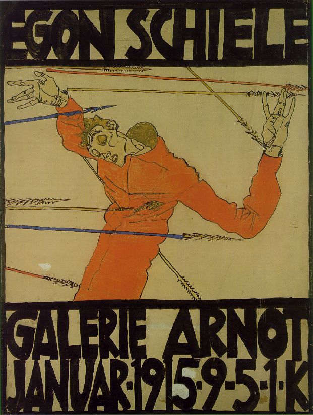
Egon Schiele - Self Portrait as Saint Sebastian
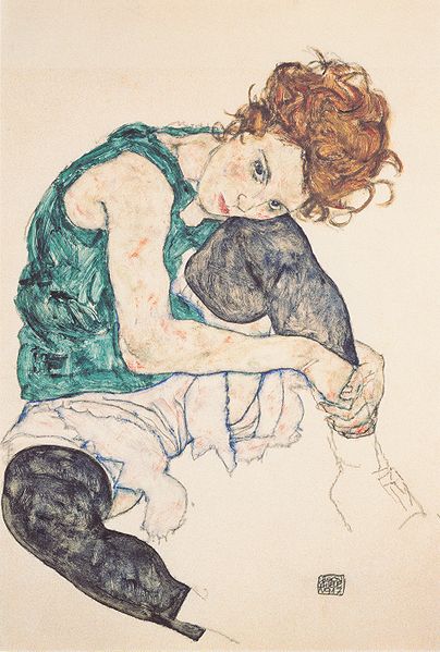
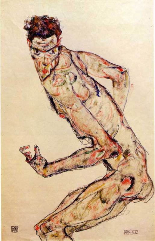
My favourite paintings by Schiele have got to be the Fighter 1913 and Seated Woman with Bent Knee 1917, although I have to admit I do love a nude or two of his which are simple, crude but very erotic.
Egon Schiele - Seated Woman with Bent Kneee 1917
Egon Schiele - Fighter, 1913
I love the way he has clearly thought hard about the subjects (maybe a bit too hard from what we know of Schiele) and yet his paintings are no more than coloured sketches on a plain background, allowing him to show movement and even though some regard his subjects as being 'soulless' I don't think they can be accused of being lifeless. I can see how it is easy to be influenced by an artist such as Schiele and I know that his paintings will come to mind in the 'Drawing Figures' part of this course.
Bibliography:

Wednesday, 14 May 2014

Drawing 1, Part 2 Observations in Nature, Research Point, Masters of Detailed Drawing, 19th Century Thomas Hartley Cromek

For this research point I was asked to find two artists who exemplify mastery of detailed drawing.
I used to have a reproduction painting site and am familiar with the works and lives of quite a few but since starting this course I've been introduced to new artists and new techniques so I thought I'd carry that on by typing in a few keywords on Google to see where they took me.
The first artist I found was a 19th century artist called Thomas Hartley Cromek and after seeing that his place of death was Wakefield, my home town, I made the decision to research this artist a little more.
Born in London in 1809 Thomas Hartley Cromek was the son of Robert Hartley Cromek the  engraver and art dealer who allegedly cheated William Blake out of potential profits. In his childhood he moved from school to school starting off his education at Enoch Harrison's school in Wakefield and then onto the Moravian School in Fulneck. He then moved back to Wakefield to study at the grammar school there before returning to Harrison's.
Thomas Hartley Cromek received his first art lessons from a Wakefield based portrait painter, James Hunter but then in 1826 he moved to Leeds study landscape painting under Joseph Rhodes, while studying in Leeds Thomas also taught himself anatomical drawing.
He travelled to Italy in 1830 to study the old masters and spent most of the next 20 years within the country mainly in Florence eventually reaching Rome where he attracted much attention for his 'excellence in drawing and his careful colouring' - Wikipedia. While in Rome he gave drawing lessons to several distinguished visitors including the British artist and poet, Edward Lear.
Between 1831 and 1849 Thomas Cromek spent most of his time drawing the major buildings in Rome as well as Greece but then was forced to leave Rome with the outbreak of the first Italian War of Independence.
There's not much information about Thomas Hartley Cromek online about techniques, ideas, influences etc but I did find quite a few images.
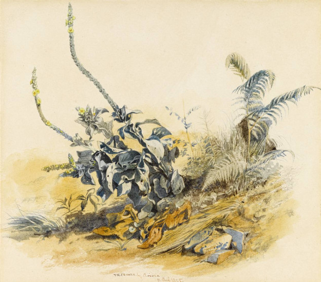
Study of Plants, Ariccia Watercolour, over traces of a pencil underdrawing.
Study of Plants, Ariccia
Watercolour, over traces of a pencil underdrawing.
I found many of his works online but it was the drawing above that caught my eye and I thought it was quite relevant to this module. The drawing itself is only 7 1/4 x 8 1/8 in in size and yet his brilliant use of shadow amplifies the detail of the drawing. I enlarged this image on my computer to the size he would have worked at and was amazed how much detail he has got into such a small drawing with what I still regard to be a messy medium, for me that is anyway. He has managed to depict some very thin leaves and blades of grass and makes this picture seem a lot bigger than what it is.
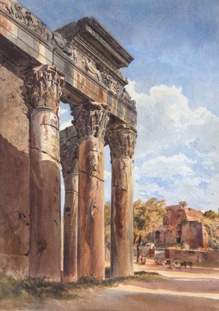
THE TEMPLE OF ANTONINUS AND FAUSTINA, FORUM, ROME - WATERCOLOUR 18 1/4 X 13 INCHES
 Just like his drawing of plants and flowers his watercolour paintings of buildings such as the Temple of Antoninus above shows brilliant detail and colour as well as amazing shadows which really amplify the bulkiness of the stone structure.
Bibliography

Drawing 1, Part 2 Observations in Nature - Research Point: Masters of Detailed Drawing - Modern Artist, Eliot Hodgkin

For this research point I was asked to find two artists who exemplify mastery of detailed drawing 1 from the 19th century or earlier and a modern artist. I already researched the 19th century artist Thomas Hartley Cromek in 'Masters of Detailed Drawing 1, 19th Century, Thomas Hartley Cromek' and it was now time to find a Modern artist. Again I wanted to find an artist that I wasn't familiar with so I started my search on Google looking for British artists of the 20th century. A list of names of British artists came up on Wkipedia so I went down the names looking at their work 1 artist at a time.
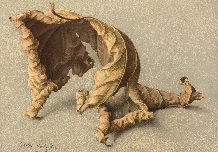
I came across the name Eliot Hodgkin, a name that I was very familiar with but I'm not sure from where so I took a look at his work to see if I recognised any of his paintings. I had never seen any of his paintings before but what I did see was truly inspiring and perfect for this part of the course. With the image below Large Leaf 2 particularly catching my eye as near my school there are some very similar large leafs that I would love to draw for this part of the course.
Eliot Hodgkin Large Leaf 2 Tempera on Card
Curwen Eliot Hodgkin was an English painter born into a Quaker family in Purley-on-Thames on 19 June 1905 and was the cousin of abstract painter Howard Hodgkin. Eliot Hodgkin was educated at Harrow School but his artistic life began at the Byam Shaw School of Art and then at the Royal Academy Schools where he studied under Francis Ernest Jackson.
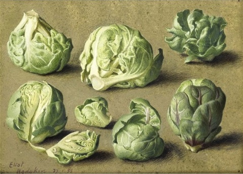
Eliot Hodgkin Seven Brussel Sprouts
Hodgkin had already established himself as a still life and landscape painter by the mid-1930s and regularly exhibited at the Royal Academy. In 1937 Hodgkin started working in egg tempera a recipe that was given to him by his close friend and former teacher Maxwell Armfield.
Hodgkin stated that he wasn't attracted to tempera as a medium as it was used by Italian primitives and their work did not do anything for him, he simply used tempera as it was the only medium that allowed him to express the unique character of the objects that fascinated him.
Hodgkin said that his conscious purpose was to 'show the beauty in natural objects'- that people would usually think unattractive such as 'Brussels sprouts, turnips, onions, pebbles and flints, bulbs, dead leaves, bleached vertebrae, an old boot cast up by the tide.'
When i did a search for his paintings and saw his work the first thing that went through my mind was how beautiful his paintings were and yet his compositions are so very simple. I have heard of tempera before but as far as I know I have never seen anything painted in it until now and I knew at firs glance that they were painted in a medium other than oil or acrylic.
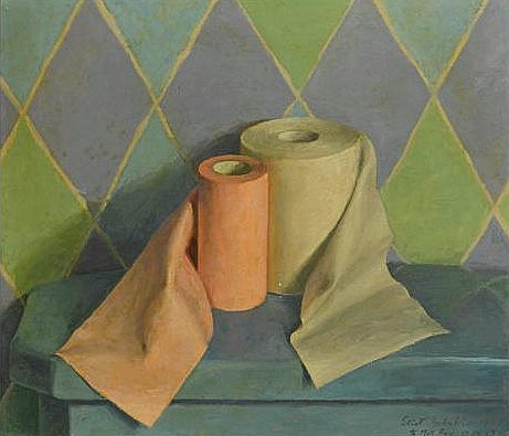
He depicts the texture of his objects wonderfully and his paintings are so crisp and life-like but still he manages to express them in a way that makes u aware of the beauty of these objects for the first time with wonderful contours and a brilliant balance of light and dark tone, whether it be a dead leaf or a toilet roll.
Toilet Rolls Eliot Hodgin
Like Eliot Hodkin Says ' People sometimes tell me that they had never really ‘seen’ something before I painted it, and I should like to believe this… For myself, if I must put it into words, I try to look at quite simple things as though I were seeing them for the first time and as though no one had ever painted them before.'
For me I agree with others that to see these objects in his paintings is to 'see' them for the first time with detail and beauty that you would never notice before. Hodgkin really makes you notice every part of the object, every leaf, every crease and every pattern on the objects surface.
Bibliography - Wikipedia

Wednesday, 24 April 2013

Drawing 1, Part 1, Mark Making and Tone, Reflected Light, Research Point - Patrick Caulfield (Part 2)


The brief for this was to make a drawing in a similar style to Patrick Caulfield White Ware screen prints, it wasn't that easy. I decided that I wasn't going to keep looking at his images so after I finished my part 1 of this research point, researching him, I thought I could remember enough about his prints and paintings to work in a similar style.
I decided to work on an A2 sheet from my larger sketchbook which is too big to work with felt tips and I wanted to show as little pen or brush strokes as possible so I went out and bought some Kurecolor graphic design markers, which were very expensive but well worth the money.
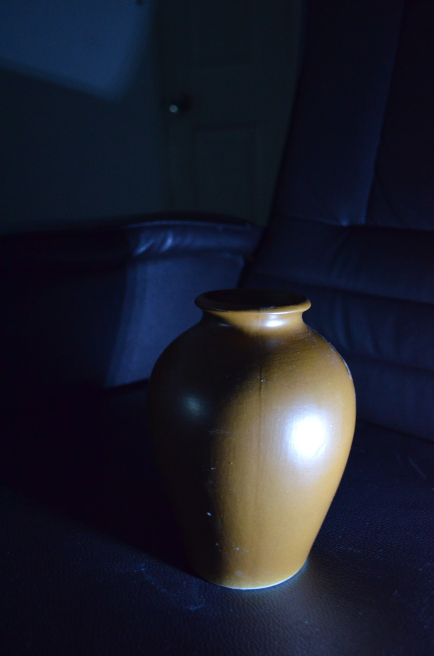
I used the vase that I used in an an earlier exercise 'Study of Light Reflected from one Object to Another' and placed it in the chair that I would usually sit in to do my work. I wanted to shine a more acute light on my subject so instead of using the bendy light that I used before I used a torch that I got free from the local western supermarket. I knew that the batteries in the torch wouldn't last that long so I turned all the lights off found the right angle for the torch to shine at and took a photo, then I worked completely from the photo.
drawing in the style of in the chair that I would patrick caulfield
Photo with Torch, vase and Chair
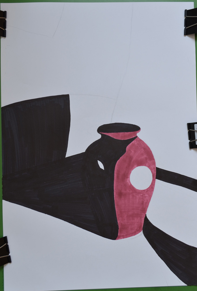
I started by drawing the shadow on the vase, then instead of using white I used colour for the other half, I purchased the markers day before but I swapped vases so the colour did not match but I wasn't worried about that, I just wanted to know if I could draw something in the similar style as Patrick Caulfield, I highlighted the light reflected from the vase vase by leaving those areas blank.
drawing in the style of in the chair that I would patrick caulfield
Drawing after first Two Colours
I used grey for the light that spread from the torch beam as I had I didn't want the drawing to be completely dark and I had seen Patrick Caulfield also use grey in his paintings, this paid off.
drawing in the style of in the chair that I would patrick caulfield
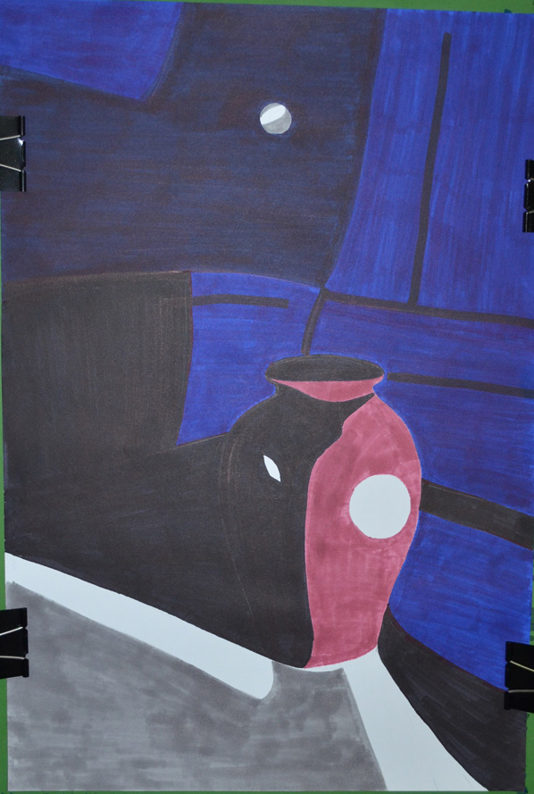
Finished drawing
I cut down on the detail in my drawing and over exaggerated the detail that was left, after adding colour to the vase shadows and foreground I stopped looking at the photo and worked completely from memory hence the various differences like the position of the door handle  and seams in the chair positioning where I thought they would look best rather than where they should be.
I was really happy with the finished drawing and even though it doesn't resemble any 1 particular Caulfield style of painting you can tell he is the inspiration behind it.

View my learning full drawing 1 learning log at: http://www.mydrawingcourse.com/

Thursday, 4 April 2013

Drawing 1, Part 1, Mark Making and Tone, Reflected Light, Research Point - Patrick Caulfield (Part1)


Patrick Caulfield (29 Jan 1936 - 29 Sept 2005) was an English painter and printmaker who started his formal education as an artist at the Chelsea School of Art in 1956. He then studied from 1960-1963 at the Royal College of Art where he was one year below students who were credited with starting the UK pop art movement.
As a student he was influenced by abstract painters such as Mark Rothko and Jackson Pollock even though he only experimented in abstract painting for a short time. His bold, colourful prints and paintings are deemed to be Pop Art even though Caulfield himself was wary of being connected with any such movements. His association with the movement with ‘Pop Art’, mainly due to exhibiting alongside David Hockney, Allen Jones and R B Kitaj at the ‘New Generation’ exhibition in 1964.
Unlike the American Pop Artists his works depicted ordinary every day subjects such as a vase, buildings or interiors rather than images of popular culture such as celebrities or advertising products. It is the way he treats his subject that that gives his work a Pop Art feel, creating ambiguity by treating fine art subjects in an unrealistic and stylised manner.
When I first looked at Caulfield’s work it seems to me that the negative space plays just as much an important role in his paintings as positive space. In some of his images he uses negative space to sculpture the objects which in some cases are an abstract image but we get the sense that we are looking at the whole thing subject.
In the ‘White Ware’ screen prints he has managed to balance out the level of importance between negative space, reflected light and what we automatically presume is the main subjects such as a vase. With this he leaves the viewer trying to imagine what the light source maybe or what could be causing the shadows in his images. He also creates a good sense of distance between the foreground objects and what’s happening in the background by using very simple shapes to depict reflected light for example.
In some of these prints he has inserted a second object behind the main subject, this is made up of one or two shapes and difficult to work out what it is but is just as important as the main subject. I love some of his other paintings and in the future I would very much like to paint something in the style of ‘After Lunch 1975’ due to the simplicity of my Bangkok apartment and the technical city scape outside. For now I will concentrate on the task at hand and make a drawing in the style of his ‘White Ware’ screen prints for this research point.
 Blibliography
View my learning full drawing 1 learning log at: http://www.mydrawingcourse.com/

Drawing 1, Part 1, Mark making and Tone, basic Shapes and Fundamental Form, Research Point - Odilon Redon


Odilon Redon (April 20, 1840 - July 6, 1916), started drawing as a young boy, and was awarded a prize for drawing at school at the age of 10. At 15 years of age, at his father’s insistence, he took up formal architectural studies, but failed to pass his entrance exams at Paris ‘Ecole des Beaux-Arts (School of Fine Arts). On return to Bordeaux he took up sculpture, and also etching and lithography under the instruction of Rodolphe Bresdin.
Threw his early career he continued to work almost exclusively in black and white, in lithographs and charcoal drawings right into his 50s. These drawings became known as his Blacks ‘Les Noirs’. He developed an extremely unique repertoire of weird subjects such as strange creatures, insects and plants with human heads on; these subjects were often influenced by the writings of Edgar Allen Poe.
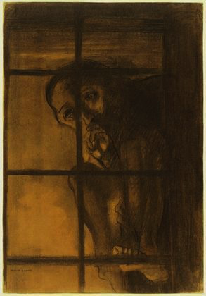
In 1975 he studied trees and the Underwood at Barbizon in North-Central France, the same year saw his Blacks reached the ‘Most distressed period’ with him often depicting the topic of prisoners in his works, appearing behind the bars of windows or isolated in a nightmare or hallucination. Has he said about his Noirs “They were executed in hours of sadness and pain”.
From the 1890s due to illness and a religious crisis which transformed into a happier person he began to use  pastels and oils, expressing himself with use of vibrant colour, creating works that depicted mythical scenes and flower paintings. Odilon abandoned his Noirs completely after 1900.
He always remained a fairly private person but the end of his life he became a rather distinguished figure with various awards and recognitions and was also regarded by the surrealists to be one of the forefathers of the surrealist movement (I was almost certain that it was going to say this in at least one of the online biographies as I began to look at his works.)
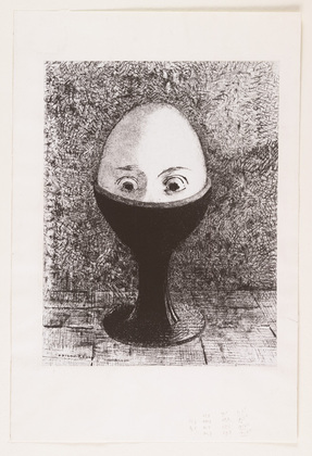
I had never heard of this artist until I was asked to research him but I’m glad I got the chance to do so. It was good to get a chance to see all his paintings side by side and to see how his works changed over the years, rollercoastering in and out of an often dominating dark mood until his change in mediums in the 1890s. I found a lot of his images disturbing and quite a lot of the hybrid characters made me feel uncomfortable like ‘The Egg’. However I was inspired by some of his darker works like ‘The Convict’; since my childhood I have often tried to put something similar down on paper but never got around to it.
The Egg, Odilon Redon 1885
I find a lot of his works interesting and could probably gain inspiration and ideas from them. Although I would find it hard to bare my emotions like he did, for all to see I quite often like to depict some of my innermost feelings and beliefs into my work and will continue to do so.
The Convict, Odilon Redon 1881
View my learning log at: http://mydrawingcourse.com/