Showing posts with label bachelor degree in painting. Show all posts

Monday, 27 October 2014

Drawing 1, Part 2 Observations in Nature, Drawing Fruits and Vegetables in Colour, Research Point: Ben Nicholson

Born in to an artistic family in Denham, Buckinghamshire in 1894 Ben Nicholson was the son of artists William Nicholson and Mabel Pryde.  In 1896 the Nicholson family moved to London where Ben was educated at the Tyttenhangar Lodge Prepatory School in Seaford before becoming a boarder at the Gresham’s School for boys in Holt, Norfolk. Ben Nicholson began his training as an artist in London at the Slade School of art, where he studied from 1910 – 1911, then from 1912 to 1914 he travelled between France, Spain and Italy.
In 1920 Nicholson married is first wife, painter Winifred Roberts to whom he had three children, two sons, Jake and Andrew and a daughter Kate, who also became a painter. From 1923 Ben and Winifred split their time between England and Switzerland spending their winters in the southern Swiss town of Lugano and the rest of the year was divided between Cumberland, where they made their home for that decade and London While In London following an exhibition with his wife Winifred he was invited to join the 7 & 5 Society, he was made chairman of the society in 1926.
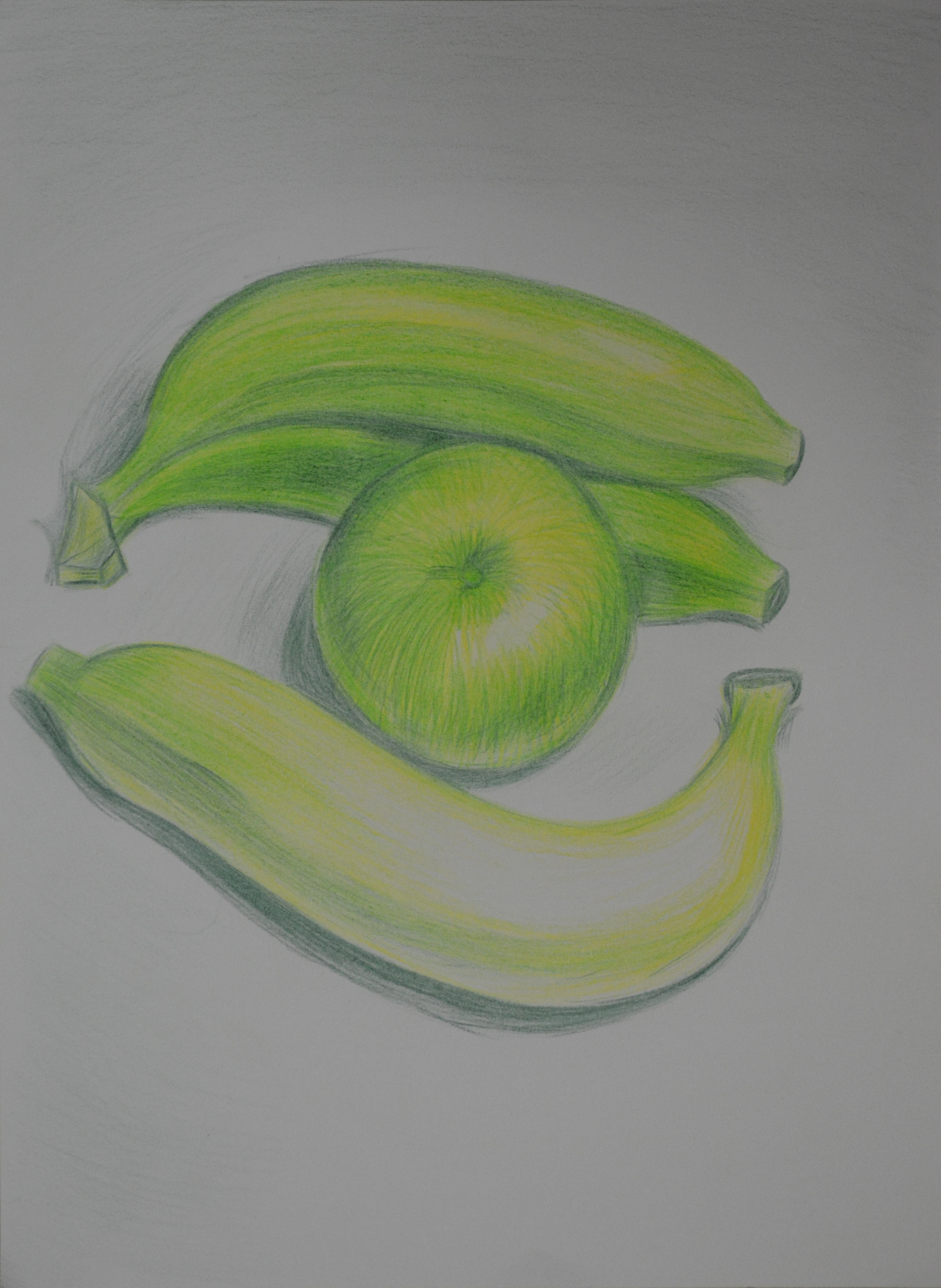
Nicholson’s early paintings were still-lifes influenced by the works of his father but then after his first solo show at the Twenty-one gallery he began experimenting with abstract painting influenced by Synthetic Cubism which he implied in all his works thereafter. His works throughout the 1920s were of deceptively simple table top still-life’s and landscapes painted in Switzerland, Cumberland and Cornwall, making his first visit there in 1928.
While visiting France in 1932 and 1933, Nicholson became familiar with the works of artists such as Hans Arp, Joan Miro, Piet Mondrian and Alexander Calder who had settled in Paris in the 1920s. Nicholson was successful in fusing the European trends into a new style that would become identified as his own.
He made these visits to Paris with Barbara Hepworth; Winifred and Ben were divorced in 1938 a break up that was brought on by his growing relationship with Wakefield born sculptor. Hepworth had kids to Nicholson in 1934, three triplets and after his divorce in 1938 she would become his second wife.
Together they moved to Cornwall in 1939 and in 1943 he joined the St. Ives society of artists. Following the Second World War Nicholson lost faith in the ‘utopian promise of geometric abstraction’ and resumed painting landscapes adding colour to his abstract reliefs to emphasize the fundamental unity between nature and abstraction. Hepworth and Nicholson were divorced in 1951.
Throughout the 1950s he achieved international recognition as an artist through a series of awards which included the first Guggenheim International Painting Prize in 1956 and the International Prize for Painting at the São Paulo Biennale in 1957. From 1954 – 1961 retrospective exhibitions of his work were held throughout Europe including shows at the Venice Biennale and Tate Gallery and in several cities in the USA in the 60’s and 70’s.
Nicholson married his third wife, German photographer Felicitas Vogler in 1957 and the two moved to Ticino in Switzerland in 1958 where he again began to concentrate on painted reliefs. In 1968 Queen Elizabeth awarded him the O.M. (Order of Merit) and in 1971 after the end of his third marriage he moved back to England where he died in London in 1982 at the age of 87.
Researching this Artist
I used many different websites researching this artist as the information I found was confusing and contradictory, with information differing from site to site and so I chose to gather information from the websites of establishments that I found out at shown his work, The British Council, Tate Gallery and the Guggenheim comparing the details with the biographywww.oxfordartonline.com.
I have never heard of Ben Nicholson before although his second wife Barbara Hepworth is very familiar to coming from Wakefield I have seen her works in West Bretton (Yorkshire Sculpture Park). Since I have been living in Thailand they have opened the Hepworth Center in her name in my home town so it was interesting to read about their relationships, both personal and professional.
Although I have never heard of the artist by name before, I did recognise a few his works, including 1934 (Still Life – Birdie) 1933 (Study of a Head) and 1932 (Head and Mug in a Greek Landscape).
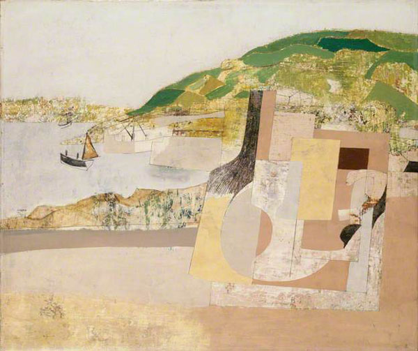
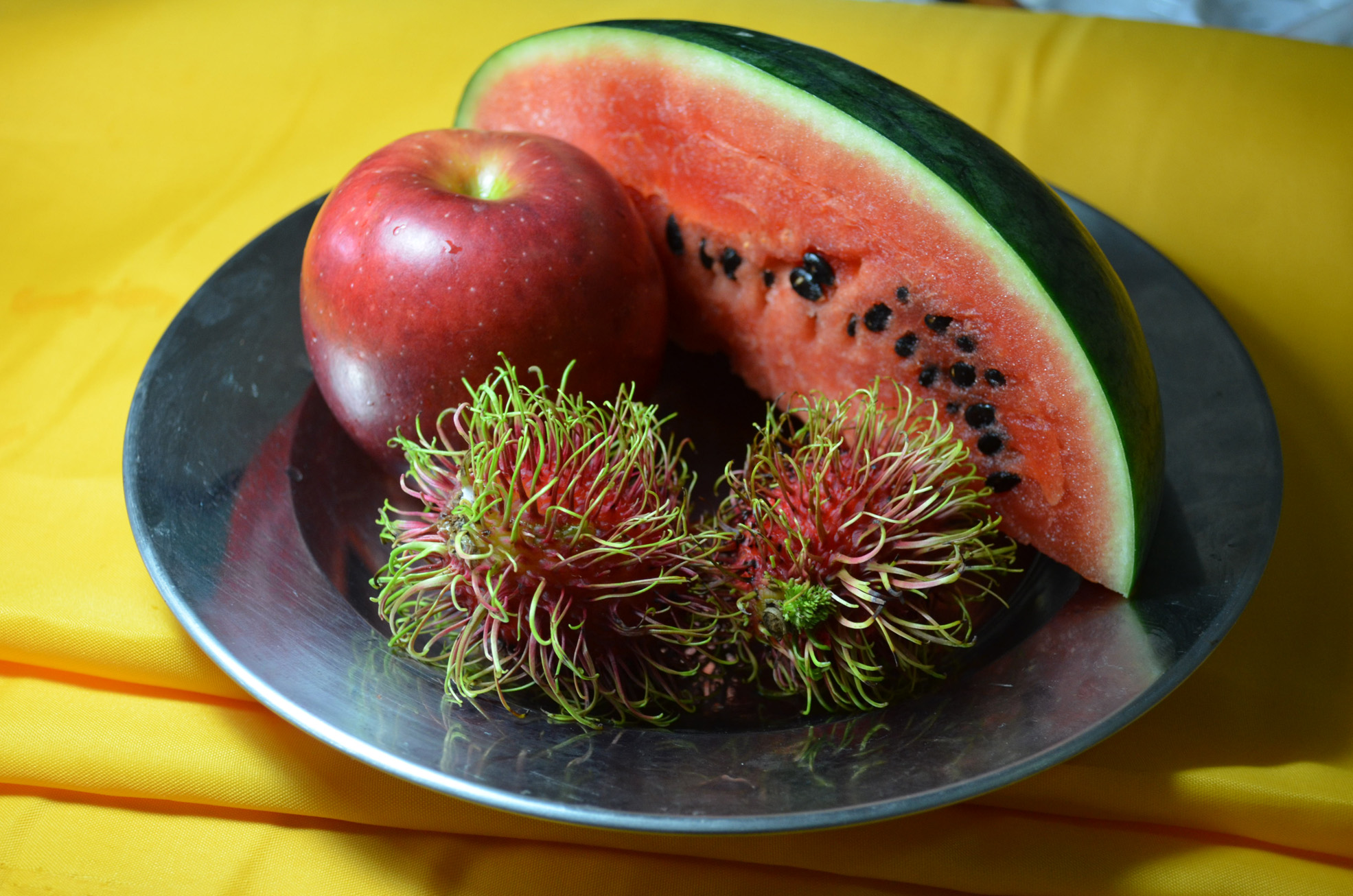
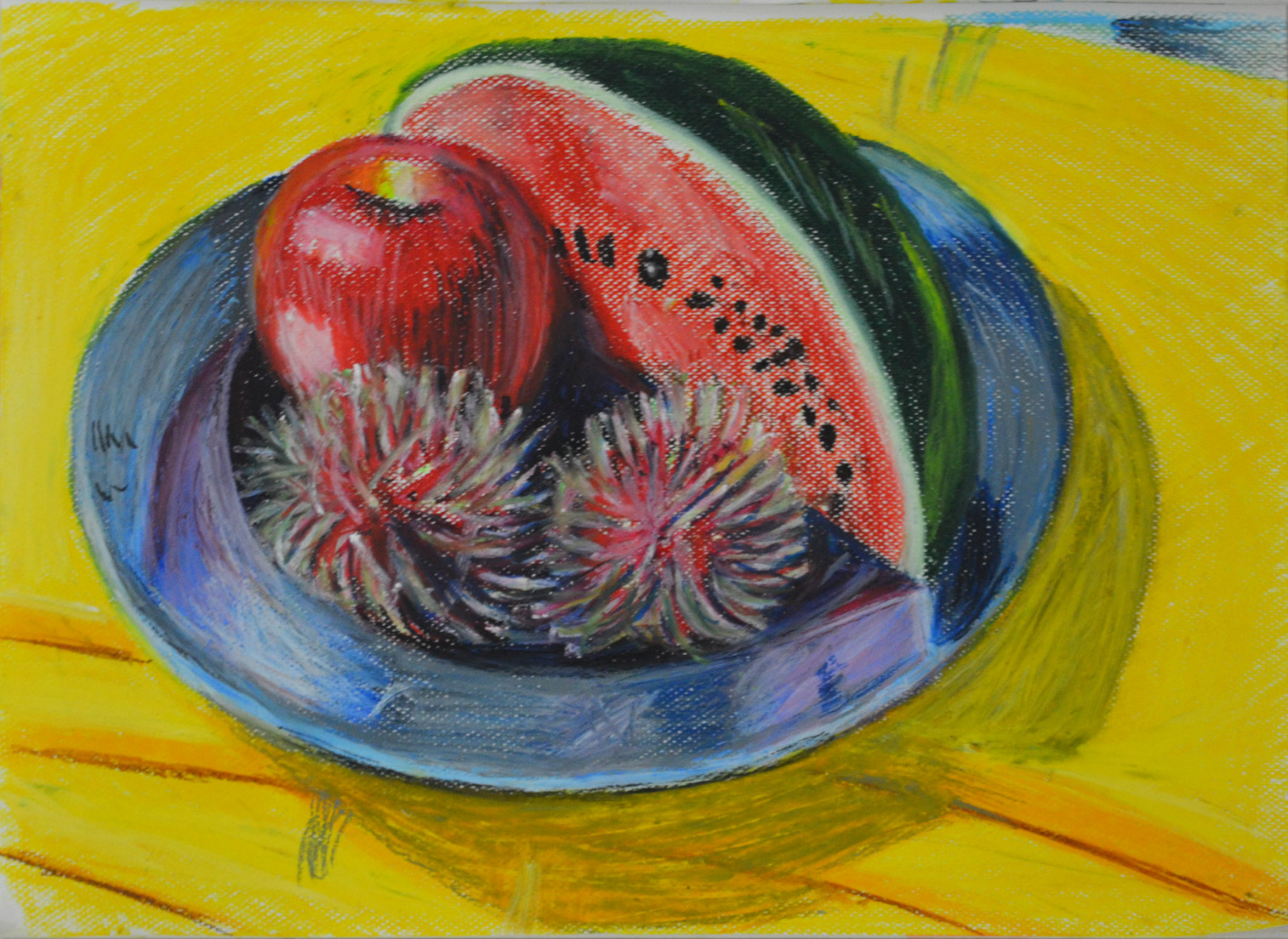
Ben Nicholson Mousehole 1947
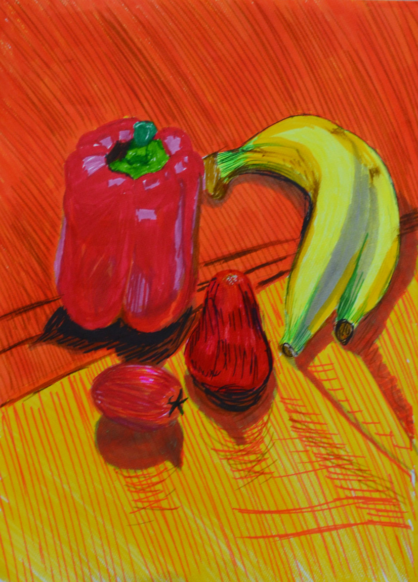
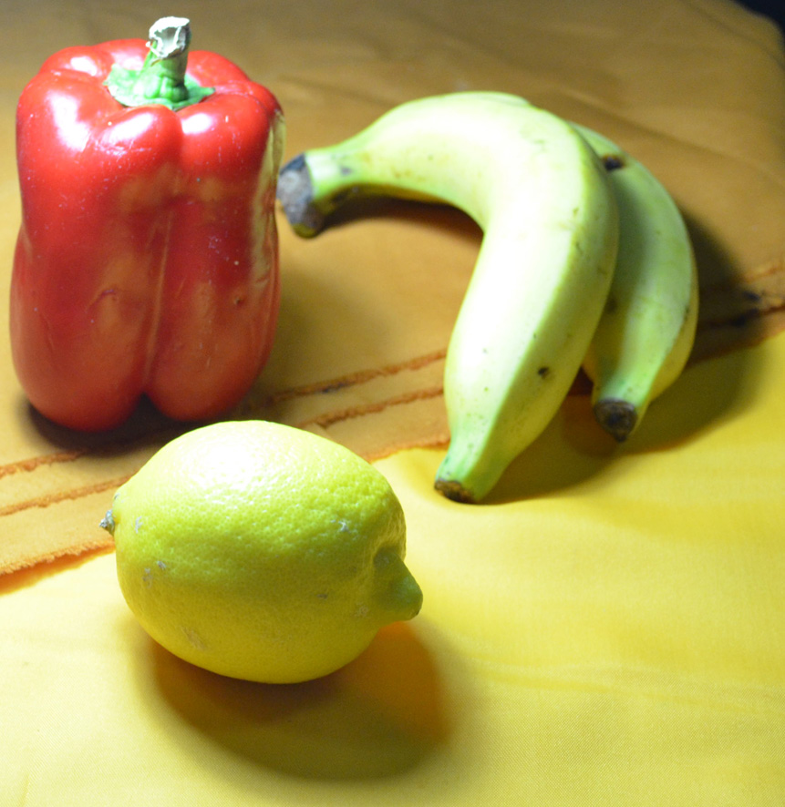
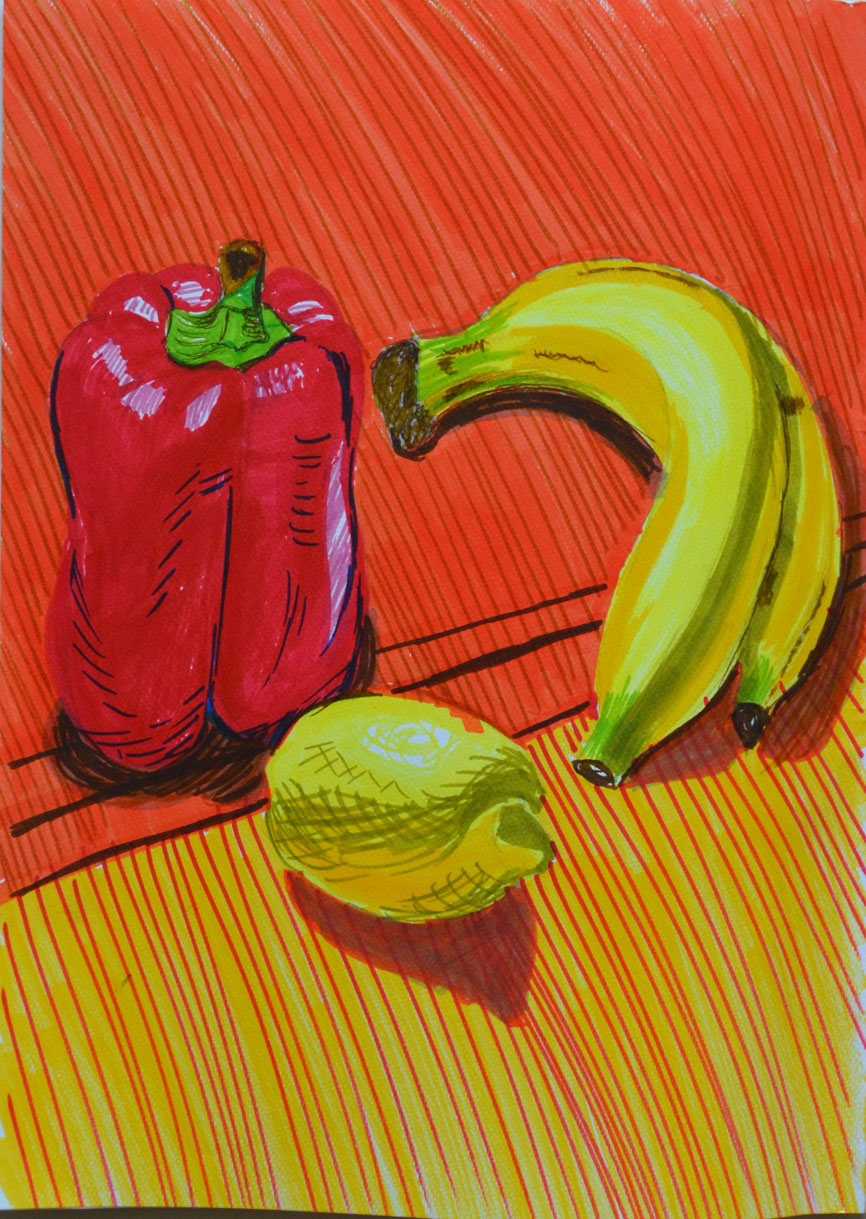
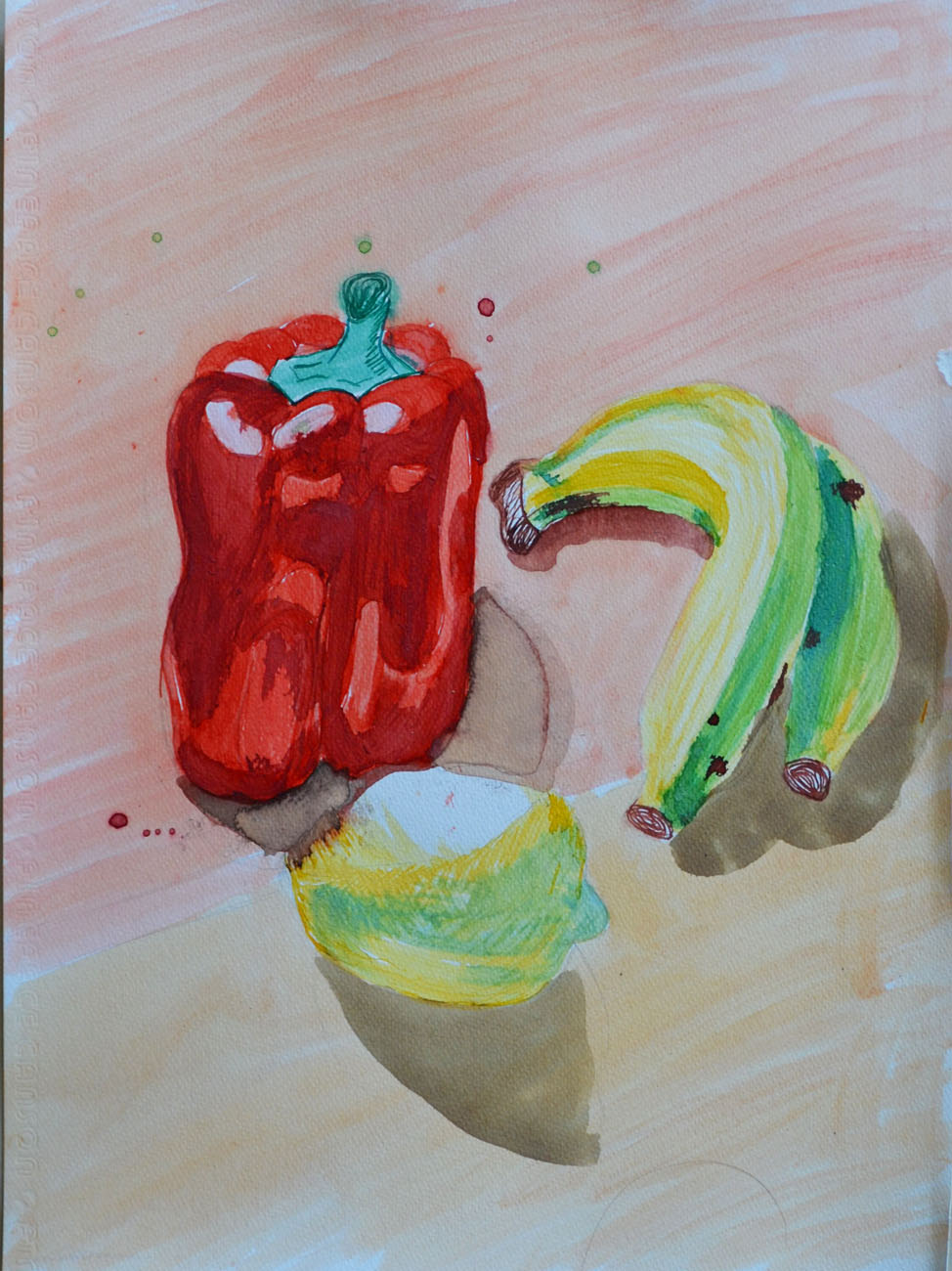
Why does he simplify still life forms and negative space and superimpose them on a Cornish Landscape?
I think the answer to this lies in the above text where it says Nicholson ‘resumed painting landscapes and added colour to his abstract reliefs to show the fundamental unity between nature and abstraction’.  Which maybe reflected in what he said in a letter from Nicholson to Patrick Heron (9 February 1954) ‘All the “still lifes” are in fact land-sea-sky scapes to me.’
Bibliography:

Drawing 1, Observations in Nature. Drawing Fruits and Vegetables in Colour, Using Oil Pastel

For this exercise I used approximately 13 different colours of oil pastel and a white textured sheet of A3 watercolour paper and I’m kicking myself now reading the brief where it says usecoloured paper. However further down the page it does say leave gaps to let the white break through so it’s easy to see how I got confused.
I set up a colourful group of fruit which included a quarter of watermelon, a red apple and two ramhutan or ‘gno’ as they are known in Thai, concentrating on creating a group of contrasting colour and texture I set them on a stainless steel reflective plate which I bought with the intention to use in the earlier exercise ‘Shadows and Reflected Light and Shade‘, and placed the composition on a piece of folded cloth used to make Thai monks robes.
Drawing Using Oil Pastel - Chosen Composition
Drawing Using Oil Pastel – Chosen Composition
First of all I lightly sketched in the main shapes of the group doing my best to fill the paper including the main shapes of the cast shadows on the cloth underneath, I think this was my best attempt at filling the paper so far.
I then started to block in the darkest areas using a sketchy hatching technique, I’m trying to be more fluid in this part of the course and I think I’m doing well so far. From there I went on to sketch the light areas in a different colour, on the watermelon and apple at least.
Once the initial layers of colour were blocked in I worked back over them to strengthen the tone using related colours on each object to strengthen the tone.
Drawing Using Oil Pastel - Finished drawing
Drawing Using Oil Pastel – Finished drawing
Approximate breakdown of colours used on objects
Watermelon:
On the flesh of the watermelon I used pink, red, a very dark red and a dark blue to create shadow as well as black and white for the seeds. For the skin I used a dark green a light yellow and a grey-blue colour.
Red Apple:
For the red apple I used ultramarine, red, orange and pink for the skin and green, yellow and orange for the core, these colours worked really well together.
Rambutan:
On the rambutan I worked from light to dark then back again and they were probably the hardest thing I’ve drawn so far. For these two objects I used all of the above colours but it took me a very long time to build up the layers and to get them looking anywhere near they did in real life. Although they are not perfect I really love the effect I have created while working on them. They are a very irregular shape and yet I have still managed to make them look round and spiky.
The Plate:
Same again on the plate, because it was so reflective I used a lot of the colours utilized for the fruit plus a light blue, grey and white.
This is the first time I have worked with oil pastels other than experimenting and I found that you have to know when enough is enough for danger of messing up your drawing.
I’m very impressed with the finished picture, but what is worrying me now is how I am going to preserve it, I have sprayed it a few times with an expensive fixative already but I used cheap pastels by Pentel and it doesn’t look like the fixative is not going to do any good…

Drawing 1, Part 2 Observations in Nature, Drawing Fruits and Vegetables in Colour, Using Markers and Dip Pens

For me this was a stressful exercise that took me over two weeks to complete. I initially wanted to focus more on dip pens and ink for this exercise but it was a mediu I would continue to have problems with.
I started with markers as I already had a good choice of Kurecolor Markers, with a composition that consisted of vine tomatoes, bananas and an apple however I failed miserably looking down at the apple at that angle plus I didn’t have the right colour for the apple.
Using Markers First Composition
My second composition consisted of a red pepper, bananas a rose apple and plum tomato set on a back drop of two different coloured materials used to make monks robes; but then when I drew the composition in markers on the watercolour paper there was too much red in the picture and the colours weren’t brilliant enough for me.
Using Markers or Dip Pens - 2nd Composition
Using Markers or Dip Pens – 2nd Composition

Composition in Marker Pens
I setteled for a simple composition made up of the bananas, red pepper and lemon that I managed to find in an international supermarket as the Thai lemons are very small and green kind of like a lemon/lime hybrid.

Using Markers or Dip Pens - Final Composition
Using Markers or Dip Pens – Final Composition
Firstly I drew them in marker pens which wasn’t too difficult but getting the colours right before putting pen to paper was almost impossible as the markers reacted differently on the watercolour paper especially when layering at this stage I wasn’t really looking at the shadows and light formations of the surface of the pepper and just added a bit of depth with a dark blue which didn’t work well enough for me.
Chosen Composition in Marker Pens
I finally got round to using dip pens and at this stage I felt like packing in. Firstly I started with liquid water colour which did not stay well on the pen nibs I made several attempts which all got binned before going out to look for higher quality watercolour paper that wouldn’t get saturated as easy and some proper drawing inks.
1st Attempt at Dip Pens
1st Attempt with Ink and Dip Pens
My first attempt with dip pens, ink was a disheartening mess and I was trying to work out what I was doing wrong, inks were running into each other and the paper was still getting saturated. Realising that I wasn’t giving the inks on each object enough time to dry before adding different colours I decided to have another go.
2nd Attempt at Dip Pens
2nd Attempt with Ink and Dip Pens
My second attempt with ink and dip pens was an improvement but I decided that I would use markers on the final piece as I could capture the reflected light and shadows on the pepper a lot better with different coloured marker pens and so started work on my A4 piece,
Final Drawing on A4
Final Drawing on A4
I did use a bit of ink on the final piece with a lemon yellow was over the lemon and a dark wash for the shadows which was a bad decision and a couple of ink splashes finished it off. The final piece is not brilliant but I do feel it is an improvement to the earlier drawings and I think I did really well to capture the patterns on the peppers surface.

Drawing 1, Part 2 Observations in Nature, Drawing Fruits and Vegetables in Colour, Using Hatching to Create Tone

For this exercise firstly I was to select some pieces of fruit and vegetables and draw each of them individually in my sketchbook in a medium of my choice paying attention to the shapes or planes that make up the objects outline.
I decided to use colour pencils for this exercise as I needed more practise and have yet to get used to blending. I initially chose an onion, a cucumber and some strange Asian mushrooms for my composition but all that was to change.
Then I was to write my thoughts and ideas next to the sketches including some notes about tonal values and ideas about the arrangement of a composition and use a view finder to crop some of the shapes in different positions.
Using Hatching to Create Tone - Initial choice of objects
Using Hatching to Create Tone – Initial choice of objects
As a view finder I used my camera sometimes looking at a photo of the composition you notice things that you wouldn’t notice with the naked eye. It took me at least two hours to decide on the composition and what fruits and vegetables to change and the angle from which I would draw from, trying my hardest to stay away from similar layouts to the compositions I had used in earlier drawings.
Using Hatching to Create Tone - Orange, apple and dragon fruit
Using Hatching to Create Tone – Orange, apple and dragon fruit
I swapped the Asian mushrooms/toadstools for an orange and an apple as I could use them in different positions and together with the onion the three spherical objects looked great with the cucumber. They also picked up the reflected light from the pink cloth that I decided to use as a backdrop very well.
Using Hatching to Create Tone - Composition
On an A3 sheet of paper I lightly sketched the outline of the objects with a 2H pencil and began to hatch working on the cucumber first but not finishing and then moving to the other objects to see how the cucumber looked against them this helped me decide on tone and colour of the cucumber being the more awkward of the 4 objects.
Using Hatching to Create Tone - Finished Drawing
Using Hatching to Create Tone – Finished Drawing
After working on the other 3 objects I came back to the cucumber which I had to reshape a little bit with an eraser. I’m quite happy with the finished drawing I think the composition fills up the picture plane quite nicely, and I think I did quite a good job with the hatching which I think is more fluid than anything I have done before. Probably the most difficult part of the drawing is the props I used the slightly transparent cloth and the straw basket.
The only think I am not satisfied with really is my photo skills and will try and get a better photo to send in for assessment.
View more Drawing fruits and Vegetables exercises on my my Drawing 1 working log

Tuesday, 7 October 2014

Drawing 1, Part 2 Observations in Nature, Still Life - Still Life Group in Tone

After the last exercise 'Still Life Group Using Line' this exercise sounded like it was going to be a breath of fresh air and indeed it was...
Still Life Group in Tone
I started with a bit of a study to firstly get the right composition for this exercise and then to try out different colours so I could find three colours that would give me three different tones for this drawing. I feel like I cheated on this exercise as I chose objects that could be drawn easily enough with just three colours, a yellowy green banana, an apple and two green bananas but I just started a high fruit diet the week before and I used objects that were at hand.
Like it instructed me in the brief I screwed up my eyes to take a look at the dark colours only and lightly sketched them in and then chose a different colour to sketch in the mid tones, then another for the light tone. On completion of the initial sketch I decided that my darkest colour was too light and so changed it for my final drawing.
Still life group in tone
I changed the composition of my final drawing slightly so I could depict the full form of the apple and I'm glad I did. The final drawing took me less than two hours going at a really steady pace and I am really satisfied with the completed drawing and my choice of colours, It would have been nice to apply a fourth colour though and also maybe a variation in orange and reds.
The one thing I am not happy with is the amount of blank space I left on the paper but I tried to make up for this by shading with my darkest colour.

Wednesday, 14 May 2014

Drawing 1, Part 2 Observations in Nature, Detailed Observation, Line Drawing Detail

For this exercise I was to select an object with interesting detail such as a sliced through red cabbage or a fir cone. Then on a sheet of A4 paper create a line drawing of the object that I set up, taking time and effort to really look at the patterning, thickness of line, texture and shape of the overall composition. The brief also said that I was to position the drawing well on the paper and fill the paper effectively with a continuous line drawing and no shading which is what I TRIED to do...
I made a few attempts at this with two different subjects, both of which were green peppers but in the Bangkok heat they go off pretty quick. With the first pepper every attempt was a continuous drawing with minimum detail, I used the thick nib of a double tipped felt pen and although the subject fit well on the paper, I didn't give it a strong enough light source to pick up all the detail and too be honest the finished drawings at that line thickness all looked somewhat pathetic.
Exercise - Line Drawing Detail First Subject
I gave it a week with another exercise in between before I had another go at this exercise. Visually the drawings with the second subject look a lot better, I used the finer nib of the felt pen and this time after I completed what I could do continuously without taking my pen off the paper I decided to add the detail which were the ribs on the inside of the pepper that I could see from wisely using a light source this time.
Exercise - Line Drawing Detail Second Subject 1
Exercise - Line Drawing Detail Second Subject - Image A
I probably did go a bit overboard and it does look like I have had a go at shading the object but this is all down to the closeness off the lines on the inside of the pepper. However I am quite happy with the results.
Exercise - Line Drawing Detail Second Subject 2
Exercise - Line Drawing Detail Second Subject - Image B
The thing that I am not happy with however is the positioning on the paper and how much space I left to the sides and underneath it. When drawing an object such as a pepper with a very irregular shape I think it's best if you know where to start, in Image A above I started at the core just above the seeds. With Image B I started at the tip of the stem Starting near the center of the image was better with this object but that would differ with something like a cabbage.

View my full Drawing 1 Learning log

Drawing 1, Part 2 Observations in Nature, Research Point, Masters of Detailed Drawing, 19th Century Thomas Hartley Cromek

For this research point I was asked to find two artists who exemplify mastery of detailed drawing.
I used to have a reproduction painting site and am familiar with the works and lives of quite a few but since starting this course I've been introduced to new artists and new techniques so I thought I'd carry that on by typing in a few keywords on Google to see where they took me.
The first artist I found was a 19th century artist called Thomas Hartley Cromek and after seeing that his place of death was Wakefield, my home town, I made the decision to research this artist a little more.
Born in London in 1809 Thomas Hartley Cromek was the son of Robert Hartley Cromek the  engraver and art dealer who allegedly cheated William Blake out of potential profits. In his childhood he moved from school to school starting off his education at Enoch Harrison's school in Wakefield and then onto the Moravian School in Fulneck. He then moved back to Wakefield to study at the grammar school there before returning to Harrison's.
Thomas Hartley Cromek received his first art lessons from a Wakefield based portrait painter, James Hunter but then in 1826 he moved to Leeds study landscape painting under Joseph Rhodes, while studying in Leeds Thomas also taught himself anatomical drawing.
He travelled to Italy in 1830 to study the old masters and spent most of the next 20 years within the country mainly in Florence eventually reaching Rome where he attracted much attention for his 'excellence in drawing and his careful colouring' - Wikipedia. While in Rome he gave drawing lessons to several distinguished visitors including the British artist and poet, Edward Lear.
Between 1831 and 1849 Thomas Cromek spent most of his time drawing the major buildings in Rome as well as Greece but then was forced to leave Rome with the outbreak of the first Italian War of Independence.
There's not much information about Thomas Hartley Cromek online about techniques, ideas, influences etc but I did find quite a few images.
Study of Plants, Ariccia Watercolour, over traces of a pencil underdrawing.
Study of Plants, Ariccia
Watercolour, over traces of a pencil underdrawing.
I found many of his works online but it was the drawing above that caught my eye and I thought it was quite relevant to this module. The drawing itself is only 7 1/4 x 8 1/8 in in size and yet his brilliant use of shadow amplifies the detail of the drawing. I enlarged this image on my computer to the size he would have worked at and was amazed how much detail he has got into such a small drawing with what I still regard to be a messy medium, for me that is anyway. He has managed to depict some very thin leaves and blades of grass and makes this picture seem a lot bigger than what it is.
THE TEMPLE OF ANTONINUS AND FAUSTINA, FORUM, ROME - WATERCOLOUR 18 1/4 X 13 INCHES
 Just like his drawing of plants and flowers his watercolour paintings of buildings such as the Temple of Antoninus above shows brilliant detail and colour as well as amazing shadows which really amplify the bulkiness of the stone structure.
Bibliography

Drawing 1, Part 2 Observations in Nature - Research Point: Masters of Detailed Drawing - Modern Artist, Eliot Hodgkin

For this research point I was asked to find two artists who exemplify mastery of detailed drawing 1 from the 19th century or earlier and a modern artist. I already researched the 19th century artist Thomas Hartley Cromek in 'Masters of Detailed Drawing 1, 19th Century, Thomas Hartley Cromek' and it was now time to find a Modern artist. Again I wanted to find an artist that I wasn't familiar with so I started my search on Google looking for British artists of the 20th century. A list of names of British artists came up on Wkipedia so I went down the names looking at their work 1 artist at a time.
I came across the name Eliot Hodgkin, a name that I was very familiar with but I'm not sure from where so I took a look at his work to see if I recognised any of his paintings. I had never seen any of his paintings before but what I did see was truly inspiring and perfect for this part of the course. With the image below Large Leaf 2 particularly catching my eye as near my school there are some very similar large leafs that I would love to draw for this part of the course.
Eliot Hodgkin Large Leaf 2 Tempera on Card
Curwen Eliot Hodgkin was an English painter born into a Quaker family in Purley-on-Thames on 19 June 1905 and was the cousin of abstract painter Howard Hodgkin. Eliot Hodgkin was educated at Harrow School but his artistic life began at the Byam Shaw School of Art and then at the Royal Academy Schools where he studied under Francis Ernest Jackson.
Eliot Hodgkin Seven Brussel Sprouts
Hodgkin had already established himself as a still life and landscape painter by the mid-1930s and regularly exhibited at the Royal Academy. In 1937 Hodgkin started working in egg tempera a recipe that was given to him by his close friend and former teacher Maxwell Armfield.
Hodgkin stated that he wasn't attracted to tempera as a medium as it was used by Italian primitives and their work did not do anything for him, he simply used tempera as it was the only medium that allowed him to express the unique character of the objects that fascinated him.
Hodgkin said that his conscious purpose was to 'show the beauty in natural objects'- that people would usually think unattractive such as 'Brussels sprouts, turnips, onions, pebbles and flints, bulbs, dead leaves, bleached vertebrae, an old boot cast up by the tide.'
When i did a search for his paintings and saw his work the first thing that went through my mind was how beautiful his paintings were and yet his compositions are so very simple. I have heard of tempera before but as far as I know I have never seen anything painted in it until now and I knew at firs glance that they were painted in a medium other than oil or acrylic.
He depicts the texture of his objects wonderfully and his paintings are so crisp and life-like but still he manages to express them in a way that makes u aware of the beauty of these objects for the first time with wonderful contours and a brilliant balance of light and dark tone, whether it be a dead leaf or a toilet roll.
Toilet Rolls Eliot Hodgin
Like Eliot Hodkin Says ' People sometimes tell me that they had never really ‘seen’ something before I painted it, and I should like to believe this… For myself, if I must put it into words, I try to look at quite simple things as though I were seeing them for the first time and as though no one had ever painted them before.'
For me I agree with others that to see these objects in his paintings is to 'see' them for the first time with detail and beauty that you would never notice before. Hodgkin really makes you notice every part of the object, every leaf, every crease and every pattern on the objects surface.
Bibliography - Wikipedia

Drawing 1, Part 2 Observations in Nature, Exploring Coloured Media - Check and Log

Which of the media you have experimented with did you find the most expressive?
From experimenting with the different colour media in this exercise I would probably say at this stage that the oil pastel is the most expressive. Oil pastels seem to allow more sketchy fluid strokes and seems to work well with all the techniques that I have practised so far.
Which medium do you think lends itself to more detailed work?
From what I have seen so far I would say coloured pencils as well as ball point pen but then again I do not think I have worked with nib pens and ink enough at this stage to dismiss these as a medium for more detailed drawings

Sunday, 16 February 2014

Drawing 1, Part 1 Mark Making and Tone, Assignment 1 – Check and Log


Did you do enough preliminary work before starting on your final pieces?


Yes definitely, the preliminary work not only helped me decide on the best composition for the final piece but helped me to decide which mediums I should use. In both parts of this assignment it changed my mind about what mediums I would use and also the layout of the composition for the final piece. I probably could have done more with regards to colour blending and make more notes on which colours to use for the Natural Objects.
Do your large drawings give an accurate interpretation of the still life groups? If not, what went wrong?
The large drawing for Made Objects I believe was a very accurate interpretation of the still life group even after playing down certain details such as the amount of bars on the electric fan cage. However I I’m not too happy with the interpretation of the still life group in the large drawing for the Natural forms. There are certain shapes on the edge of the drawing that I know are not the same as the actual objects this was due to moving the objects about trying to find the composition that I chose to develop, then having to work from the drawings I had already done and photos that I had taken.
Did you make a good selection of objects or did you try to include too much?
I believe I made a good selection of objects for both parts of this assignment with a minimum amount of objects in mind as I set out on each project.
Do your drawings fit well on the paper, or could they be improved by working on a larger sheet of paper?
The drawings do fit well on the paper but I do feel that both compositions may have been improved on a larger A1 sheet of paper because of the objects that I chose for the Made Objects and for the medium that I chose for the Natural Forms.
Did you have problems with drawing, or find hatching too difficult?
I don’t feel that I have any problems with drawing, any problems that do have are probably from the lack of experience with certain mediums. In the Natural forms part of the assignment I thought I did quite well in developing my hatching skills with hard pastel.
View My Drawing 1 learning log here www.mydrawingcourse.com

Drawing 1, Part 1 Mark making and Tone, Enlarging an Image - Enlarging a Simple Flat Image


This exercise was aimed to give me further practice in enlarging original drawing with a slightly more complicated structure. For this exercise I chose a fancy jar of face cream (borrowed from my girlfriend), a roll on deodorant and a plastic Nasol bottle.


Enlarging a simple flat image -
Enlarging a simple flat image – initial sketches
To get familiar with the objects I did a quick 3 minute drawing of each one before putting them together for the composition in my A5 sketchbook. This helped me to recognise problem areas on the objects such as the top of the Nasol bottle that would have looked a mess too wide or too narrow.
Enlarging a simple flat image - A5 sketchbook
Enlarging a simple flat image – A5 sketchbook
As in the previous exercise ‘ Enlarging an Existing Image’ I drew the composition of three objects in my A5 sketchbook and drew a grid of 2 cm squares over the top of the composition with an HB pencil. Just as in the previous exercise I labeled the squares by writing numbers across the top and letters down the right hand side to stop any confusion to which squares I would be drawing in.
From there I drew a grid of 3 cm squares in my A4 sketchbook, again moving the composition up the page by taking away the A row in the grid then reproduced the drawing on a larger scale.
Enlarging a simple flat image - englarged sketch
Enlarging a simple flat image – englarged sketch
Again, I really loved this exercise it was so simple and easy, I erased the odd line due to points of contact on the grid being slightly wrong, but the results of drawing these 3 objects were actually better than in the first object. I think this  was down to viewing all three at once rather than trying to look for faults on the angles and curves of one single object.
Enlarging a simple flat image - Side by Side
Enlarging a simple flat image – Side by Side

View My Drawing 1 learning log here www.mydrawingcourse.com

Wednesday, 24 April 2013

Drawing 1, Part 1, Mark Making and Tone, Still Life - Check and Log


Do you think it is easier to suggest three dimensions on man-made or natural objects?
This project has taught me that it is easier to suggest three dimensions on man-made objects rather than natural objects. Man-made objects are usually made up of geometrical shapes such as cylinders, cones or cubes and so the lines of man-made objects are easier to draw and suggest their 3D form using most mediums. The irregular shapes of natural objects means that their three dimensional features are much more subtle with lines that are more difficult to depict and draw.
How did you create a sense of solidity in your composition?
In the exercise ‘Still Life Sketches of Made Objects’ I created a sense of solidity by using various hatching techniques and swapping between pencils of different hardness mainly B, HB and 2B, shadows and tone also played a big part in making the objects look solid.
exercise still life of made objects
Image 1: Exercise - Still Life of Made Objects
In the exercise 'Composition of Natural Objects' working with watercolor pencil I used hatching and layers of darker colour to show solidity.
Composition of Natural Objects
Image 2: Exercise - Composition of Natural Objects
Do you think changing the arrangement of your composition makes a difference to the way you create a sense of form?
Changing the arrangement of the objects changed the way each objects interacted with each other, shadows and light reflected off one object to another and other objects in the composition (such as the plate in image 2) can play a major role in creating a sense of form.
How did you decide how to position yourself in relation to the objects?
For the second exercise I decided to position myself slightly above looking down at the objects so I could see the full form of the the objects and shadows interacting with each other in the middle of the composition, I thought this would help me to create a sense of form in my drawing. A bruised rib from a an accident the day before helped me to reinforce this decision.

View My Drawing 1 learning log here www.mydrawingcourse.com