Showing posts with label oca drawing 1 course. Show all posts

Tuesday, 4 November 2014

Drawing 1, Part 2, Observations in Nature, Plants and Flowers in Coloured Pencils

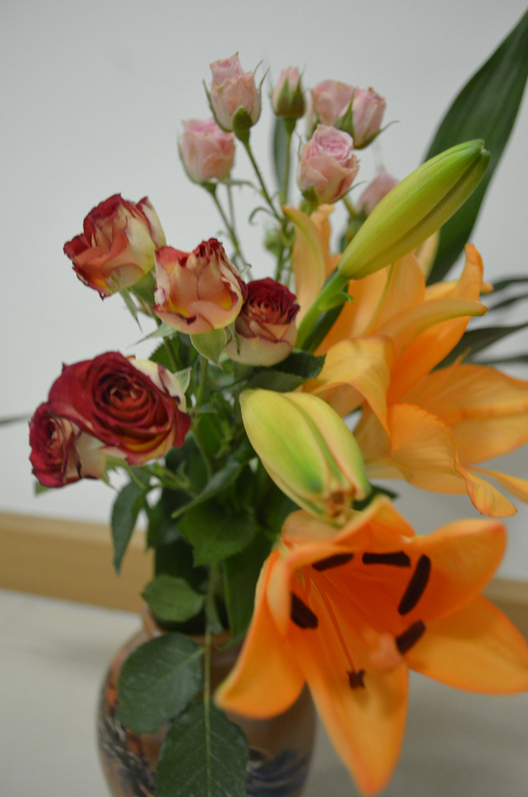
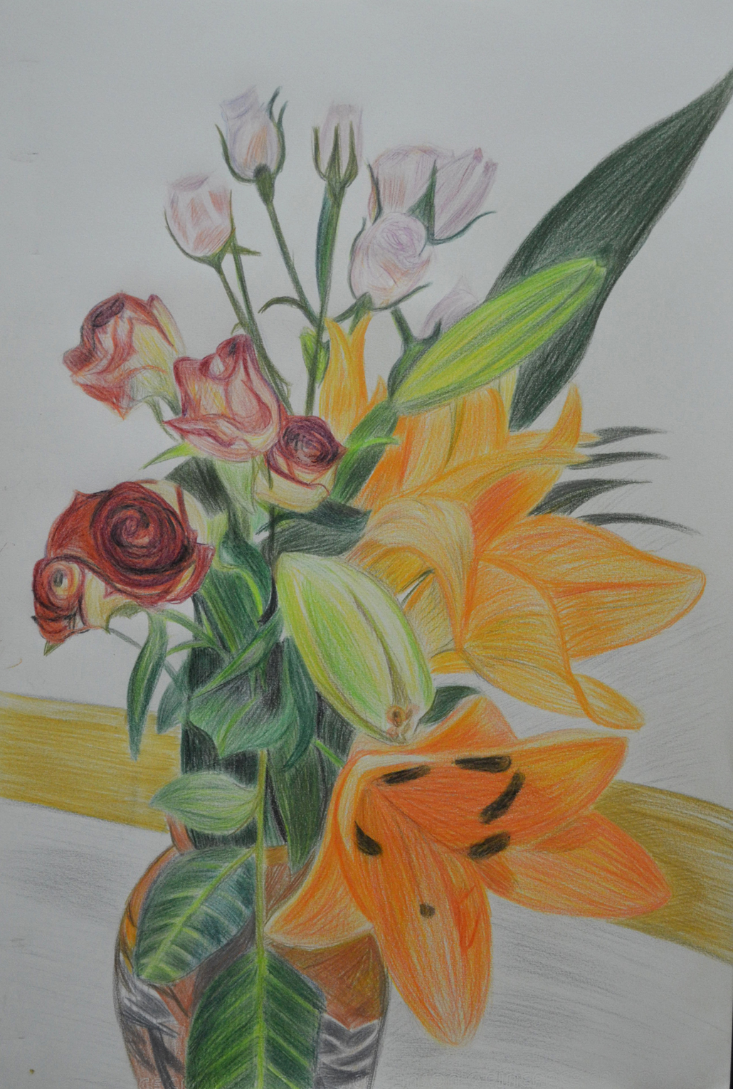
For this exercise I bought an assortment of flowers from the Tops supermarket while I was visiting my kids for a meal for my oldest daughters Birthday. The flowers I chose were orchids and some red and pink roses, I really was not thinking about shapes or colour when I purchased them but I am glad I made the choices that I did. On an A2 sheet of white paper I began to draw.
Roses and Orchids
Roses and Orchids
Now the brief said to experiment with different methods of blending in my sketchbook first, however I thought I had had enough practise blending colour with colour pencils so far in this course so I put pencil straight to paper, for the flowers this was no problem but for the leaves I wish I had done as the brief said and practised a little more.
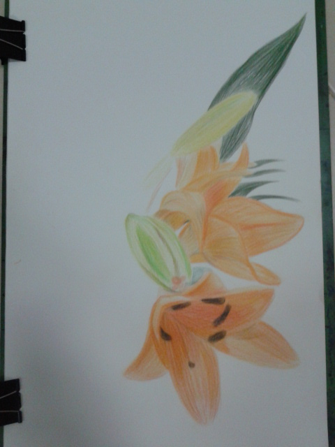
Drawing the Orchid
Drawing the Orchid
I began with a neutral colour for each subject starting with the orchid and working my way around the composition working on the most prominent flowers and leaves first keeping a careful eye on negative space.
Part way through the drawing I read the brief again to find out I had skipped over some valuable instructions:
  • Make the plant the focal point of your drawing but draw the background
  • Do not draw the plant in isolation
  • Draw in the context to give depth and substance to the drawing
The background I had chosen was a plane white wall with brown skirting boards and very pale floor tiles but I decided to carry on and I am glad I did. Using three different types of flowers with large leaves and petals on the orchid the composition and the vase I had placed them in made up the main subject and the background. Placing the largest flowers at the front and the smallest at the back helped me to create a nice three dimensional effect with the large orchid flower taking on the role as the focal point of the drawing.
I used different methods of blending for each of the flowers with layering used on all, the Still Life Group in Tone Exercise early on in this part of the course really helped using 3-4 colours on each flower but starting off with the lightest colour first and working my way to the darkest.
I used long strokes for the orchid to give it a stretching outwards feel and to me it almost seems like it as a life of its own.
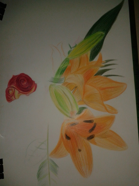
Drawing in the Red Roses
For the red roses I coloured them in a spiral motion then layered the darkest colours over the top rubbing out the colour from time to time to let the lighter colours show through.
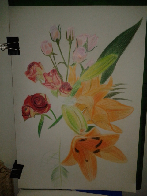
Flowers Complete
Flowers Complete
The pink roses were the most challenging of the lot with the colours and details being so delicate I decided to tackle them in a different way by hatching then squiggling over the top for the flowers where you can see the petals grouped together.
Aspects of the Drawing I am Satisfied with:
I am really happy with the 3 dimensional feel of the drawing and the way the different solutions I came up with to tackle each type of flower pad off. I am also very happy with way the drawing came together using the practise I had from the Negative Space in a Plant Exercise helped me to piece the drawing together like a jigsaw.
Plants and Flowers in Coloured Pencil
Aspects of the Drawing I am not happy with:
As always I wish I had read the brief again and again until I was clear on what I had to do but then this would have lead to a one or two plant composition  which would have probably been a lot less challenging.
I wish I had practised blending colours in my sketch book if just for the leaves and stems, although not all the leaves and stems are clearly visible I can see that I definitely could have improved on the blending on those parts of the flowers.
The final drawing is very sketchy although this is a big difference from some of the final drawings in part 1 of this and I know I allowed the the sketchy artist I researched earlier to influence me in this exercise I would have preferred a more realistic finished  drawing.

Tuesday, 7 October 2014

Drawing 1, Part 2 Observations in Nature, Still Life, Still Life Group Using Line

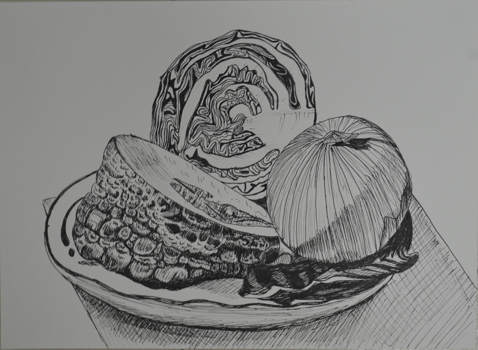
In the brief for this exercise I was to set up a still life group out of objects at my disposal, either objects that naturally connect together or deliberately contrast. For this I did a supermarket shop and purchased onions, a big chunk of knobbly Asian pumpkin and a red cabbage thinking about three objects that gradually went from rough to smooth.
I had to think about the following questions: 'How will I treat the objects?', 'How will their connections be clear?', 'How will I capture the differences between the objects?', 'How do the objects relate to their background? and 'How will I reference the colour in the group in this drawing?.
Then with these questions in mind I had to select a medium such as pen and ink, marker pens or fine black pen and A3 paper and begin to draw; which is exactly what I did. I wanted to use pen and ink for this drawing as I have kept delaying it but when i saw I would be using them in the next project I decided to use a Rotring 0.3 drawing pen.
My objects had already been in the fridge a couple of days so they wouldn't last long once I took them out and my SD card for my camera kept locking due to me removing it too often so I had to work fast as I couldn't get a photo to work from in case I didn't finish before evening came.
 Still Life Group Using Line 1st Drawing
Still Life Group Using Line 1st Drawing
There was no drawing this out in pencil first for me, I wanted to do start as I meant to go on and and put my Rotring drawing pen to paper. I started on the outline of the three objects together rather than drawing them individually then when the outline was complete I finished the shape of each object individually.
From there I started on the lines of the onion which were fairly simple and while I worked my way around the onion with a variation of light and dark lines (applying different pressures) I thought about how I was going to approach the different objects. Working from right to left I tackled the red cabbage next and it was extremely difficult; trying to view the patterns as a whole and then working on the lines individually was enough to drive me crazy.
The pumpkin was the next obstacle and because this was a still life group using line I had to exaggerate the texture of the pumpkin at certain parts where there was no real pattern at all. It looks like I have tried my hardest to depict tone here but actually I wasn't thinking about tone at all. I was just trying to complete the surface of the pumpkin with as many different line as possible, squiggly lines, short strokes, anything that came to mind.
The cabbage leaf on the right of the drawing was probably the most difficult object in this drawing and was very difficult to draw without hatching to depict it's smoothness which I wasn't very successful in doing so.
Then when I finished the composition I ruined the whole picture by doing some stupid speckle background and so I decided to have another go.
Still Life Group Using Line 2
This time I tried a slightly different angle and the finished drawing was cleaner but there are a lot more things that I am unhappy with. For one I don't know how the cutting board got so out of shape the cabbage leaf didn't turn out that great and the pumpkin surface was a little too exaggerated but certain parts of the pumpkin surface turned out a lot better.

Drawing 1, Part 2 Observations in Nature, Detailed Observation - Check and Log

Which drawing media did you find most effective to use, for which effects?
For me I love pencils I've been developing my pencil skills more and more on this course and I have got to the stage where I am doing less and less smudging and more and more hatching using my pencil at different angles with different holding techniques. I really think I did well depicting the tone of the wood and especially the bark in the 'Getting Tone and Depth in Detail' exercise. However I was very happy with my stippling with the Rotring drawing pen on the 'Stipples and Dots' exercise, not only being able to depict the tone of the leaf but also it's texture.
What sort of Marks work well to create tone and texture?
I used a variety of hatching to depict the texture of the tree branch with sporadic hatching to depict the bark and fluid lines and hatching to show the stripped wood all these marks worked really well. I thought I had chosen the wrong type of subject for the stipples and dots exercise but I think I showed the texture of the object really well with dots and patterns of stipples to show creases in the dying leaf.
Did you enjoy capturing details or are you more at home creating big broad brush sketches?
I must admit that capturing details with stipples and dots was a bit tedious but I am delighted with the finished drawing and I really enjoyed working on the tree branch in the first exercise so I can probably say that I am more at home capturing details.
Look at the composition of the drawings you have done in this project. Make some sketches and notes about how you could improve your composition.
The composition and the angles of the subjects that I chose were thought about long and hard before embarking on these exercises, I feel I chose the best compositions that I could to not only capture the full beauty of the objects but to fill the paper.

Wednesday, 14 May 2014

Drawing 1, Part 2 Observations in Nature, Exploring Coloured Media - Check and Log

Which of the media you have experimented with did you find the most expressive?
From experimenting with the different colour media in this exercise I would probably say at this stage that the oil pastel is the most expressive. Oil pastels seem to allow more sketchy fluid strokes and seems to work well with all the techniques that I have practised so far.
Which medium do you think lends itself to more detailed work?
From what I have seen so far I would say coloured pencils as well as ball point pen but then again I do not think I have worked with nib pens and ink enough at this stage to dismiss these as a medium for more detailed drawings

Sunday, 16 February 2014

Drawing 1, Part 1 Mark Making and Tone, Assignment 1 – Check and Log


Did you do enough preliminary work before starting on your final pieces?


Yes definitely, the preliminary work not only helped me decide on the best composition for the final piece but helped me to decide which mediums I should use. In both parts of this assignment it changed my mind about what mediums I would use and also the layout of the composition for the final piece. I probably could have done more with regards to colour blending and make more notes on which colours to use for the Natural Objects.
Do your large drawings give an accurate interpretation of the still life groups? If not, what went wrong?
The large drawing for Made Objects I believe was a very accurate interpretation of the still life group even after playing down certain details such as the amount of bars on the electric fan cage. However I I’m not too happy with the interpretation of the still life group in the large drawing for the Natural forms. There are certain shapes on the edge of the drawing that I know are not the same as the actual objects this was due to moving the objects about trying to find the composition that I chose to develop, then having to work from the drawings I had already done and photos that I had taken.
Did you make a good selection of objects or did you try to include too much?
I believe I made a good selection of objects for both parts of this assignment with a minimum amount of objects in mind as I set out on each project.
Do your drawings fit well on the paper, or could they be improved by working on a larger sheet of paper?
The drawings do fit well on the paper but I do feel that both compositions may have been improved on a larger A1 sheet of paper because of the objects that I chose for the Made Objects and for the medium that I chose for the Natural Forms.
Did you have problems with drawing, or find hatching too difficult?
I don’t feel that I have any problems with drawing, any problems that do have are probably from the lack of experience with certain mediums. In the Natural forms part of the assignment I thought I did quite well in developing my hatching skills with hard pastel.
View My Drawing 1 learning log here www.mydrawingcourse.com

Drawing 1, Part 1 Mark making and Tone, Assignment 1 – Natural Forms


Getting started with this part of the assignment was quite difficult as it is hard to find good natural forms in Bangkok and did not have time to leave the city for the countryside. So I  collected pebbles from the car park of my apartment and in front of the office block where my language centre is and also went out with a pair of scissors and took a couple of cuttings from plants in the garden downstairs. Overall I was quite happy with the objects I chose.


Assignment 1 - Natural Forms - Finished Drawing
Assignment 1 – Natural Forms – Finished Drawing
After the very technical composition of the made objects I wanted to show a complete variation with something more simple and the objects I chose allowed me to do so. I originally intended to do the finished drawing in colour pencil but as I began the project things took a different path.
Assignment 1 - Natural Forms - Composition Studies
Assignment 1 – Natural Forms – Composition Studies
Working on the composition studies it was like a breath of fresh air compared to the composition studies of the made objects so much so that I may have moved a bit too quickly with fast strokes and very sketchy outlines. The leaves the plants that I had brought in to draw were not going to wait for me as they had started to wither as soon as they felt the air-conditioning of my living room, so working quickly was very necessary. I tried a few compositions with three and four pebbles eventually settling for one of the easiest compositions possible and so worked on it a little more and got it ready for enlargement.
Assignment 1 - Natural Forms - Composition Development
Assignment 1 – Natural Forms – Composition Development
The next step was to experiment with different mediums to help me decide exactly which one I would be using for the finished piece. By this stage the plants were well on their way to the grave, so I took several shorts with my camera so that they would help me later, unfortunately I did not take a photo of the composition I had chosen this would prove to be a problem later.
Assignment 1 - Natural Forms - Variations and Materisla Used
Assignment 1 – Natural Forms – Colour Pencil and Hard Pastel
I actually wanted to try soft pastel but then when I opened the box up I realised I had purchased a portrait set which would be no good for this project.So I tried both colour pencil and hard pastel. I don’t like the feel of colour pencil on paper, they are ok for lighter work but for work that needs more darker tones you have to press on and it makes me feel uptight as the pencil drags across the paper. Hard pastel is different on different types of paper on the Canson sketching paper it can not be smudged but is great for sketching. I decided that I would develop the composition in colour pencil and use hard pastel for the finished drawing.
assignment 1 - Natural Forms - Composition Development - Colour Pencil
assignment 1 – Natural Forms – Composition Development – Colour Pencil
Drawing a grid onto another A3 sheet from my sketchbook I enlarged the drawing and completed it in colour pencil to see how it would look. I was satisfied with how it looked but I wasn’t satisfied with the waste of paper around the edges. There was a very minimum amount of shadow in this composition and so I had to take advantage of the negative space between the objects and cropping the composition would help me to do just that. I had already erased the grid I drew when enlarging the previous drawing so it was a great chance to use the acetate grid I made in the Enlarging an Image module.
Assignment 1 - Enlargement Grid
Assignment 1 – Enlargement Grid
By this time the plants had withered up and I had forgotten to take the photo of this composition so I was working between this drawing in colour pencil and various photos. I was worried that I would just be smudging on this piece especially with my chosen medium and not be able to demonstrate anything I have learnt in the first part of the course but apart from smudging on the rocks and pebbles I managed to resist the temptation of smudging and complete it with some nice hatching and fluid strokes.
Assignment 1 - Natural Forms - Finished Drawing
Assignment 1 – Natural Forms – Finished Drawing
There are certain parts of the finished drawing that I am not happy with mainly the rock and the pebble in the top left they don’t look two bad but the shape is out on the sandy coloured rock and I couldn’t play with it that much for fear of messing up  the leaf and the white pebble which I did and used fixative before going over it again.
However, I am satisfied that I managed to make reference to certain projects in the first part of the course such as negative space, enlarging an image, tone and form, hatching and lines and other marks and managed to demonstrate quite a lot of these in the leaf and the purple plant alone. I do wish the rocks would have been more sketchy though but with the pastel paper that I used it was hard to do so without the paper underneath showing through.
composition of natural objects

Drawing 1, Part 1 Mark making and Tone, Enlarging an Image - Enlarging a Simple Flat Image


This exercise was aimed to give me further practice in enlarging original drawing with a slightly more complicated structure. For this exercise I chose a fancy jar of face cream (borrowed from my girlfriend), a roll on deodorant and a plastic Nasol bottle.


Enlarging a simple flat image -
Enlarging a simple flat image – initial sketches
To get familiar with the objects I did a quick 3 minute drawing of each one before putting them together for the composition in my A5 sketchbook. This helped me to recognise problem areas on the objects such as the top of the Nasol bottle that would have looked a mess too wide or too narrow.
Enlarging a simple flat image - A5 sketchbook
Enlarging a simple flat image – A5 sketchbook
As in the previous exercise ‘ Enlarging an Existing Image’ I drew the composition of three objects in my A5 sketchbook and drew a grid of 2 cm squares over the top of the composition with an HB pencil. Just as in the previous exercise I labeled the squares by writing numbers across the top and letters down the right hand side to stop any confusion to which squares I would be drawing in.
From there I drew a grid of 3 cm squares in my A4 sketchbook, again moving the composition up the page by taking away the A row in the grid then reproduced the drawing on a larger scale.
Enlarging a simple flat image - englarged sketch
Enlarging a simple flat image – englarged sketch
Again, I really loved this exercise it was so simple and easy, I erased the odd line due to points of contact on the grid being slightly wrong, but the results of drawing these 3 objects were actually better than in the first object. I think this  was down to viewing all three at once rather than trying to look for faults on the angles and curves of one single object.
Enlarging a simple flat image - Side by Side
Enlarging a simple flat image – Side by Side

View My Drawing 1 learning log here www.mydrawingcourse.com

Drawing 1, Part 1, Mark Making and Tone, Still Life - Observing Negative Space and Perspective

This exercise of observing negative space and perspective involved following the silhouette of a group of objects that shared similar elements with a soft drawing tool such as soft pencil without taking it off the paper.
I drew in from the left using the furthest edge of the table as a starting point and followed the upper silhouette of the objects carefully assessing the silhouette and proportions of each object and changing the direction of the line as the silhouette of one object impacted off another.
Then I went back to my original starting point and followed the line until it reached the first object again then followed the bottom silhouette of the objects following the same steps as the top half. When the bottom half of the silhouette was complete I went back and drew in the details of the objects themselves.
Observing Negative Space and Perspective  1
Observing Negative Space and Perspective 1st Attempt
I used a 6B pencil for this exercise as I am still waiting for Derwent to send me replacements for my 7, 8 and 9B. I found the exercise quite difficult and frankly one that I should keep having ago at from time to time.
Observing Negative Space and Perspective 2
Observing Negative Space and Perspective 2nd Attempt
I made a few attempts without taking my pencil off the paper and I was actually very surprised when I drew the bottom silhouette and the objects looked something similar to what they did in my composition. There were a few errors in each of my attempts, vase to wide (starting to draw it too early and the bowl to narrow and the jar on the right hand side was quite wonky in each of my attempts, but the negative space between each object was the correct shape just not always the right size.
observing-negative-space 3
Observing Negative Space and Perspective Attempt 3 and 4
Like I said earlier it is an exercise that I think I will gain a lot from and should practice from time to time, I also like the way that I arranged the objects and would like to do a similar still life using a similar composition, this exercise maybe a great starting point for that still life.

View My Drawing 1 learning log here www.mydrawingcourse.com

Wednesday, 24 April 2013

Drawng 1, Part 1, Mark Making and Tone, Still life, Still Life Sketches of Made Objects


The aim of this exercise was to create a small still life composition from a small themed selection of made objects, of which I chose personal hygiene as my theme and the objects that I chose were, a tube of toothpaste, a toothbrush, a Bic Razor and a bottle of mouthwash.
Then with a pen, pencil, or ballpoint use a technique such as hatching. I used a 3H and a HB pencil (to show the darker shadows).
Then I had to draw two or three thumbnail sketches in my sketchbook of different arrangements from different view points, using my light source to help create strong lights and dark shadows on the surfaces of the objects. I had to include tonal values to indicate form in my sketches as well as shadows seeing as they can also play an important part of a still life composition.
Then I was to make notes on or around my sketches about the technique I used and why I had used it. And make notes on anything else I felt was important.
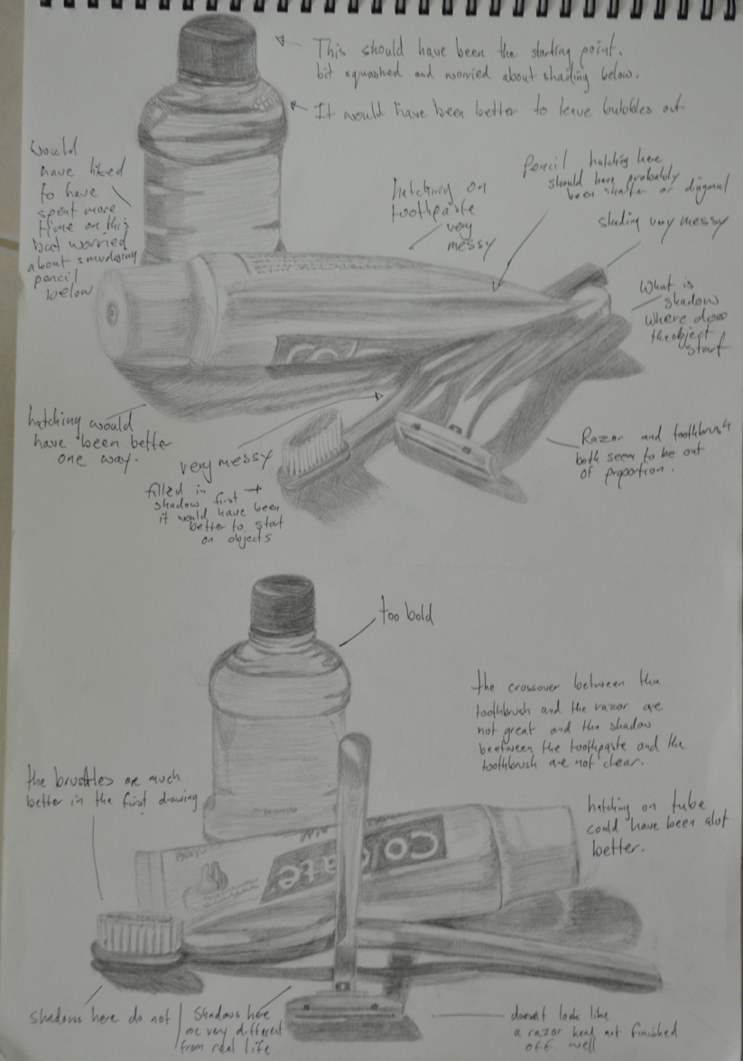
I did two initial drawings that I have to admit were not exactly thumbnail size, I think this was down to miscalculating proportions of the first objects I started on in each composition and then having to keep up proportions,
exercise: still life of man made objects
First attempt at this exercise
In the first drawing I started on the toothpaste tube as I always end up working clockwise, I think this is force of habit. However, because of this I misjudged how much paper I would need for the mouthwash so squashed the lid to fit the rest in; so when I came to the second drawing I worked from  the mouthwash down.
On the first attempt I forgot what I was instructed to do in the exercise. Instead of writing down about the techniques I used I totally ripped the sketches apart fault by fault, only actually remembering what I was supposed to do after I took the photo to upload to my working log. I decided to do the exercise again and this time do it right.
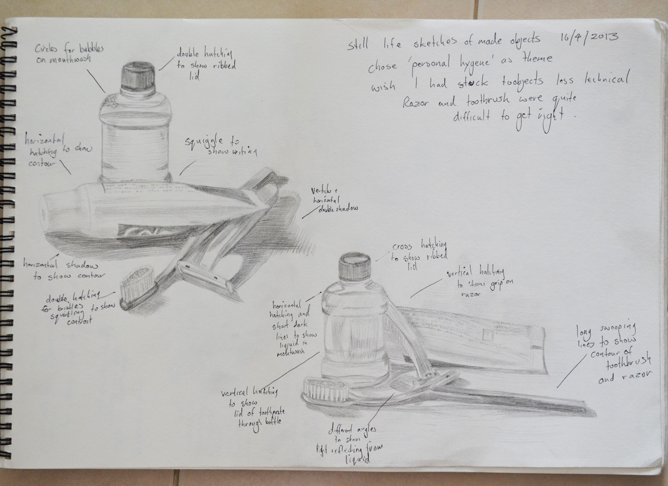
In my second attempt I scaled the drawings down and was less worried about every detail. My hatching technique also seemed to improve a lot in my second attempt, using a variation of cross, vertical and horizontal hatching as well as swooping lines to follow the contours of certain objects.
exercise 2 still life of made objects
Second Attempt at this exercise was much better
This exercise was probably the first time that I made no attempt of smudging in the pencil lines instead I practiced the pencil holding techniques I used earlier in this course, from the tip, from the end etc...
The hardest thing to draw in the composition were the toothbrush and razor and I felt like abandoning the objects and using something easier to draw but stuck at it and did a reasonably good attempt at getting proportions and details right all 4 times

You can visit the learning log that my tutors see right here http://www.mydrawingcourse.com 

Thursday, 4 April 2013

Drawing 1,Part 1, Mark Making and Tone, Reflected Light, Study of Light Reflected from one Object to Another


The brief was to 'Arrange two three objects ,  at least one of which has a shiny reflective surface, side by side with a small space in between them. Place a light source so that it is to one side of your (two) objects to cast clear shadows. Sit so that you can easily see the shadow on one side of the objects and the light on the other'.
Objects with Coloured Paper Background
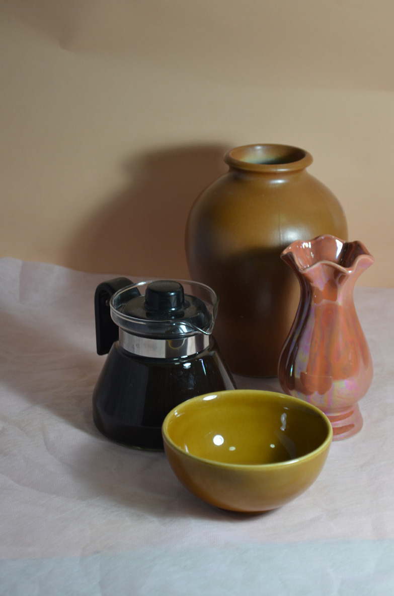
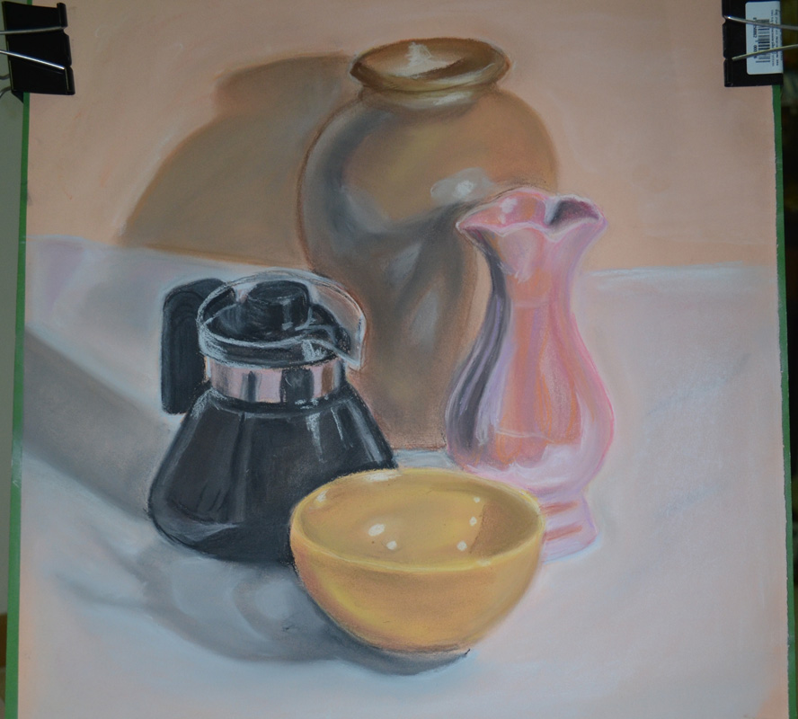
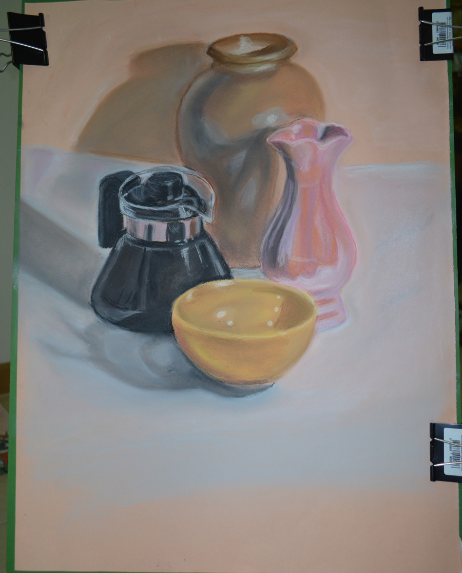
The first sentence said two or three and the second paragraph said two but the example students drawing had quite a few objects so I want for four, which were a ceramic bowl, a pearlescent vase, a Chinese style vase and a glass teapot. The glass teapot had a chrome band around it but it didn't cover a large area so I filled it up with a very strong black coffee in order to make the glass more reflective
The sample student drawing was on coloured paper which gave me an idea, so I bought some large sheets of orange coloured paper and set one as the background and did the drawing on the other. The medium I chose for this exercise was hard pastel by Cretacolor, I had never drawn with hard pastel before and this was the perfect chance to lose my virginity.
I was instructed to draw the main shadow pattern created by the light source first then add the reflective light and shadow patterns to the drawing. I followed the instructions drawing it in graphite pencil first as I knew that when it came to add the shadow patterns and reflective light with the hard pastel I would have to work on an object at a time due to how much work blending in this medium needed especially on the coloured paper that I chose.
A Close up of my Finished Drawing in Hard Pastel
I found that I bit off more than I could chew and it took me about 6 hours to finish the exercise, and the colours on the objects in the drawing were quite different from real life, I find blending most mediums quite difficult and really need to spend more time experimenting before working on a piece.
Although happy with the finished drawing I feel I have let myself down and could have gone out of my way to find better objects that were more reflective, although the teapot reflected the colour of the other objects quite well over the small reflective area, the pearlescent vase also did quite a good job.
I could have also done a better job of positioning the objects on the paper which was approximately A3 with about a third of the paper gone to waste.
The valuable lessons that I have learnt from this are that I should choose my mediums and objects wisely and  to use more of the paper next time.
Bad Example of Paper Wastage
View my learning full drawing 1 learning log at: http://www.mydrawingcourse.com/

,Drawing 1, Part 1, mark Making and Tone, Tone and Form – Check and Log


How difficult was it to distinguish light from the primary light source and secondary reflected light?
I was very aware of where the light was coming from on the first two drawings of the Johnsons baby Powder Bottle and Mug in the first exercise, and even clearer while working on the second sketch. There were other light sources in the room as I worked on them in the evening but still it was quite easy to tell, I think using the ceramic mug helped.
In the second exercise it was not so easy to tell but I did know what to look for so it helped; the easiest reflections to make out was the light reflecting from the ping  pong  ball on to the apple. But even though I knew  which light came from the primary source I wasn't quite sure where certain reflections of light on the mug were coming from. I could only guess.
How as awareness of light and shade affected your depiction of tone and form?
I could have gone my whole life missing certain reflections and shadows out, saying to myself ‘Yeah, that’ll do’, trying to copy as precisely as possible, thinking that’s enough. However, these two exercises have made me more aware of reflected light and I’m starting to piece together where the light in certain places is coming from, this has helped to make these drawings more realistic than anything I’ve done before so it’s something I will continue to observe.
View my learning full drawing 1 learning log at: http://www.mydrawingcourse.com/

Drawing 1, Part 1, Mark Making and Tone, Basic Shapes and Fundamental forms - 2 Jugs and Jars


For this Jugs and Jars exercise I collected together 6 cylindrical objects including jars, vases, bottles and jugs as well as a glass and arranged them so I was looking slightly down at them. Then with a softish pencil I drew what I could see, then rearranged and drew them at a slightly different angle.
I flew through the pencil sketches in a matter of minutes as I had no fears of getting it wrong, knowing that I could always work the objects into shape with a few extra strokes.
1st Sketch HB
1st Sketch HB
I then moved the objects around and drew them from different angles and again, I breezed through this part of the exercise and the only time I used an eraser was to restart drawing the first object as I worked from left to right and I started drawing the glass teapot a little too low that the small jug at the front would have been off the page.
2nd sketch HB change of angle
When it came down to drawing with pen I got nervous, knowing that I couldn't erase anything, even though I hadn't need to make real corrections while using the pencil and with this in my head I began to mess up and make some real mistakes. I drew the first couple of pen drawings with an Artline 0.3 Drawing pen and it was pretty crappy and scratchy, so I was forced to purchase a couple of Rotring Drawing pens.
1st Sketch with artliner
1st Sketch with Artline Drawing Pen
I found it a lot easier and smoother to draw with the Rotring so it gave me some confidence back but it would still take a lot of practise to get it right first time with a pen without using any kind of scaling system or going through it in pencil first.
2nd sketch Rotring Pen
With Rotring Drawing  Pen
View my full learning log for Drawing 1 at: http://www.mydrawingcourse.com