Showing posts with label oca drawing 1. Show all posts

Monday, 27 October 2014

Drawing 1, Part 2 Observations in Nature, Drawing Fruits and Vegetables in Colour, Check and Log

Your composition should occupy most of the paper’s surface. How much negative space do you have left?
I think I did really well with all the three exercises of this project, ‘Using Hatching to Create Tone‘, ‘Using Markers or Dip Pens‘ and ‘Drawing Using Oil Pastel‘. In all three final drawings I left minimal negative space allowing for shadows and props used.
What have you learnt from drawing the details of fruit and vegetables?
All fruits and vegetables have different surfaces from smooth and shiny to rough, hairy and spiky so every object is a challenge not only this but its very difficult to get familiar with the shape of a certain fruit or vegetable as the surface differs from one to another taking into consideration ‘ripeness’.
What did you find most challenging about this part of the course? 
Firstly, I really had problems using dip pens and creating tone with this medium it is something I really have to work hard at getting as much practise in as possible.
Secondly composition arrangement and that arranging a composition with fruit and vegetables takes more time than arranging other objects; not only for fear of repeating a similar composition you drew in a previous exercise  but for fear of arranging a composition that will not allow you to capture the full details of the objects.

Drawing 1, Part 2 Observations in Nature, Drawing Fruits and Vegetables in Colour, Using Hatching to Create Tone

For this exercise firstly I was to select some pieces of fruit and vegetables and draw each of them individually in my sketchbook in a medium of my choice paying attention to the shapes or planes that make up the objects outline.
I decided to use colour pencils for this exercise as I needed more practise and have yet to get used to blending. I initially chose an onion, a cucumber and some strange Asian mushrooms for my composition but all that was to change.
Then I was to write my thoughts and ideas next to the sketches including some notes about tonal values and ideas about the arrangement of a composition and use a view finder to crop some of the shapes in different positions.
Using Hatching to Create Tone - Initial choice of objects
Using Hatching to Create Tone – Initial choice of objects
As a view finder I used my camera sometimes looking at a photo of the composition you notice things that you wouldn’t notice with the naked eye. It took me at least two hours to decide on the composition and what fruits and vegetables to change and the angle from which I would draw from, trying my hardest to stay away from similar layouts to the compositions I had used in earlier drawings.
Using Hatching to Create Tone - Orange, apple and dragon fruit
Using Hatching to Create Tone – Orange, apple and dragon fruit
I swapped the Asian mushrooms/toadstools for an orange and an apple as I could use them in different positions and together with the onion the three spherical objects looked great with the cucumber. They also picked up the reflected light from the pink cloth that I decided to use as a backdrop very well.
Using Hatching to Create Tone - Composition
On an A3 sheet of paper I lightly sketched the outline of the objects with a 2H pencil and began to hatch working on the cucumber first but not finishing and then moving to the other objects to see how the cucumber looked against them this helped me decide on tone and colour of the cucumber being the more awkward of the 4 objects.
Using Hatching to Create Tone - Finished Drawing
Using Hatching to Create Tone – Finished Drawing
After working on the other 3 objects I came back to the cucumber which I had to reshape a little bit with an eraser. I’m quite happy with the finished drawing I think the composition fills up the picture plane quite nicely, and I think I did quite a good job with the hatching which I think is more fluid than anything I have done before. Probably the most difficult part of the drawing is the props I used the slightly transparent cloth and the straw basket.
The only think I am not satisfied with really is my photo skills and will try and get a better photo to send in for assessment.
View more Drawing fruits and Vegetables exercises on my my Drawing 1 working log

Drawing 1, Part 2 Observations in Nature, Still Life, Check and Log

What aspects of each drawing have been successful, and what did you have problems with?
Still Life Group Using Line
I drew this drawing from scratch without sketching in pencil first in this aspect I think I did really well. However I found it very difficult not to start hatching to depict tone and so I probably went overboard on the pumpkin but I feel that it was better to but too much effort in than two little.
I was also dissatisfied with the pumpkin because the actual surface wasn’t as rough or bumpy as what I made it out to be in my drawing. In both drawings.
Still Life Group in Tone
The only problem I had with this is I should have chose a composition that used up more of the paper. I also could have been more adventurous with the subjects that I chose. Apart from that I think I did really well with depicting tone and none of the objects look out of place.
Did you manage to get a sense of depth in your Drawings? What elements of the drawings and still life groupings helped create that sense?
This is one thing I did not have a problem with with the Still Life Group Using Line exercise I did this by placing the tallest objects at the back. With the Still Life Group in Tone I looked down at the group from an angle.
What difficulties were created by being restricted to line or tone? 
Like I said earlier sometimes it was very difficult not to cross the fine-line between drawing with line and hatching.
See more on my Still Life exercises on my Drawing 1 Blog

Tuesday, 7 October 2014

Drawing 1, Part 2 Observations in Nature, Detailed Observation - Stipples and Dots

For this exercise I was to pick another interesting object and use A4 cartridge paper and a ballpoint or drawing pen. Then use a stippling effect, dots and and a variety of marks to create a drawing of depth and interest.
Exercise - Stipples and Dots, Finished Drawing
After my research on Eliot Hodgkin I took a walk through the very small park area opposite my school and took some photos of leaves with my mobile phone so I might use them later. When this exercise came up I went back into the park to grab some dying leaves to take home.
Exercise - Stipples and Dots, Leaf Subject
One particular leaf caught my eye as it had some great lines and at the time was half green half brown, so took many photos during the change from green and brown to completely brown and also tried the leaf at different angles, for my drawing I picked out the one above.
I can't say that I love stippling as it is a very slow process and this exercise took me about three hours over two days to complete and since my first assignment was handed in quite slow I'm trying to keep up momentum.
I used a Rotring 0.3 drawing pen and began as I did with other exercises, drawing the light tones by spacing out the dots  and then going back over for the darker tones with more dots. I used a variety of mark making techniques which included stippling, dots, really short hatching and lines and for the creased patterns of the dying leaf I drew the dots in tracks close together and then went back over with more dots.
Exercise: Stipples and Dots Finished
View my learning log for Drawing 1

Friday, 4 July 2014

Drawing 1, Part 2 Observations in in Nature, Detailed Observation - Getting Tone and Depth in Detail

In this exercise I was to practise building up dark medium and light tones principally using pencils and hatching and cross-hatching techniques. I was to select a single object such as a shell or piece of driftwood and get a varied effect by combining soft and medium grade pencils as well as altering the direction of the strokes I make. The brief also informed me that this exercise would be time consuming and indeed it was. I used a smooth sheet of A3 Canson paper and 2B, 3B, 4B, 5B pencils to complete this exercise as well as a putty rubber for the highlights which I used quite often to lighten strokes that were too dark as I made my way through my chosen subject. Living in Bangkok has it's downfalls especially when taking a drawing course but I'm very lucky to have a small park with some very exotic trees in front of the primary school that I teach at. I found a small branch that had fallen or been broken off one of the trees a few weeks ago that reminded me of the hammers in Pink Floyd the Wall with patches of bark still on it and some really nice contours,  so I decided to use it for this exercise.
My subject for this drawing exercise, a tree branch
I started on the end that I knew would be the most difficult to try and reproduce with pencils, the tree bark, going over it first hatching with a 2B pencil then, 3B, 4B and 5B to get the darker tones. I know the brief said use hatching and cross-hatching on this exercise but I threw everything I had at it, including stippling, squirkling and dashes and I think I depicted the surface of the bark quite well. Unfortunately my photographic skills aren't that great and the photo of the finished drawing is not as great as the drawing itself.
Getting Tine and Depth in Detail 1
The area that I thought would be the most difficult was actually the easiest, to depict tone on the areas of stripped branch with soft bare wood was the most difficult, but one thing it did teach me was to be more fluid with my drawing and for the first time ever I loosened up.
Getting Tine and Depth in Detail 2
I know there are flaws in the finished drawing, the shape is wrong in certain places and the shadow isn't brilliant but there are parts of this drawing that I am really proud of namely the  bark area which reminds me of a 'bio' tattoo for some reason. In fact I think the finished piece reminds me of an anatomy drawing and while I was working on it I kept thinking of the Marco Evaristti drawings of parts of suicide victims that I saw during my first visit to the national gallery. Overall I think I did quite well in this exercise, my tutor told me I should be more fluid and I think I managed it while working on this exercise. However, one thing I do have a problem with is drawing the very dark tones on a textured surface such as this which is something I will have to work on.

Wednesday, 14 May 2014

Drawing 1, Part 2 Observations in Nature, Research Point, Masters of Detailed Drawing, 19th Century Thomas Hartley Cromek

For this research point I was asked to find two artists who exemplify mastery of detailed drawing.
I used to have a reproduction painting site and am familiar with the works and lives of quite a few but since starting this course I've been introduced to new artists and new techniques so I thought I'd carry that on by typing in a few keywords on Google to see where they took me.
The first artist I found was a 19th century artist called Thomas Hartley Cromek and after seeing that his place of death was Wakefield, my home town, I made the decision to research this artist a little more.
Born in London in 1809 Thomas Hartley Cromek was the son of Robert Hartley Cromek the  engraver and art dealer who allegedly cheated William Blake out of potential profits. In his childhood he moved from school to school starting off his education at Enoch Harrison's school in Wakefield and then onto the Moravian School in Fulneck. He then moved back to Wakefield to study at the grammar school there before returning to Harrison's.
Thomas Hartley Cromek received his first art lessons from a Wakefield based portrait painter, James Hunter but then in 1826 he moved to Leeds study landscape painting under Joseph Rhodes, while studying in Leeds Thomas also taught himself anatomical drawing.
He travelled to Italy in 1830 to study the old masters and spent most of the next 20 years within the country mainly in Florence eventually reaching Rome where he attracted much attention for his 'excellence in drawing and his careful colouring' - Wikipedia. While in Rome he gave drawing lessons to several distinguished visitors including the British artist and poet, Edward Lear.
Between 1831 and 1849 Thomas Cromek spent most of his time drawing the major buildings in Rome as well as Greece but then was forced to leave Rome with the outbreak of the first Italian War of Independence.
There's not much information about Thomas Hartley Cromek online about techniques, ideas, influences etc but I did find quite a few images.
Study of Plants, Ariccia Watercolour, over traces of a pencil underdrawing.
Study of Plants, Ariccia
Watercolour, over traces of a pencil underdrawing.
I found many of his works online but it was the drawing above that caught my eye and I thought it was quite relevant to this module. The drawing itself is only 7 1/4 x 8 1/8 in in size and yet his brilliant use of shadow amplifies the detail of the drawing. I enlarged this image on my computer to the size he would have worked at and was amazed how much detail he has got into such a small drawing with what I still regard to be a messy medium, for me that is anyway. He has managed to depict some very thin leaves and blades of grass and makes this picture seem a lot bigger than what it is.
THE TEMPLE OF ANTONINUS AND FAUSTINA, FORUM, ROME - WATERCOLOUR 18 1/4 X 13 INCHES
 Just like his drawing of plants and flowers his watercolour paintings of buildings such as the Temple of Antoninus above shows brilliant detail and colour as well as amazing shadows which really amplify the bulkiness of the stone structure.
Bibliography

Drawing 1, Part 2: Observations in Nature, Exploring Coloured Media - Exploring Coloured Media

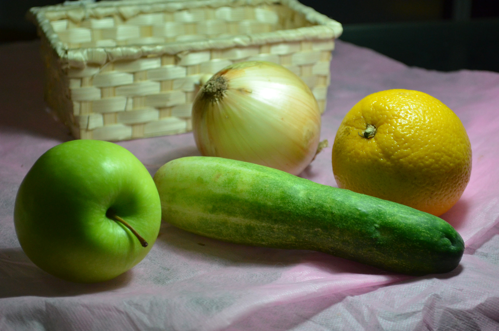
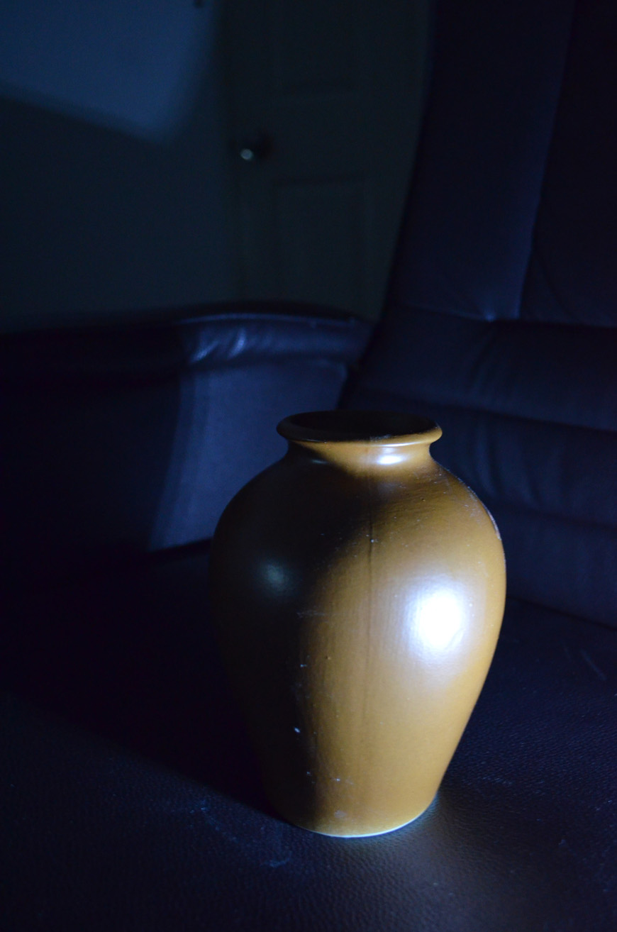
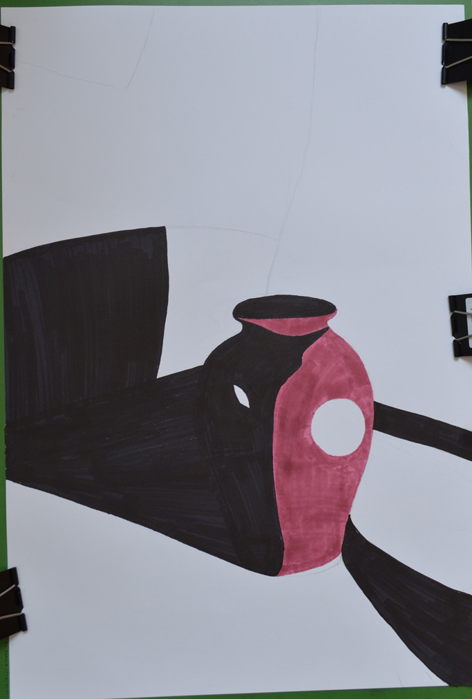
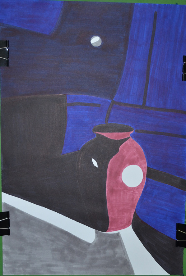
In this exercise I set out to explore the different coloured mediums I had available which included oil pastels, soft pastels, felt tips, markers, different coloured inks and dip pens as well as coloured pencils and a pack of coloured ball point pens. Just like I did in the Making Marks Project in Part 1 I decided to go at this project using a mixture of doodling and filling in squares with different techniques.
Coloured Pencils
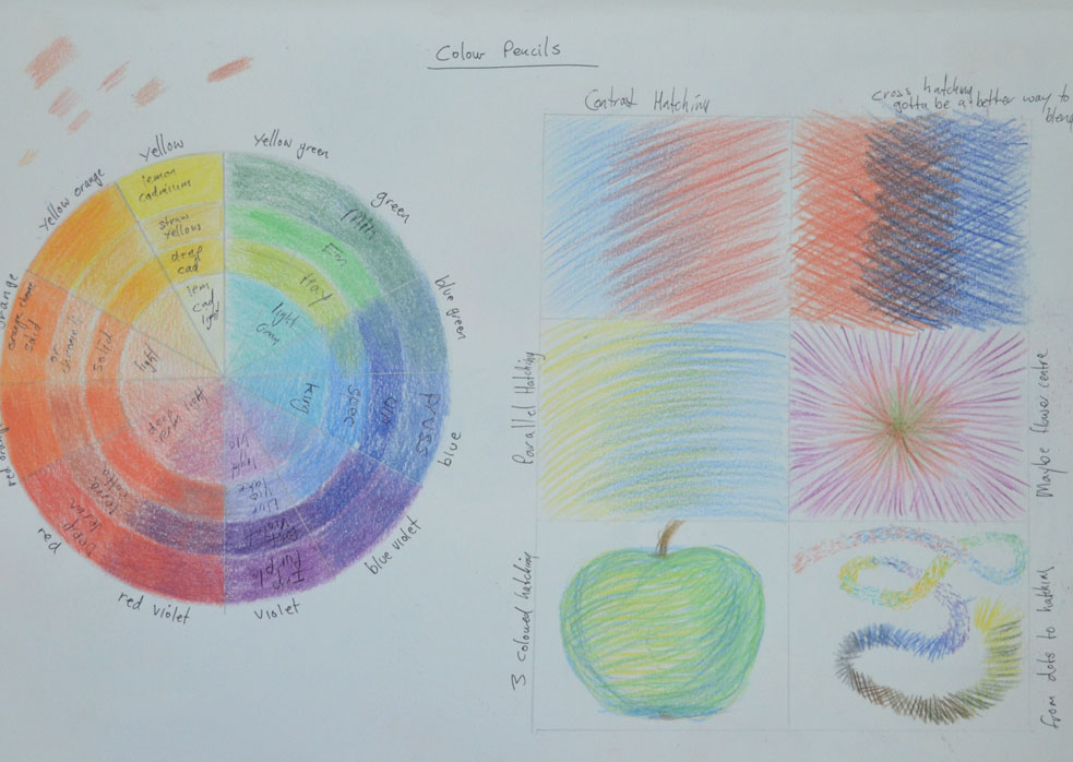
I started out with coloured pencils I had recently bought some Derwent coloured pencils for the composition development of assignment 1 but have yet to discover their full potential. I began by putting together a rough colour wheel based on one that I found online to see how the colours would blend together, there are much more possible colour variations  to be had from blending this medium but it gives me some idea and will help me in the future.
exploring coloured media - Coloured Pencil
In the squares i tried different hatching techniques such as cross hatching and horizontal hatching. some techniques work better with this medium but I think all can be utilized in a drawing and this gives me some idea of what each technique can be used for,
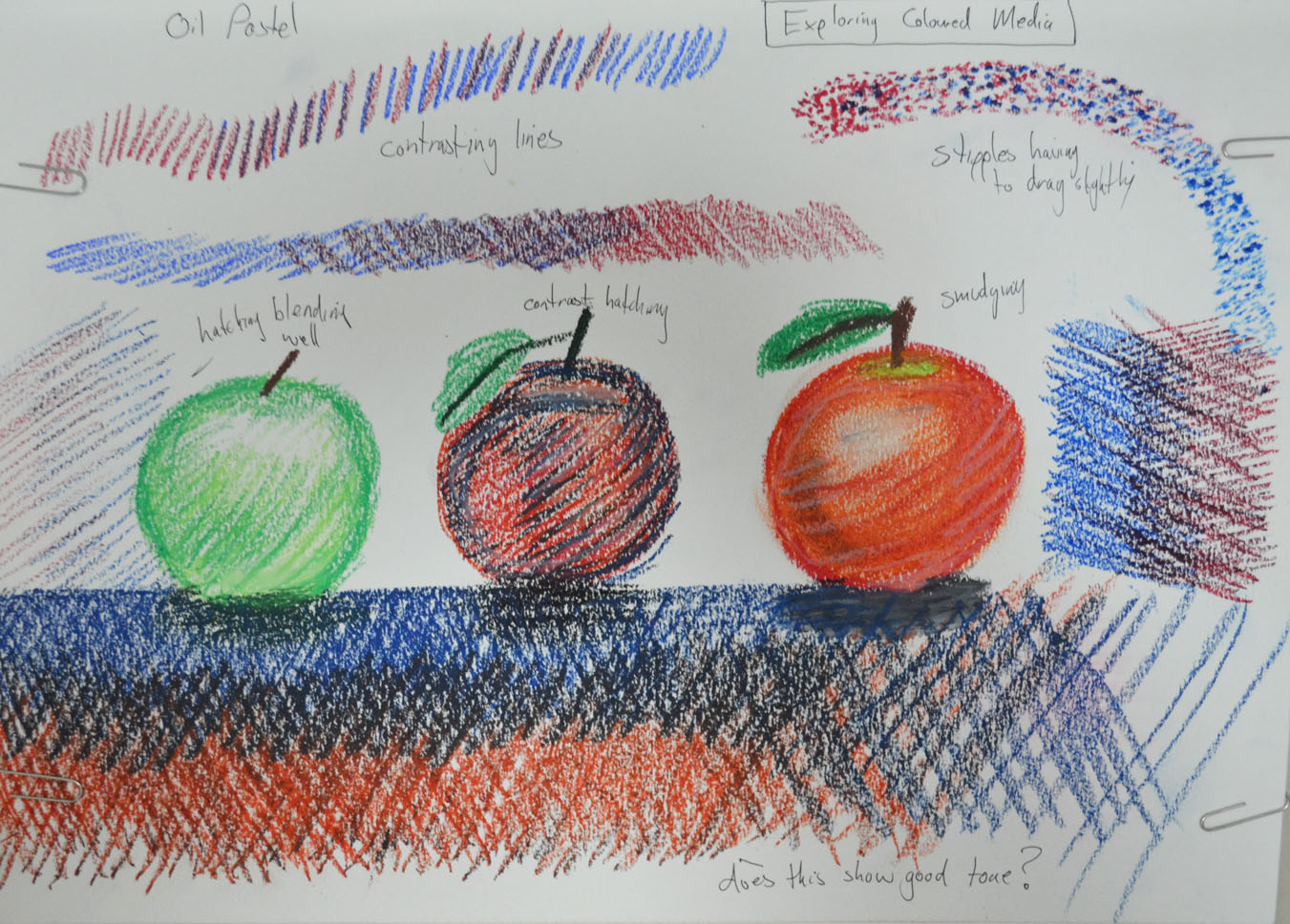
exploring coloured media - Oil Pastel
Oil Pastels
With the oil pastels I decided to do some experimenting by doodling just to get a better feel for this medium as I know I will be using them a lot later. I found that they were quite good forstippling and leave a lot more colour on the page when stippling than coloured pencils which weren't great and found myself drawing circles with them. They were also really good for hatching but can also be smudged quite well, so all in all a very versatile medium.
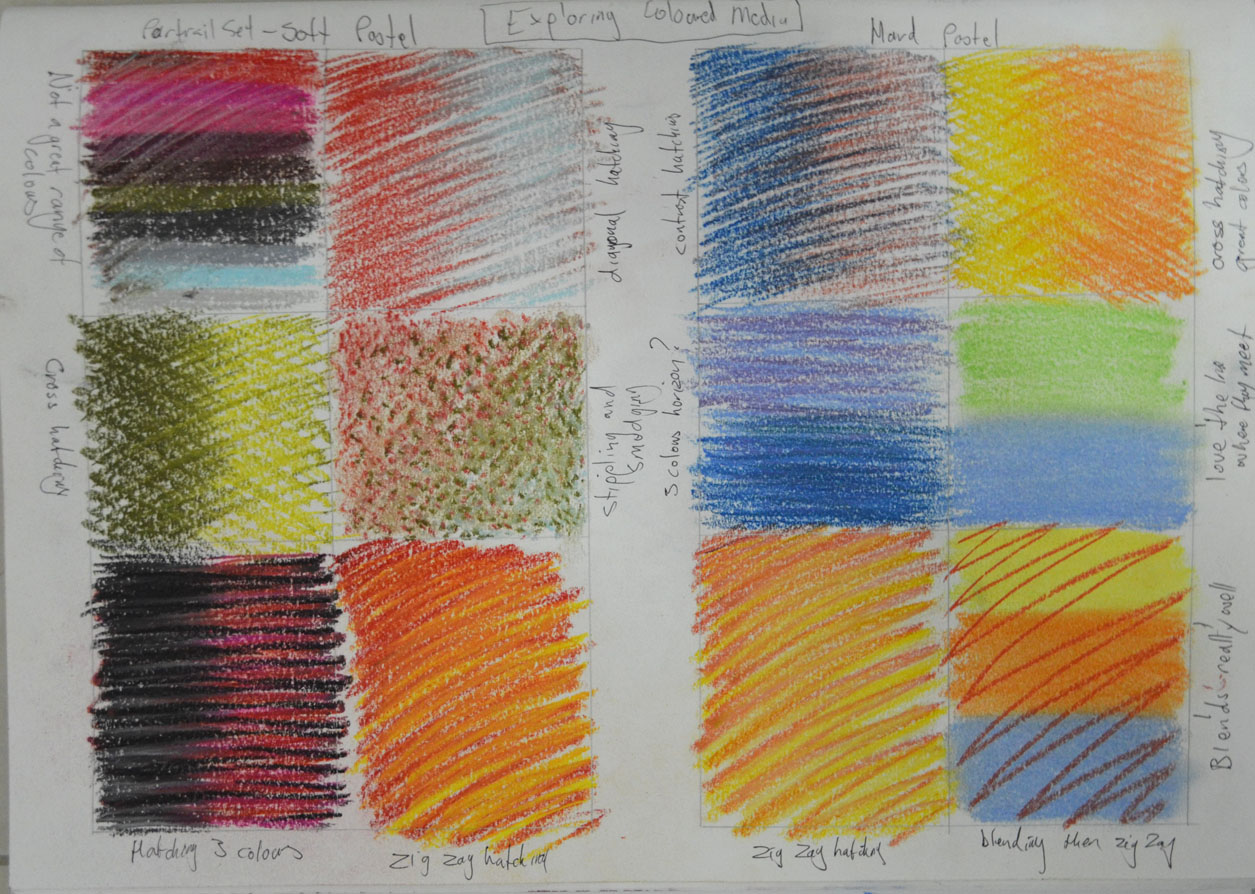
exploring coloured media - Soft and Hard Pastel
Soft Pastels
At the start of the course I bought some soft pastels but haven't really used them until now. I hadn't noticed that they were a portrait set so I didn't have much choice of colours, however I did enjoy working with them. They were very good for stippling and hatching and depicted tone very well, in one box I did some stippling and then smudged over the top and was rather pleased with the result.
Hard Pastels
I've used these a couple of times now in both the Study of Light Reflected from one Object to Another exercise in part 1 of this course as well as in my finished piece for the Natural Forms part of Assignment 1 but yet still have to discover their full potential. Hard pastels are great for hatching and smudging as well as layering. They are also quite expressive when using certain techniques and they blend very well.
exploring coloured media - Ball Point and Felt Tip
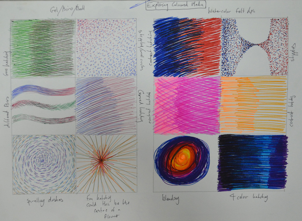
Ball Point Pens
I bought a cheap pack of Staedtler coloured ball points that were in a sale in a local art/book store and tried out different techniques, now I know from the work I have seen of other artists in ball point that they are a great medium to use, however techniques have to be improved, when hatching they seem to work better when you lift the pen off the paper towards the end. I get a feeling they are probably better for small pieces rather than large drawings.
Felt Tip Pens
The felt tip pens that I have here are not a normal felt tip but a watercolour pen, I didn't know they existed, the colours are very vivid and seem to better when used for darker images. Stippling is great with this medium but when hatching they tend to clot on the paper towards the end of the stroke so like the ball points I found that they work better if you lift your pen off the paper towards the end of the stroke. These watercolour pens also blended quite well, I have yet to try out normal felt tip pens but shall be doing so quite soon.
exploring coloured media - Markers and Dip Pens/ Coloured Inks
Markers
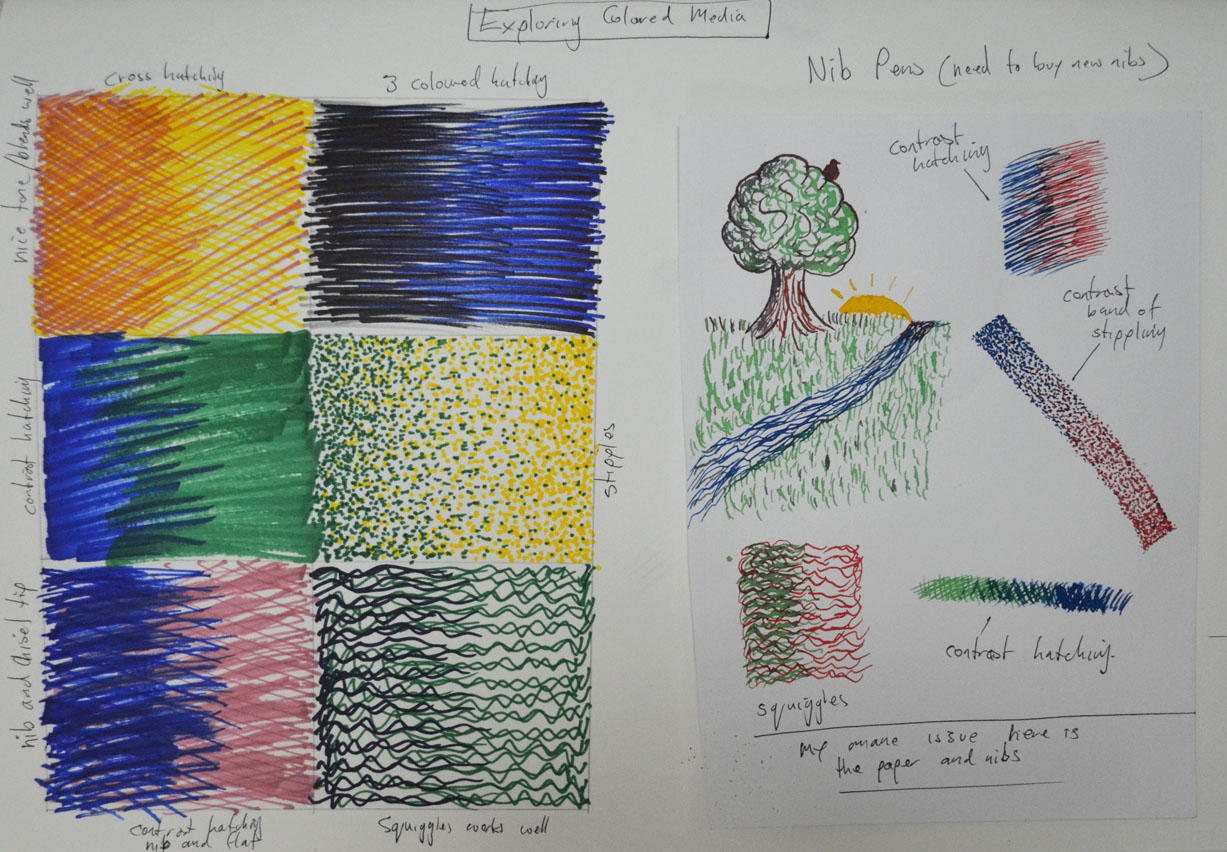
I used markers for the Patrick Caulfield Research point but only used them in blocks of colour, I really enjoyed using them just as I did in this exercise. They were brilliant for stipling and hatching and depicted tone very well, I also filled a square with hatching using both the pointed nib and the chisel nip and found it to be very expresive. Again they tend to clot but not as much as the felt tip and I found that that they are probably better for darker drawings.
Nib Pens and Coloured Inks
This is a medium that I am still struggling with I have a good few Ecoline colours to play around with and have been experimenting with different papers but I think my nibs are letting me down, I shall be investing in some quality nibs very shortly. However, i did get some decent results this time. Starting off with a bit of doodling I got used to the feel of the pen on the smooth paper in my A5 drawing book then did some stippling and hatching. I get the feeling that it is best to let the inks dry before using other colours. I found that they were great for stippling on the smooth paper but then on water colour paper not great at all the same went for hatching. This is a medium that I want to see myself using more of as I love pen and ink drawings so it is going to be worthwhile exploring this medium more deeply.

Sunday, 16 February 2014

Drawing 1, Part 1, Mark making and Tone, Enlarging an Image - Enlarging an Existing Image


For this exercise I drew a thumbnail drawing of my favourite coffee cup roughly 10 cm square in my small A5 sketchbook, which I’ve barely put to use so was good to fill a page or 2. Once I had finished the thumbnail drawing I drew a grid of 2 cm squares with an HB pencil over my thumbnail sketch.


Enlarging an existing image 1
Enlarging an existing image – A5 sketchbook
In my A4 sketchbook I drew 3 cm squares, deciding they were a perfect size for this object on this size paper, with a larger more detailed composition I would have probably needed smaller squares in both sketchbooks.
Enlarging an existing image - A4 Sketchbook
Enlarging an existing image – A4 Sketchbook
To make it easier for myself to identify which squares I would be drawing in I labelled the squares with letters down the left hand side and numbers across the top. However the drawing was quite low in my A5 sketchbook so in my A4 sketchbook I started at B instead of A lifting the drawing up 1 square.
Enlarging an existing image using grids
Enlarging an existing image – side by side
I loved this ‘Enlarging an Existing Image’ exercise, it was like piecing together a jigsaw puzzle but a hell of a lot easier and as the squares weren’t that big quite easy to judge where  a line curves or which point of the grid they would meet. Admittedly I did do a little bit of rubbing out with an eraser but not that much.

View My Drawing 1 learning log here www.mydrawingcourse.com

Wednesday, 24 April 2013

Drawing 1, Part 1, Mark Making and Tone, Still Life - Check and Log


Do you think it is easier to suggest three dimensions on man-made or natural objects?
This project has taught me that it is easier to suggest three dimensions on man-made objects rather than natural objects. Man-made objects are usually made up of geometrical shapes such as cylinders, cones or cubes and so the lines of man-made objects are easier to draw and suggest their 3D form using most mediums. The irregular shapes of natural objects means that their three dimensional features are much more subtle with lines that are more difficult to depict and draw.
How did you create a sense of solidity in your composition?
In the exercise ‘Still Life Sketches of Made Objects’ I created a sense of solidity by using various hatching techniques and swapping between pencils of different hardness mainly B, HB and 2B, shadows and tone also played a big part in making the objects look solid.
exercise still life of made objects
Image 1: Exercise - Still Life of Made Objects
In the exercise 'Composition of Natural Objects' working with watercolor pencil I used hatching and layers of darker colour to show solidity.
Composition of Natural Objects
Image 2: Exercise - Composition of Natural Objects
Do you think changing the arrangement of your composition makes a difference to the way you create a sense of form?
Changing the arrangement of the objects changed the way each objects interacted with each other, shadows and light reflected off one object to another and other objects in the composition (such as the plate in image 2) can play a major role in creating a sense of form.
How did you decide how to position yourself in relation to the objects?
For the second exercise I decided to position myself slightly above looking down at the objects so I could see the full form of the the objects and shadows interacting with each other in the middle of the composition, I thought this would help me to create a sense of form in my drawing. A bruised rib from a an accident the day before helped me to reinforce this decision.

View My Drawing 1 learning log here www.mydrawingcourse.com

Drawing 1, Part 1, Mark Making and Tone, Reflected Light, Research Point - Patrick Caulfield (Part 2)


The brief for this was to make a drawing in a similar style to Patrick Caulfield White Ware screen prints, it wasn't that easy. I decided that I wasn't going to keep looking at his images so after I finished my part 1 of this research point, researching him, I thought I could remember enough about his prints and paintings to work in a similar style.
I decided to work on an A2 sheet from my larger sketchbook which is too big to work with felt tips and I wanted to show as little pen or brush strokes as possible so I went out and bought some Kurecolor graphic design markers, which were very expensive but well worth the money.
I used the vase that I used in an an earlier exercise 'Study of Light Reflected from one Object to Another' and placed it in the chair that I would usually sit in to do my work. I wanted to shine a more acute light on my subject so instead of using the bendy light that I used before I used a torch that I got free from the local western supermarket. I knew that the batteries in the torch wouldn't last that long so I turned all the lights off found the right angle for the torch to shine at and took a photo, then I worked completely from the photo.
drawing in the style of in the chair that I would patrick caulfield
Photo with Torch, vase and Chair
I started by drawing the shadow on the vase, then instead of using white I used colour for the other half, I purchased the markers day before but I swapped vases so the colour did not match but I wasn't worried about that, I just wanted to know if I could draw something in the similar style as Patrick Caulfield, I highlighted the light reflected from the vase vase by leaving those areas blank.
drawing in the style of in the chair that I would patrick caulfield
Drawing after first Two Colours
I used grey for the light that spread from the torch beam as I had I didn't want the drawing to be completely dark and I had seen Patrick Caulfield also use grey in his paintings, this paid off.
drawing in the style of in the chair that I would patrick caulfield
Finished drawing
I cut down on the detail in my drawing and over exaggerated the detail that was left, after adding colour to the vase shadows and foreground I stopped looking at the photo and worked completely from memory hence the various differences like the position of the door handle  and seams in the chair positioning where I thought they would look best rather than where they should be.
I was really happy with the finished drawing and even though it doesn't resemble any 1 particular Caulfield style of painting you can tell he is the inspiration behind it.

View my learning full drawing 1 learning log at: http://www.mydrawingcourse.com/

Thursday, 4 April 2013

Drawing 1, Part 1, Mark Making and Tone, Reflected Light, Research Point - Patrick Caulfield (Part1)


Patrick Caulfield (29 Jan 1936 - 29 Sept 2005) was an English painter and printmaker who started his formal education as an artist at the Chelsea School of Art in 1956. He then studied from 1960-1963 at the Royal College of Art where he was one year below students who were credited with starting the UK pop art movement.
As a student he was influenced by abstract painters such as Mark Rothko and Jackson Pollock even though he only experimented in abstract painting for a short time. His bold, colourful prints and paintings are deemed to be Pop Art even though Caulfield himself was wary of being connected with any such movements. His association with the movement with ‘Pop Art’, mainly due to exhibiting alongside David Hockney, Allen Jones and R B Kitaj at the ‘New Generation’ exhibition in 1964.
Unlike the American Pop Artists his works depicted ordinary every day subjects such as a vase, buildings or interiors rather than images of popular culture such as celebrities or advertising products. It is the way he treats his subject that that gives his work a Pop Art feel, creating ambiguity by treating fine art subjects in an unrealistic and stylised manner.
When I first looked at Caulfield’s work it seems to me that the negative space plays just as much an important role in his paintings as positive space. In some of his images he uses negative space to sculpture the objects which in some cases are an abstract image but we get the sense that we are looking at the whole thing subject.
In the ‘White Ware’ screen prints he has managed to balance out the level of importance between negative space, reflected light and what we automatically presume is the main subjects such as a vase. With this he leaves the viewer trying to imagine what the light source maybe or what could be causing the shadows in his images. He also creates a good sense of distance between the foreground objects and what’s happening in the background by using very simple shapes to depict reflected light for example.
In some of these prints he has inserted a second object behind the main subject, this is made up of one or two shapes and difficult to work out what it is but is just as important as the main subject. I love some of his other paintings and in the future I would very much like to paint something in the style of ‘After Lunch 1975’ due to the simplicity of my Bangkok apartment and the technical city scape outside. For now I will concentrate on the task at hand and make a drawing in the style of his ‘White Ware’ screen prints for this research point.
 Blibliography
View my learning full drawing 1 learning log at: http://www.mydrawingcourse.com/

Drawing 1, Part 1, Mark Making and Tone, Reflected Light - 2 Shadows and Reflected Light and Shade


In this exercise I was instructed to 'Use charcoal, a putty rubber and pick two objects with shiny reflective surfaces. Decide on the size of the composition, use A1 or A2 paper so that you can do bold strokes. Try to fill the paper with your objects showing the reflected light and shade of one object falling on another and try to leave very little background space.'
Shadows and Reflective LIght and Shade
Photo of Chosen Objects, Sieve and Ladle
I went out and purchased a few objects specifically for this exercise, after putting them together in pairs to see how they reflected off each other I settled for what I think is some kind of sieve and a ladle. I chose A2 for the composition because my drawing board wasn't big so an A1 size drawing board will be my next purchase. The brief said to leave very little background but I wanted to show some of the handle of the ladle and the shadow that it cast but to be honest I could have shown a lot less and made the objects bigger.
Drawing Pattern of Shadow with Charcoal
Drawing Pattern of Shadow
I sketched an outline with an H3 pencil then as instructed I drew the basic pattern of shadow first with sweeps of charcoal. I did try hatching but the charcoal seemed to leave too darker marks on the paper even trying the charcoal at different angles, this may have been down to the smoothness of the Carson paper that I used.
I tried to stay away from smudging the charcoal as it said nothing about it in the brief but when I did resort to smudging my finger took too much off so I used a stump that I forgot I had. It was great for smudging the charcoal without taking too much off as well as drawing solid outlines. I think if I had used A1 sized paper I could have probably had a better chance of completing the drawing using hatching.
Finished Drawing, Shadows and Reflective Light and Shade
I did start off with the darker tones on the ladle but just on the inner shadows to make sure I was drawing the correct shape (hopefully in time I'll get more confident with charcoal) and then once everything was fine I switched to the mid tones and then built up to the darker tones.
For the lightest tones and the light reflected from the bendy lamp I used a putty rubber to erase the charcoal. I bought a couple of Conte  knead-able erasers which were much better quality than the ones I bought when starting off the course which stuck to everything in the Bangkok heat and left debris on the paper.
I enjoyed the exercise and proud of the result but I am still lacking the confidence with charcoal. I seem to still have a lot more to know about the different types of charcoal, if time allowed I would have liked to have done this again on an A1 sheet of paper to see if I can do the whole exercise without smudging.
View my learning full drawing 1 learning log at: http://www.mydrawingcourse.com/

Drawing 1, Part 1, Mark making and Tone, basic Shapes and Fundamental Form, Research Point - Odilon Redon


Odilon Redon (April 20, 1840 - July 6, 1916), started drawing as a young boy, and was awarded a prize for drawing at school at the age of 10. At 15 years of age, at his father’s insistence, he took up formal architectural studies, but failed to pass his entrance exams at Paris ‘Ecole des Beaux-Arts (School of Fine Arts). On return to Bordeaux he took up sculpture, and also etching and lithography under the instruction of Rodolphe Bresdin.
Threw his early career he continued to work almost exclusively in black and white, in lithographs and charcoal drawings right into his 50s. These drawings became known as his Blacks ‘Les Noirs’. He developed an extremely unique repertoire of weird subjects such as strange creatures, insects and plants with human heads on; these subjects were often influenced by the writings of Edgar Allen Poe.
In 1975 he studied trees and the Underwood at Barbizon in North-Central France, the same year saw his Blacks reached the ‘Most distressed period’ with him often depicting the topic of prisoners in his works, appearing behind the bars of windows or isolated in a nightmare or hallucination. Has he said about his Noirs “They were executed in hours of sadness and pain”.
From the 1890s due to illness and a religious crisis which transformed into a happier person he began to use  pastels and oils, expressing himself with use of vibrant colour, creating works that depicted mythical scenes and flower paintings. Odilon abandoned his Noirs completely after 1900.
He always remained a fairly private person but the end of his life he became a rather distinguished figure with various awards and recognitions and was also regarded by the surrealists to be one of the forefathers of the surrealist movement (I was almost certain that it was going to say this in at least one of the online biographies as I began to look at his works.)
I had never heard of this artist until I was asked to research him but I’m glad I got the chance to do so. It was good to get a chance to see all his paintings side by side and to see how his works changed over the years, rollercoastering in and out of an often dominating dark mood until his change in mediums in the 1890s. I found a lot of his images disturbing and quite a lot of the hybrid characters made me feel uncomfortable like ‘The Egg’. However I was inspired by some of his darker works like ‘The Convict’; since my childhood I have often tried to put something similar down on paper but never got around to it.
The Egg, Odilon Redon 1885
I find a lot of his works interesting and could probably gain inspiration and ideas from them. Although I would find it hard to bare my emotions like he did, for all to see I quite often like to depict some of my innermost feelings and beliefs into my work and will continue to do so.
The Convict, Odilon Redon 1881
View my learning log at: http://mydrawingcourse.com/