Showing posts with label part 2 observations in nature. Show all posts

Tuesday, 4 November 2014

Drawing 1, Part 2, Observations in Nature, Drawing Plants and Flowers, Negative Space in a plant

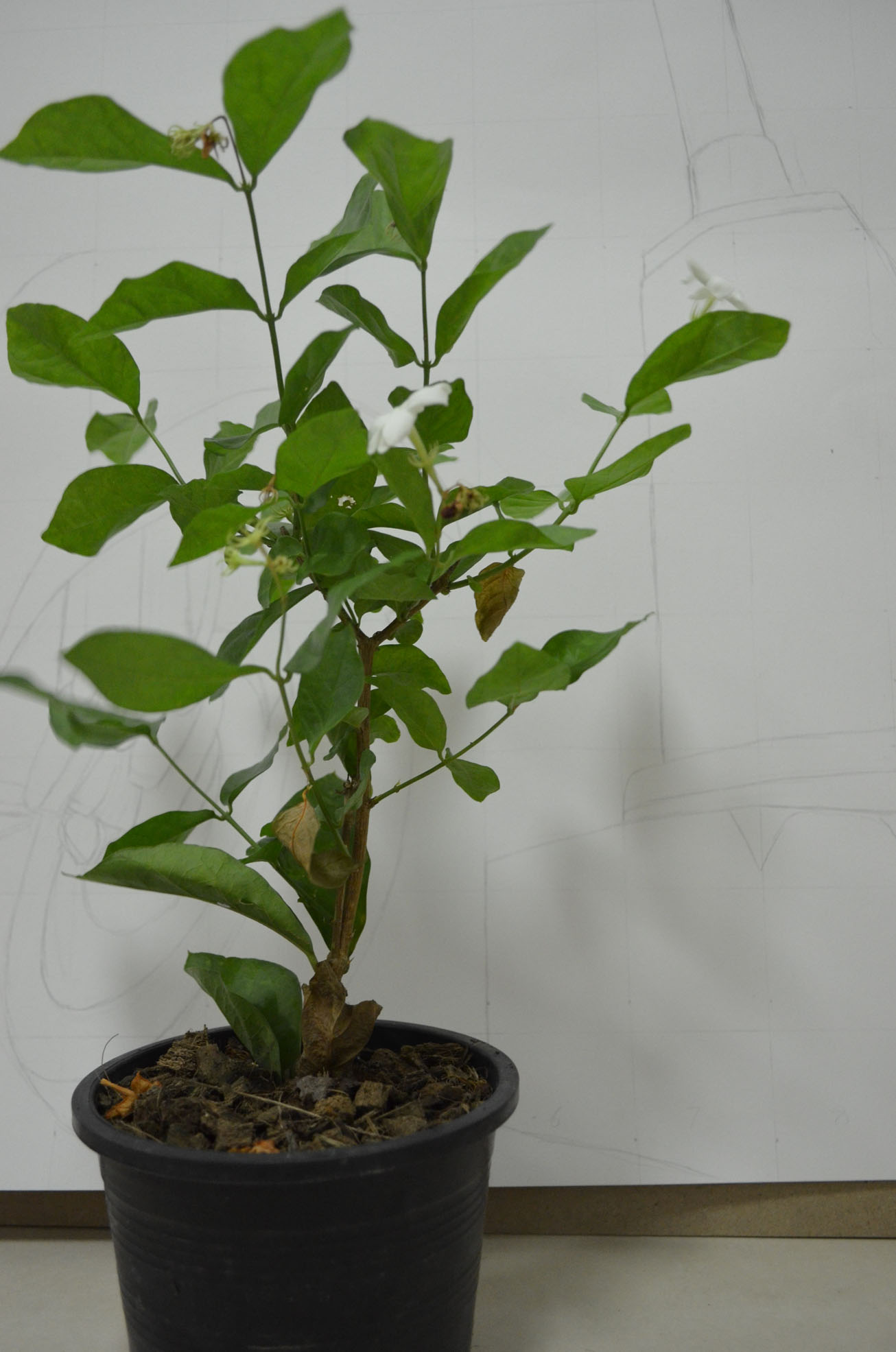
I don't have any plants at all in my apartment and was quite worried about where I would get one from without having to travel to the outskirts of Bangkok to find a suitable pot plant for this exercise.
My Subject - Jasmine
Luckily it was mothers day here in Thailand (12th August - the Queen's birthday) and while my girlfriend was shopping in Tesco she came across some Jasmine plants, Jasmine is the Queens flower and at only 49 baht (just over a pound) they were a bargain and I'd definitely picked the nest time of year to do this exerise.
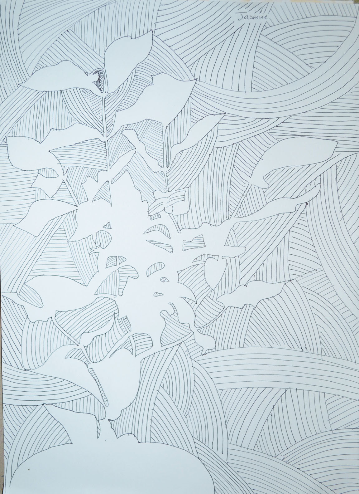
I used my faithful ball point pen and an A3 sheet of paper, placed the plant in front of a large drawing that I am in the progress of doing for a friend in England and began to draw. Concentrating on the negative spaces, I started to draw the space within and around the pot plant beginning at the top and working my way down to the bottom.
Drawing Negative Space in a Plant 1
Drawing Negative Space in a Plant 1st Attempt
My first attempt went really well until I got down to the bottom where the plant came out of the soil and I realised that the right of the plant would be well out, so to make the plant readable I drew in a few more negative spaces to even it up. I then began to finish it off by filling in the negative space in the drawing with some swirling psychedelic patterns.
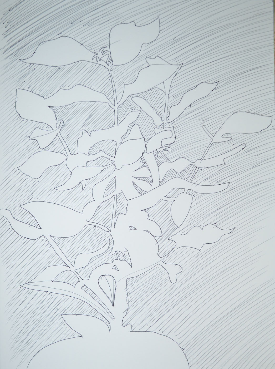
Drawing Negative Space in a Plant 2nd Attempt
My second attempt was quicker and I think is also an improvement on the first, this time I crossed over a few lines along the way and when I had finished filled in the negative space with more conservative lines.

Tuesday, 7 October 2014

Drawing 1, Part 2 Observations in Nature, Still Life, Still Life Group Using Line

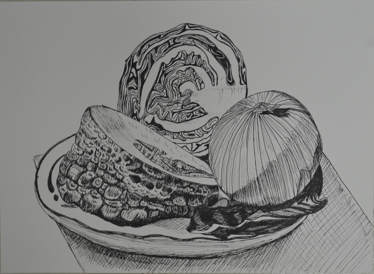
In the brief for this exercise I was to set up a still life group out of objects at my disposal, either objects that naturally connect together or deliberately contrast. For this I did a supermarket shop and purchased onions, a big chunk of knobbly Asian pumpkin and a red cabbage thinking about three objects that gradually went from rough to smooth.
I had to think about the following questions: 'How will I treat the objects?', 'How will their connections be clear?', 'How will I capture the differences between the objects?', 'How do the objects relate to their background? and 'How will I reference the colour in the group in this drawing?.
Then with these questions in mind I had to select a medium such as pen and ink, marker pens or fine black pen and A3 paper and begin to draw; which is exactly what I did. I wanted to use pen and ink for this drawing as I have kept delaying it but when i saw I would be using them in the next project I decided to use a Rotring 0.3 drawing pen.
My objects had already been in the fridge a couple of days so they wouldn't last long once I took them out and my SD card for my camera kept locking due to me removing it too often so I had to work fast as I couldn't get a photo to work from in case I didn't finish before evening came.
 Still Life Group Using Line 1st Drawing
Still Life Group Using Line 1st Drawing
There was no drawing this out in pencil first for me, I wanted to do start as I meant to go on and and put my Rotring drawing pen to paper. I started on the outline of the three objects together rather than drawing them individually then when the outline was complete I finished the shape of each object individually.
From there I started on the lines of the onion which were fairly simple and while I worked my way around the onion with a variation of light and dark lines (applying different pressures) I thought about how I was going to approach the different objects. Working from right to left I tackled the red cabbage next and it was extremely difficult; trying to view the patterns as a whole and then working on the lines individually was enough to drive me crazy.
The pumpkin was the next obstacle and because this was a still life group using line I had to exaggerate the texture of the pumpkin at certain parts where there was no real pattern at all. It looks like I have tried my hardest to depict tone here but actually I wasn't thinking about tone at all. I was just trying to complete the surface of the pumpkin with as many different line as possible, squiggly lines, short strokes, anything that came to mind.
The cabbage leaf on the right of the drawing was probably the most difficult object in this drawing and was very difficult to draw without hatching to depict it's smoothness which I wasn't very successful in doing so.
Then when I finished the composition I ruined the whole picture by doing some stupid speckle background and so I decided to have another go.
Still Life Group Using Line 2
This time I tried a slightly different angle and the finished drawing was cleaner but there are a lot more things that I am unhappy with. For one I don't know how the cutting board got so out of shape the cabbage leaf didn't turn out that great and the pumpkin surface was a little too exaggerated but certain parts of the pumpkin surface turned out a lot better.

Drawing 1, Part 2 Observations in Nature, Detailed Observation - Check and Log

Which drawing media did you find most effective to use, for which effects?
For me I love pencils I've been developing my pencil skills more and more on this course and I have got to the stage where I am doing less and less smudging and more and more hatching using my pencil at different angles with different holding techniques. I really think I did well depicting the tone of the wood and especially the bark in the 'Getting Tone and Depth in Detail' exercise. However I was very happy with my stippling with the Rotring drawing pen on the 'Stipples and Dots' exercise, not only being able to depict the tone of the leaf but also it's texture.
What sort of Marks work well to create tone and texture?
I used a variety of hatching to depict the texture of the tree branch with sporadic hatching to depict the bark and fluid lines and hatching to show the stripped wood all these marks worked really well. I thought I had chosen the wrong type of subject for the stipples and dots exercise but I think I showed the texture of the object really well with dots and patterns of stipples to show creases in the dying leaf.
Did you enjoy capturing details or are you more at home creating big broad brush sketches?
I must admit that capturing details with stipples and dots was a bit tedious but I am delighted with the finished drawing and I really enjoyed working on the tree branch in the first exercise so I can probably say that I am more at home capturing details.
Look at the composition of the drawings you have done in this project. Make some sketches and notes about how you could improve your composition.
The composition and the angles of the subjects that I chose were thought about long and hard before embarking on these exercises, I feel I chose the best compositions that I could to not only capture the full beauty of the objects but to fill the paper.

Drawing 1, Part 2 Observations in Nature, Detailed Observation - Stipples and Dots

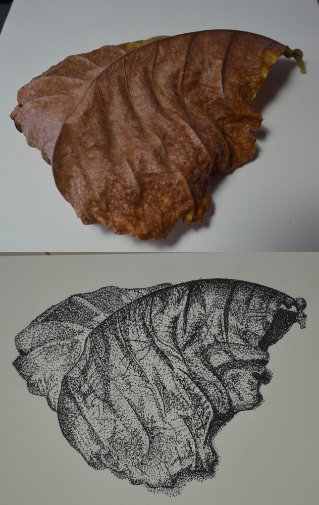
For this exercise I was to pick another interesting object and use A4 cartridge paper and a ballpoint or drawing pen. Then use a stippling effect, dots and and a variety of marks to create a drawing of depth and interest.
Exercise - Stipples and Dots, Finished Drawing
After my research on Eliot Hodgkin I took a walk through the very small park area opposite my school and took some photos of leaves with my mobile phone so I might use them later. When this exercise came up I went back into the park to grab some dying leaves to take home.
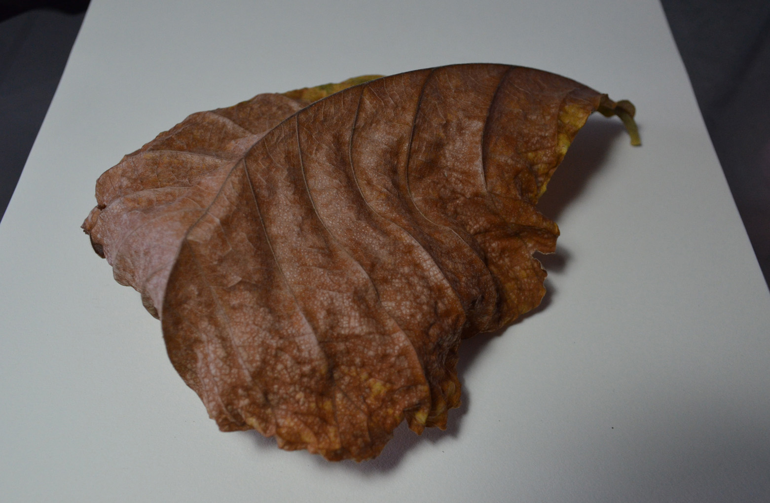
Exercise - Stipples and Dots, Leaf Subject
One particular leaf caught my eye as it had some great lines and at the time was half green half brown, so took many photos during the change from green and brown to completely brown and also tried the leaf at different angles, for my drawing I picked out the one above.
I can't say that I love stippling as it is a very slow process and this exercise took me about three hours over two days to complete and since my first assignment was handed in quite slow I'm trying to keep up momentum.
I used a Rotring 0.3 drawing pen and began as I did with other exercises, drawing the light tones by spacing out the dots  and then going back over for the darker tones with more dots. I used a variety of mark making techniques which included stippling, dots, really short hatching and lines and for the creased patterns of the dying leaf I drew the dots in tracks close together and then went back over with more dots.
Exercise: Stipples and Dots Finished
View my learning log for Drawing 1

Drawing 1, Part 2 Observations in nature, Detailed Observation, Research Point B - 2 Contrasting Artists, Gustave Courbet

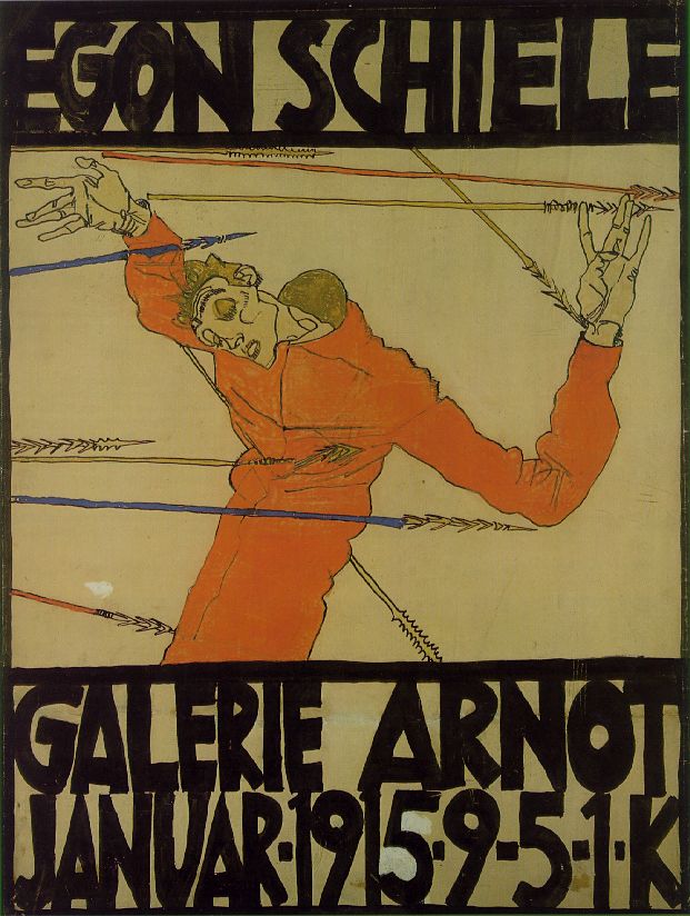
For this research point I was to find two artists who work in contrasting ways: from tight, rigorous work to a more sketchy style. For the artist who worked in a sketchy style I had already researched Egon Scheile in Part A so now it was time to find an artist who did more tight, rigorous work.
I was all ready to research a modern artist for this part of this research point and discovered Grant Wood while looking at Egon Schiele’s work, but then on a last minute search I found another artist that was just as new to me.
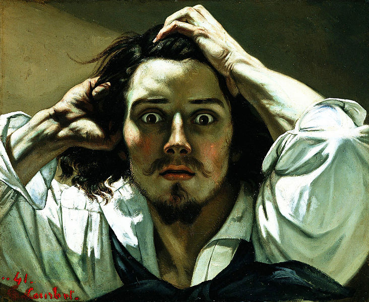
While searching for images  I came across a picture that I had seen many times and for some obvious reason I thought was a picture of Johnny Depp in one of his movie rolls. I was surprised to find out that it was a self-portrait called ‘A Desperate Man’ by an artist called Gustave Courbet, the father of realism and even more interesting the artist that first coined the phrase.
Born in Ornans, France to a wealthy family, Gustave Courbet went to Paris in 1841 with the intention of studying law but soon decided that he would study painting and did so by copying the paintings of the French, Flemish and Spanish masters in the Louvre.
His style was shaped near the start of his career when he chose direct his paintings to observed reality, among his early paintings were self portraits portraying himself in various roles he also painted seascapes, still-lifes and figurative compositions.
Courbet's figurative work was somewhat controversial because he addressed social issues in his paintings portraying subjects that were considered vulgar at the time such as rural hierarchy, peasants and the poor working conditions of the underprivileged.
Courbet's style became known as realism however instead of using perfect line and form in his paintings he dealt with realism with spontaneous brush strokes and a rough handling of paint achieving a sense of direct observation by the artist while depicting the inconsistency in nature.
Although Gustave Courbet and Egon Schiele are artists of two different movements living at two different times their lives are very similar in that they seem to demonstrate freedom of expression in their art by painting subjects that were pornographic or controversial at that time. The poses by Courbet's nudes such as La Femme Aux Bas Blancs, (Woman with White Stockings), 1861 and The Origin of the World (L'Origine du monde) (1866) remind me very much of Schiele's paintings; as though Schiele could have been influenced by the artist. Both artist's also served time in prison.
I'm not particularly turned on by the works of the old masters and so there are a lot of Gustave's paintings that I don't find appealing, but there are two or three that I think are brilliant simply because I can imagine how sensational they were at that time being so 'real' when photography was still in it's infancy.
http://en.wikipedia.org/wiki/File:Origin-of-the-World.jpg - The Origin of the World (L'Origine du monde) (1866)
Gustave Courbet auto retrato
Self-portrait (The Desperate Man), c. 1843–1845 (Private collection)
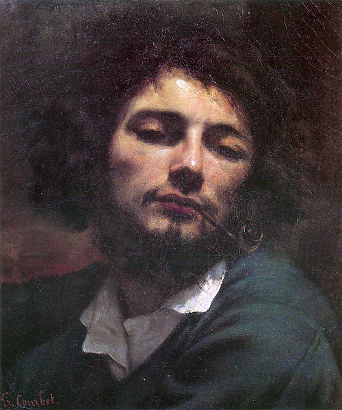
Gustave Courbet Autoportrait
The man with a pipe Self-portrait, 1848-49
Bibliography:

Drawing 1, Part 2 Observations in Nature, Detailed Obsevations, Research Point 2 Contrasting Artists A - Egon Schiele

For this research point I was to find drawings by two artists who work in contrasting ways: from tight, rigorous work to a more sketchy style.
I decided to research the artist who works in a sketchy style first.  While I have tried to find new artist so far in this module for this part of this research point I decided to research an artist I was already familiar with as when I saw the words 'sketchy style' he was the first artist that popped into my head and rightly so.
Austrian Expressionist painter Egon Schiele  was born in Tulin in 1890. His father Adolph Schiele was the station master at Tulin Railway station and as a child Egon was fascinated by trains and would spend many hours drawing them. It is said that his passion for drawing started at the early age of 1 and a half years old and this led his father to believe is son would become an engineer and so at eleven years old was sent off to attend a Realgymnasium 25 miles away from his home town. Due to lack of friends and lack of interest in his studies he was a poor student and was kept back two years. When his father died of syphilis in 1905 family problems made his situation worse and eventually was politely asked to leave school by his teachers
In 1906 he asked his mother and uncle to allow him to apply at the Vienna Academy of Fine Arts and in the summer of that year, passed the tough entrance exam to became the youngest student ever to attend his class. Although he was passionate about art he showed a resistance to the strict regimen at the academy. As a brilliant draughtsman he would get through projects in minutes that would take other students in his class hours to complete but his early works were heavy handed and his soulless depictions of professional models did not amuse his tutors who simply gave him grades of ‘satisfactory.’
Schiele’s early work showed traits of Gustav Klimt and then in 1908 after a visit to a the large art show known as the ‘Kunstschau’ where a room full of the artists’ paintings were on show the influence of Klimt emerged full blown in Schiele’s paintings. He saw himself as the new Klimt and paraded round Vienna calling himself the ‘Silver’ Klimt and against the Academy’s authority accepted invitations to exhibit at the ‘Kunstschau’. In 1909 Schiele and a few of his like-minded class mates handed over a formal letter of protest to the academy expressing their disapproval at the academy’s rigid rules and withdrew themselves from the school.
By 1910 Egon Schiele’s unique expressionist style had gotten him many admirers including Gustav Klimt himself who bought several of his paintings and also offered to exchange some for his own. Klimt also introduced him to patrons and collectors and he thought that leaving the academy had turned out to be a wise career move but that wasn’t to be the case. Klimt was very vain and expected his works to be snapped up by the patrons who he had hoped would show him devotion but the truth was they didn't find him the least bit cooperative and found his commissioned works, far too sexually explicit. Feeling let down he left Vienna for the countryside.
Egon Schiele led a short life dying at the early age of 28 of the Spanish flue in the epidemic that swept Europe in 1918 but his short life was somewhat controversial. At 21 years old he was imprisoned for seducing an underage girl and during his arrest the officials destroyed many of his drawings that were regarded at the time as pornographic due to the nature of his subjects. He spent a total of only 24 days in custody but during that time he a created a 'series of 12 paintings depicting the difficulties and discomfort of being locked in a jail cell' - Wikipedia.
His work was shaped by World War I during which he was drafted up and stationed in a Russian prisoner of war camp; however he still continued to paint and was even given a disused store room to be used as a studio where he painted captured Russian officers.
His style changed over the years  he was influenced by Klimt and Oskar Kokoschka and his early works from 1907 to 1909 resembled those of Klimt but in 1010 began experimenting with nudes and began developing his own unique style that we know today, pasty soulless doll like figures with strong overtones. Many view his works as pornographic, twisted or erotic depicting death, sex and discovery and yet I see his works as simply brilliant and way ahead of their time; paintings that have influenced so many artists since.
I first came across Schiele's work in the music room at my secondary school, a poster of his 'Self Portrait of Saint Sebastian' but it wouldn't be til many years later that i would find out the name of the artist or what the painting was called.
Egon Schiele - Self Portrait as Saint Sebastian
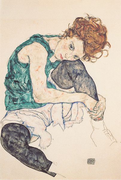
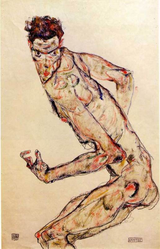
My favourite paintings by Schiele have got to be the Fighter 1913 and Seated Woman with Bent Knee 1917, although I have to admit I do love a nude or two of his which are simple, crude but very erotic.
Egon Schiele - Seated Woman with Bent Kneee 1917
Egon Schiele - Fighter, 1913
I love the way he has clearly thought hard about the subjects (maybe a bit too hard from what we know of Schiele) and yet his paintings are no more than coloured sketches on a plain background, allowing him to show movement and even though some regard his subjects as being 'soulless' I don't think they can be accused of being lifeless. I can see how it is easy to be influenced by an artist such as Schiele and I know that his paintings will come to mind in the 'Drawing Figures' part of this course.
Bibliography:

Wednesday, 14 May 2014

Drawing 1, Part 2: Observations in Nature, Exploring Coloured Media - Exploring Coloured Media

In this exercise I set out to explore the different coloured mediums I had available which included oil pastels, soft pastels, felt tips, markers, different coloured inks and dip pens as well as coloured pencils and a pack of coloured ball point pens. Just like I did in the Making Marks Project in Part 1 I decided to go at this project using a mixture of doodling and filling in squares with different techniques.
Coloured Pencils
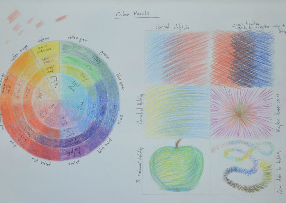
I started out with coloured pencils I had recently bought some Derwent coloured pencils for the composition development of assignment 1 but have yet to discover their full potential. I began by putting together a rough colour wheel based on one that I found online to see how the colours would blend together, there are much more possible colour variations  to be had from blending this medium but it gives me some idea and will help me in the future.
exploring coloured media - Coloured Pencil
In the squares i tried different hatching techniques such as cross hatching and horizontal hatching. some techniques work better with this medium but I think all can be utilized in a drawing and this gives me some idea of what each technique can be used for,
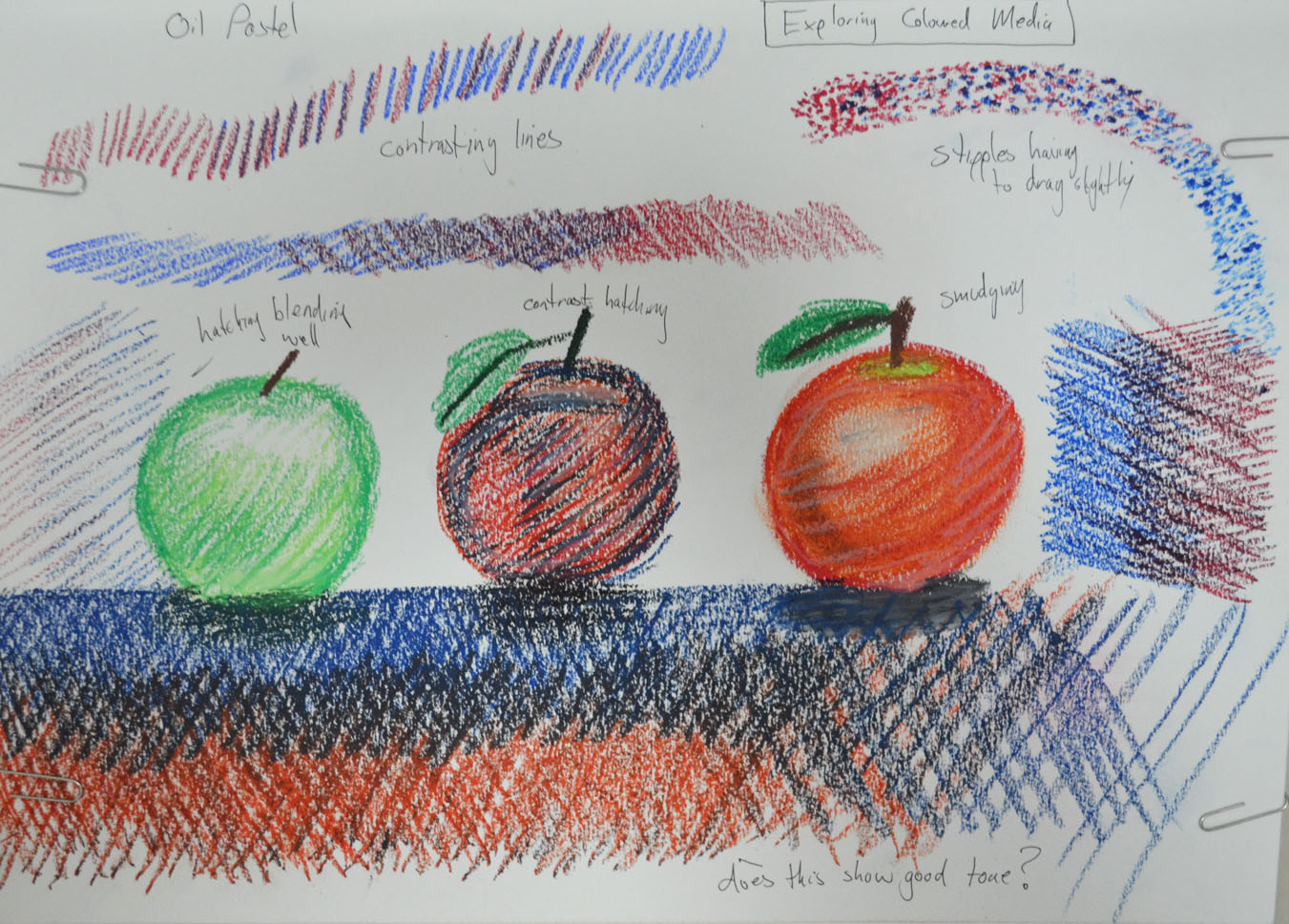
exploring coloured media - Oil Pastel
Oil Pastels
With the oil pastels I decided to do some experimenting by doodling just to get a better feel for this medium as I know I will be using them a lot later. I found that they were quite good forstippling and leave a lot more colour on the page when stippling than coloured pencils which weren't great and found myself drawing circles with them. They were also really good for hatching but can also be smudged quite well, so all in all a very versatile medium.
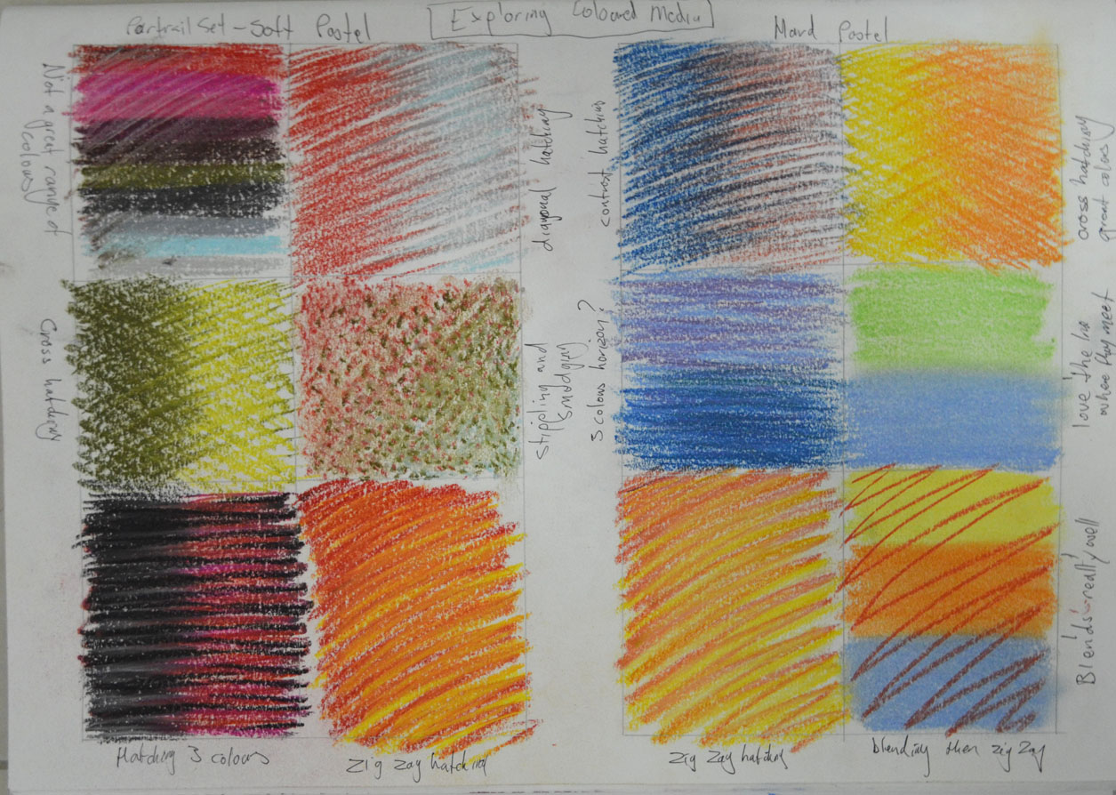
exploring coloured media - Soft and Hard Pastel
Soft Pastels
At the start of the course I bought some soft pastels but haven't really used them until now. I hadn't noticed that they were a portrait set so I didn't have much choice of colours, however I did enjoy working with them. They were very good for stippling and hatching and depicted tone very well, in one box I did some stippling and then smudged over the top and was rather pleased with the result.
Hard Pastels
I've used these a couple of times now in both the Study of Light Reflected from one Object to Another exercise in part 1 of this course as well as in my finished piece for the Natural Forms part of Assignment 1 but yet still have to discover their full potential. Hard pastels are great for hatching and smudging as well as layering. They are also quite expressive when using certain techniques and they blend very well.
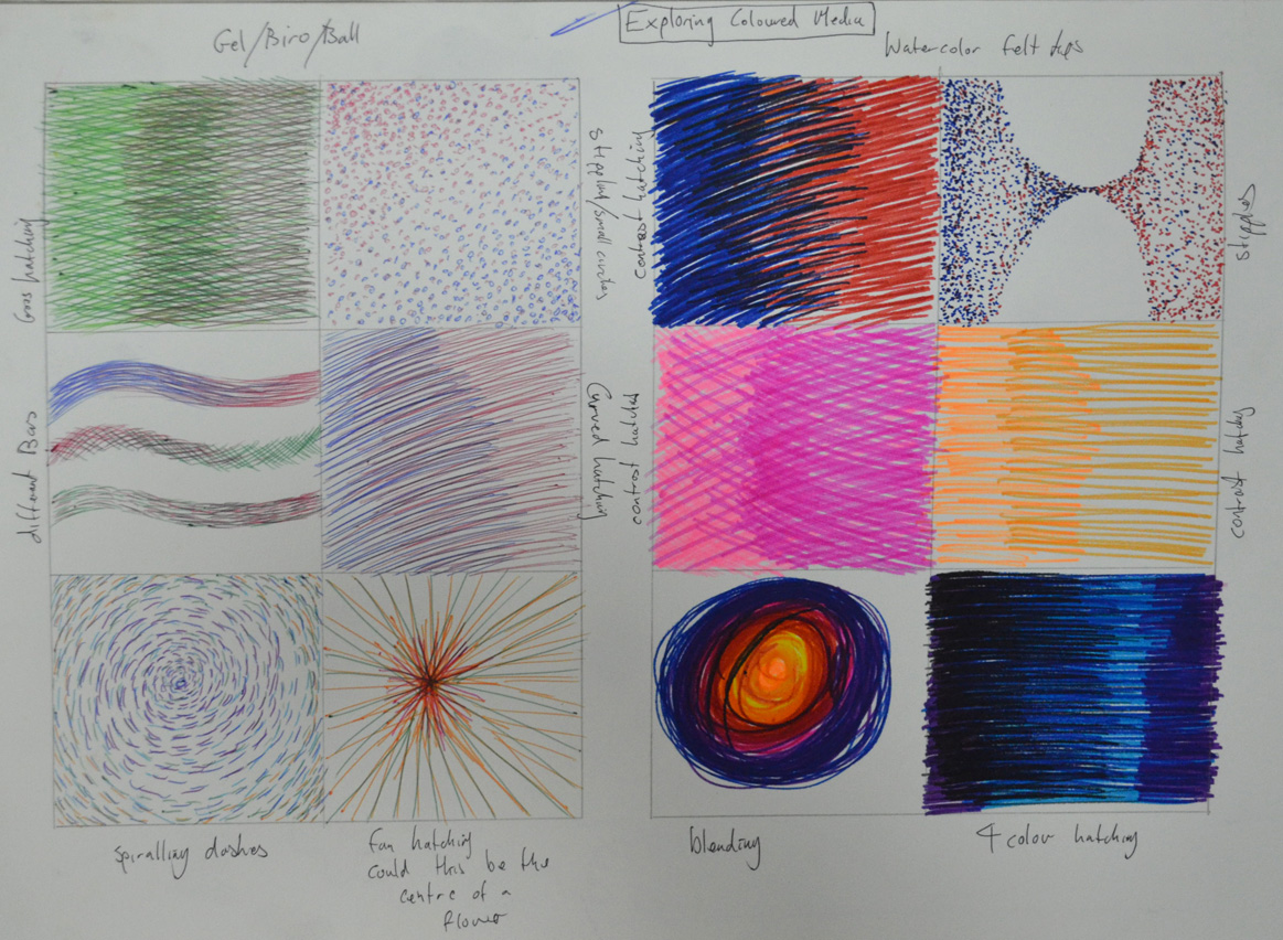
exploring coloured media - Ball Point and Felt Tip
Ball Point Pens
I bought a cheap pack of Staedtler coloured ball points that were in a sale in a local art/book store and tried out different techniques, now I know from the work I have seen of other artists in ball point that they are a great medium to use, however techniques have to be improved, when hatching they seem to work better when you lift the pen off the paper towards the end. I get a feeling they are probably better for small pieces rather than large drawings.
Felt Tip Pens
The felt tip pens that I have here are not a normal felt tip but a watercolour pen, I didn't know they existed, the colours are very vivid and seem to better when used for darker images. Stippling is great with this medium but when hatching they tend to clot on the paper towards the end of the stroke so like the ball points I found that they work better if you lift your pen off the paper towards the end of the stroke. These watercolour pens also blended quite well, I have yet to try out normal felt tip pens but shall be doing so quite soon.
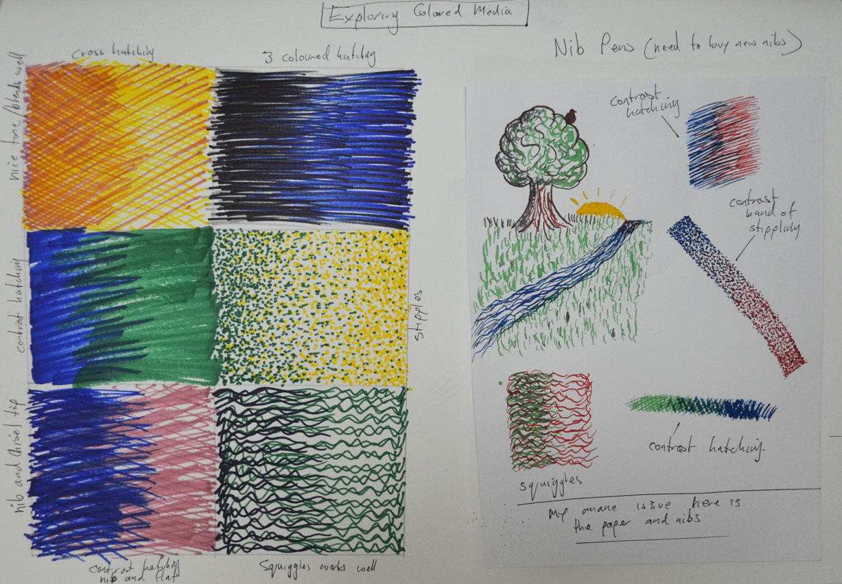
exploring coloured media - Markers and Dip Pens/ Coloured Inks
Markers
I used markers for the Patrick Caulfield Research point but only used them in blocks of colour, I really enjoyed using them just as I did in this exercise. They were brilliant for stipling and hatching and depicted tone very well, I also filled a square with hatching using both the pointed nib and the chisel nip and found it to be very expresive. Again they tend to clot but not as much as the felt tip and I found that that they are probably better for darker drawings.
Nib Pens and Coloured Inks
This is a medium that I am still struggling with I have a good few Ecoline colours to play around with and have been experimenting with different papers but I think my nibs are letting me down, I shall be investing in some quality nibs very shortly. However, i did get some decent results this time. Starting off with a bit of doodling I got used to the feel of the pen on the smooth paper in my A5 drawing book then did some stippling and hatching. I get the feeling that it is best to let the inks dry before using other colours. I found that they were great for stippling on the smooth paper but then on water colour paper not great at all the same went for hatching. This is a medium that I want to see myself using more of as I love pen and ink drawings so it is going to be worthwhile exploring this medium more deeply.