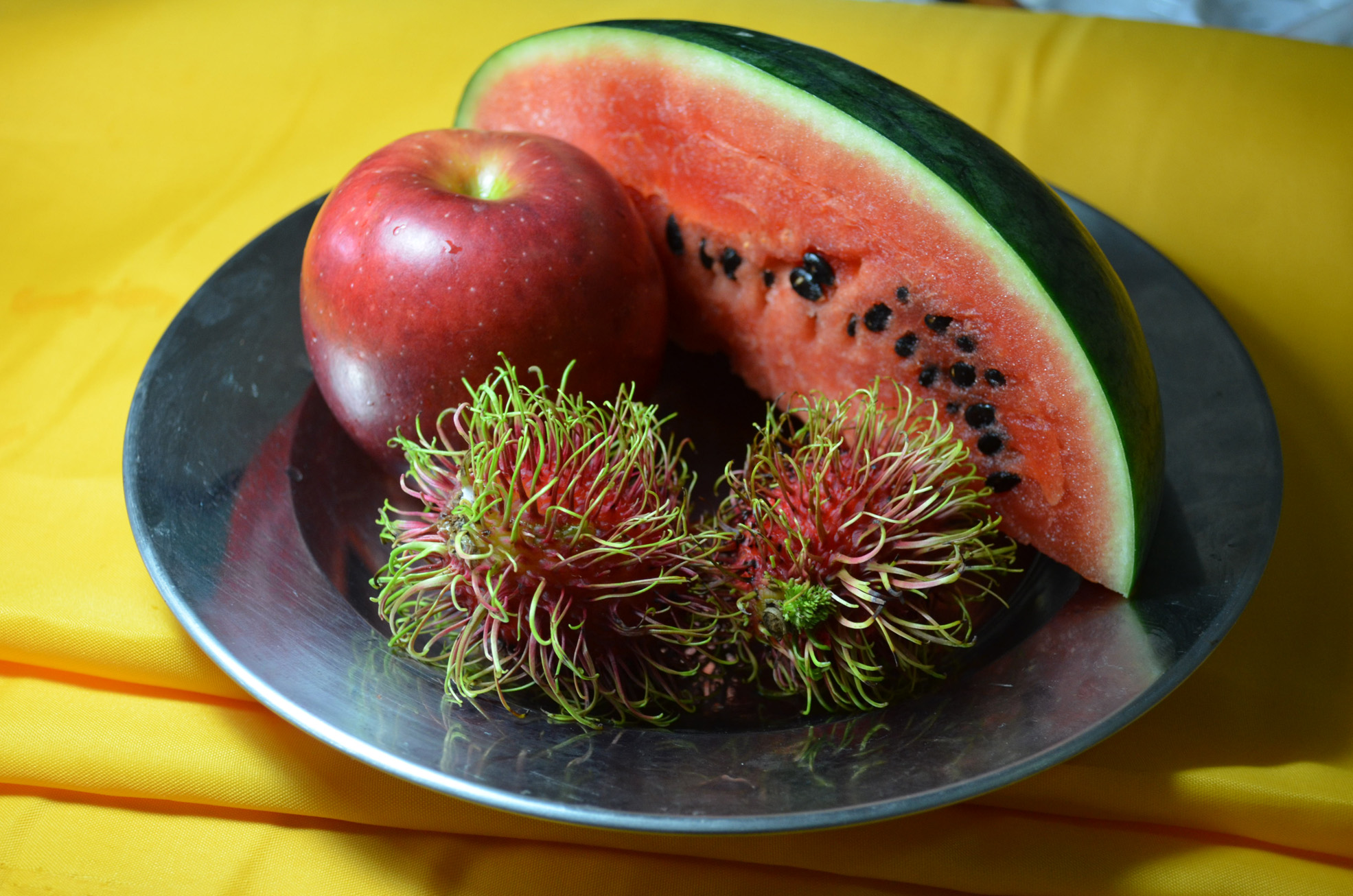
For this exercise I used approximately 13 different colours of oil pastel and a white textured sheet of A3 watercolour paper and I’m kicking myself now reading the brief where it says usecoloured paper. However further down the page it does say leave gaps to let the white break through so it’s easy to see how I got confused.
I set up a colourful group of fruit which included a quarter of watermelon, a red apple and two ramhutan or ‘gno’ as they are known in Thai, concentrating on creating a group of contrasting colour and texture I set them on a stainless steel reflective plate which I bought with the intention to use in the earlier exercise ‘
Shadows and Reflected Light and Shade‘, and placed the composition on a piece of folded cloth used to make Thai monks robes.

Drawing Using Oil Pastel – Chosen Composition
First of all I lightly sketched in the main shapes of the group doing my best to fill the paper including the main shapes of the cast shadows on the cloth underneath, I think this was my best attempt at filling the paper so far.
I then started to block in the darkest areas using a sketchy hatching technique, I’m trying to be more fluid in this part of the course and I think I’m doing well so far. From there I went on to sketch the light areas in a different colour, on the watermelon and apple at least.
Once the initial layers of colour were blocked in I worked back over them to strengthen the tone using related colours on each object to strengthen the tone.

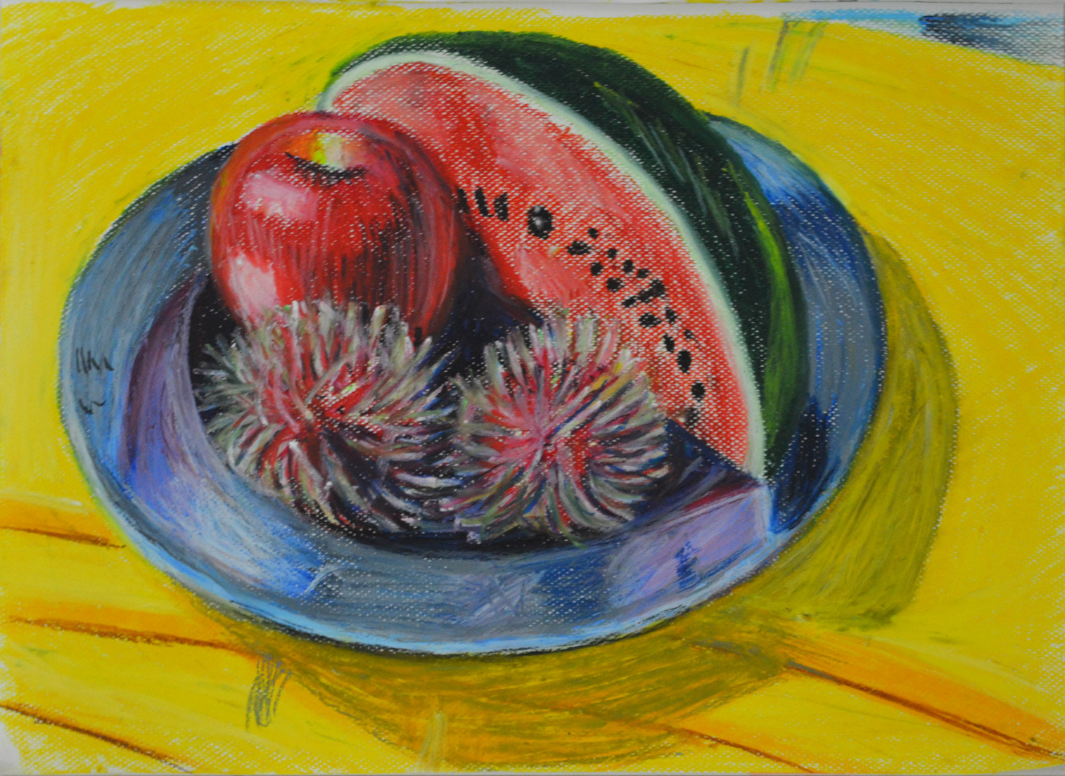
Drawing Using Oil Pastel – Finished drawing
Approximate breakdown of colours used on objects
Watermelon:
On the flesh of the watermelon I used pink, red, a very dark red and a dark blue to create shadow as well as black and white for the seeds. For the skin I used a dark green a light yellow and a grey-blue colour.
Red Apple:
For the red apple I used ultramarine, red, orange and pink for the skin and green, yellow and orange for the core, these colours worked really well together.
Rambutan:
On the rambutan I worked from light to dark then back again and they were probably the hardest thing I’ve drawn so far. For these two objects I used all of the above colours but it took me a very long time to build up the layers and to get them looking anywhere near they did in real life. Although they are not perfect I really love the effect I have created while working on them. They are a very irregular shape and yet I have still managed to make them look round and spiky.
The Plate:
Same again on the plate, because it was so reflective I used a lot of the colours utilized for the fruit plus a light blue, grey and white.
This is the first time I have worked with oil pastels other than experimenting and I found that you have to know when enough is enough for danger of messing up your drawing.
I’m very impressed with the finished picture, but what is worrying me now is how I am going to preserve it, I have sprayed it a few times with an expensive fixative already but I used cheap pastels by Pentel and it doesn’t look like the fixative is not going to do any good…